#seaborn search results


📊可视化:ChatGPT 做资产配置 Step1: 让 ChatGPT 给出初步配置,我在 Memory 中给出了 '/a' 短指令,默认触发可视化讲解。 Step2: 细分层级、按偏好去调整。 Step3: 按可视化库的规范给出代码,贴到 IDE 中运行。 图表规范参考,到官方文档复制给 GPT 就好,推荐 #plotly、bokeh、#seaborn 等等。…

شرح مكتبة #seaborn في #البايثون إحدى أقوى وأجمل المكتبات في عمل الرسوميات وتحليل البيانات وتصويرها 💪 youtu.be/RwO5bXF1-xY لا يفوتكم الدرس أعزائي متابعة ممتعة 💐


¡Chicos! 🚀 Hoy quiero compartir con ustedes un resumen sobre el objeto FacetGrid en Seaborn. 📊 Veremos cómo usarlo, para qué nos resulta útil y otros datos interesantes. #Seaborn #FacetGrid 🧵👇🏼


More #earthquake #dataviz, magnitude and time with #seaborn for 2012 #python #DataScience #DataAnalytics


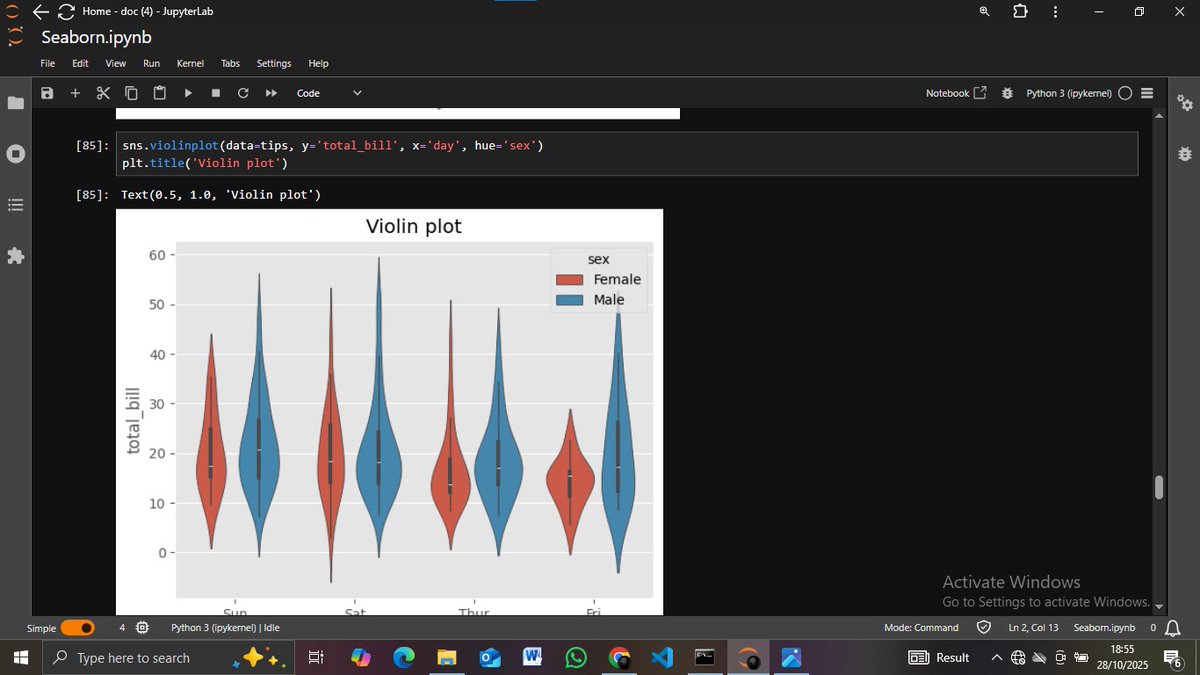
🧵 Day 48: Seaborn Categorical Plots 📊 ✅ Learned all types of categorical plots ✅ Covered: barplot, countplot, boxplot, violinplot, stripplot, swarmplot ✅ Understood use cases & comparisons for categorical data #100DaysOfCode #Seaborn #Python #DataScience #Day48


✍️Enroll Now: bit.ly/4dTCTBn 👉Attend a Free Workshop on Data Analyst with Python using Pandas & Seaborn by Mr.Shiva Rama Krishna. 📅 On: 2nd June @ 10:00 AM (IST) #Fullstackdatascience #pandas #seaborn #ai #machinelearning #python #chatgpt #sql #Database #Dataanalyst


各可視化ライブラリの引数名比較表を作りました📊✨ seabornとplotly. expressは同じような使い方ができますが、引数名が微妙に違うので注意が必要です🤔 #Python #pandas #seaborn #plotly


Knowing how to build specific data visualizations enables us to extract valuable insights to make critical data-driven decisions. From creating simple data plots to building a #Seaborn histogram and leveraging #Shiny, dive into three vital #Python tutorials. 🐍 👇


Soon an interesting blog 🧾 is coming where i have explained how i analyzed Income distribution by education level using the UCI Adult Dataset. Visualizing real-world bias and patterns in census data. ⭐📊 #Seaborn #Matplotlib #DataScience #Python #letsconnect #AI #code #Blogs


🚀 Matplotlib & Seaborn | 360DigiTMG 🚀 Unlock data visualization skills with Matplotlib & Seaborn to create powerful and insightful charts with ease. 📺 Access the session via the provided link: youtube.com/live/07NXbGbj9… #Matplotlib #Seaborn #Python #DataScience #360DigiTMG


Pearson's correlation measures the linear relationship between two variables, standardizing covariance to a range of -1 to 1. Image generated with #python + #seaborn + #illustrator


Once upon a time in the silver waters of Norway a legacy took shape: Seaborn Silver. A perfect blend of innovation and tradition. #Seaborn #FjordTrout

Tried clustering my life—settled for clustering flowers. Iris pairplots > life pair problems. 😅🌸 #MachineLearning #DataScience #Seaborn #LearningInPublic #ML #EDA #Visualization #IrisDataset #Python #learningtoearning #Peace #NEW


🔥💨Master Seaborn like a pro. Here are 10 advanced Seaborn tips & tricks to make your data visualizations look clean, powerful, and presentation-ready. Every data scientist should know these 👇 #DataScience #Seaborn #Python #Data


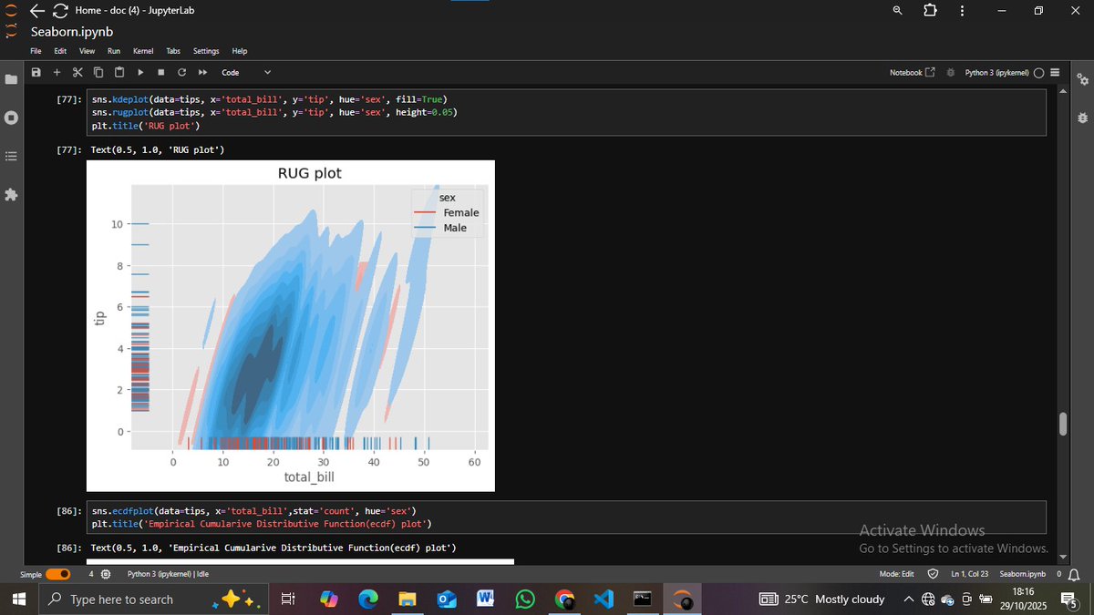
Day 3 of #100daysofcodingchallenge kdeplot → smooth density curve ecdfplot → cumulative distribution rugplot → data points along an axis displot → combined histogram + KDE #Seaborn #Python #DataScience


Day 2 of #100DaysOfData 📊 Explored more Seaborn plots today: -barplot, boxplot, countplot -histplot, stripplot, swarmplot, violinplot 🎨 Each reveals data in a unique way — from distributions to category insights. #Python #Seaborn #DataScience


📊 Data is powerful only when visualized well. Master Seaborn and turn raw numbers into clear insights with Python. Watch here: youtube.com/playlist?list=… #Python #DataScience #Seaborn #Visualization #Analytics
Day 2 of #100DaysOfData 📊 Explored more Seaborn plots today: -barplot, boxplot, countplot -histplot, stripplot, swarmplot, violinplot 🎨 Each reveals data in a unique way — from distributions to category insights. #Python #Seaborn #DataScience
Day 2 of #100DaysOfData 📈 Practiced data visualization with a new dataset today Focus: barplot → category comparison boxplot → distribution & outliers countplot → frequency of categories Visualization is truly where data starts to make sense. #DataScience #Python #Seaborn


Diving into data viz! Check out my latest creations: a sleek Seaborn pie chart (Img 1), a vibrant Plotly pie chart (Img 2), and a stylish Plotly doughnut chart (Img 3). Which one’s your fave? Let’s talk data storytelling! #DataViz #Python #Seaborn #Plotly"


🚀 Day 49 of my #Trinovous AI/ML journey: 📊 Employee Insight Visualizer Upload CSV or use default data Choose chart type: Bar, Hist, Box, Heatmap Download charts as PNG bit.ly/3WVDlaV #Python #Seaborn #Gradio #DataScience #PortfolioProject


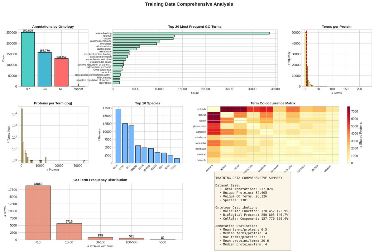
🚀 Today’s Project: Protein Function EDA using CAFA 6 Dataset! 🧬📊 💥Explored biological processes, ontology terms, and protein relationships through beautiful Python visualizations using #Seaborn & #Matplotlib 💡 🧠 Data meets Biology. 👇 Comment “Link” to explore! #Ai #EDA
🎨 Want to make your data beautiful & insightful? Learn how to create stunning visualizations with Seaborn in Python! Watch here: youtube.com/playlist?list=… #Python #Seaborn #DataScience #DataVisualization #MachineLearning

Achievement Unlocked: Mastered NumPy Vectorization, set up the entire Pandas data toolkit, and even got my first #Seaborn visualization working. I go still chop this theory las las sha.😭🤲 #11WeeksOfCode #machinelearningcode
👩💻 Want to impress with your data stories? This Seaborn tutorial playlist shows you how to visualize data like a pro. Watch here: youtube.com/playlist?list=… #Python #Seaborn #DataScience #Analytics #DataViz
🔥 Elevate your data visualization skills! This free playlist teaches you how to use Seaborn for stunning plots in Python. Watch here: youtube.com/playlist?list=… #Python #Seaborn #DataScience #MachineLearning #DataViz

Just completed a full Seaborn crash course! 🐍📊 Covered: Scatter, Line, Regression, Bar, Box, Violin, KDE, Heatmap, Pair Plot & more! Ready to turn data into insightful visuals. #Python #Seaborn #DataViz #MachineLearning

If your Matplotlib plots feel clunky, Shittu Olumide’s KDnuggets guide shows how Seaborn’s clean defaults and Pandas integration can sharpen visuals with less code. Useful run-through of plot types and when Seaborn beats raw Matplotlib. #Python #DataViz #Seaborn…


Seaborn ist eine leistungsstarke Bibliothek für statistische Visualisierungen in Python, die auf Matplotlib aufbaut. Sie bietet saubere Standards, enge Integration mit Pandas und vereinfacht den Code. Perfekt für Datenanalysen! #Python #DataScience #Seaborn #Visualisierung


Seaborn funtions used in Data Sciecne morioh.com/a/cb480cce281b #seaborn #python #programming #developer #morioh #programmer #softwaredeveloper #computerscience #webdev #webdeveloper #webdevelopment #pythonprogramming #pythonquiz #ai #ml #machinelearning #datascience

شرح مكتبة #seaborn في #البايثون إحدى أقوى وأجمل المكتبات في عمل الرسوميات وتحليل البيانات وتصويرها 💪 youtu.be/RwO5bXF1-xY لا يفوتكم الدرس أعزائي متابعة ممتعة 💐
#Python has lots of great plotting packages. 🐍📊 Here are two examples of creating box plots using @matplotlib and #seaborn


More #earthquake #dataviz, magnitude and time with #seaborn for 2012 #python #DataScience #DataAnalytics

I just recently learned about @matplotlib's subplot_mosaic function (or rather had forgotten it exists...). It's super helpful for creating paper-ready figures with @matplotlib @michaelwaskom's #seaborn and @arviz_devs in Python @ThePSF!


Re-learning #pandas and #seaborn. I have already played with those a couple of years ago. Anyone out there studying data science?

✍️Enroll Now: bit.ly/4dTCTBn 👉Attend a Free Workshop on Data Analyst with Python using Pandas & Seaborn by Mr.Shiva Rama Krishna. 📅 On: 2nd June @ 10:00 AM (IST) #Fullstackdatascience #pandas #seaborn #ai #machinelearning #python #chatgpt #sql #Database #Dataanalyst

To tell a story about your data you need to understand the trend, the relationship between the variables, and how variables are distributed. Python with #pandas library and #seaborn, will be very helpful to analyze your data #python #dataanalytics #dataanalyst

This course introduces the Data visualization by #python #pandas and #seaborn. It explores how to visualize data and tell a story about it. This course is free provided by kaggle from google #freecoursesonline . #bigdata #machinelearning #data #cloud #ai #datavisualization


Completed two python data analyst portfolio projects from @Alex_TheAnalyst's Data Analyst Bootcamp. Learnt how to visualize data using seaborn and matpotlib! Below is one of today's output showing the change in bitcoin prices over a 90 days🤗 #python #seaborn #matplotlib

各可視化ライブラリの引数名比較表を作りました📊✨ seabornとplotly. expressは同じような使い方ができますが、引数名が微妙に違うので注意が必要です🤔 #Python #pandas #seaborn #plotly


❤️🧡💛💚💙💜 = 🏳️🌈 #PrideMonth at #Seaborn Seaborn is deeply committed to fostering diversity, equality & inclusion in the workplace. Now is the time to spread positivity and acceptance throughout Pride Month and beyond!

Pearson's correlation measures the linear relationship between two variables, standardizing covariance to a range of -1 to 1. Image generated with #python + #seaborn + #illustrator
Something went wrong.
Something went wrong.
United States Trends
- 1. Wemby 39.3K posts
- 2. Steph 79.3K posts
- 3. Draymond 17.8K posts
- 4. Spurs 33.9K posts
- 5. Warriors 57.3K posts
- 6. #Truedtac5GXWilliamEst 129K posts
- 7. Clemson 11.3K posts
- 8. Louisville 11K posts
- 9. Massie 59.8K posts
- 10. Zack Ryder 17K posts
- 11. PERTHSANTA JOY KAMUTEA 456K posts
- 12. #NEWKAMUEVENTxPerthSanta 454K posts
- 13. #DubNation 2,186 posts
- 14. Bill Clinton 197K posts
- 15. #SmackDown 54.2K posts
- 16. Marjorie Taylor Greene 51.1K posts
- 17. Harden 15.8K posts
- 18. Aaron Fox 2,610 posts
- 19. Bubba 60.1K posts
- 20. Dabo 2,016 posts