#visualizedata نتائج البحث

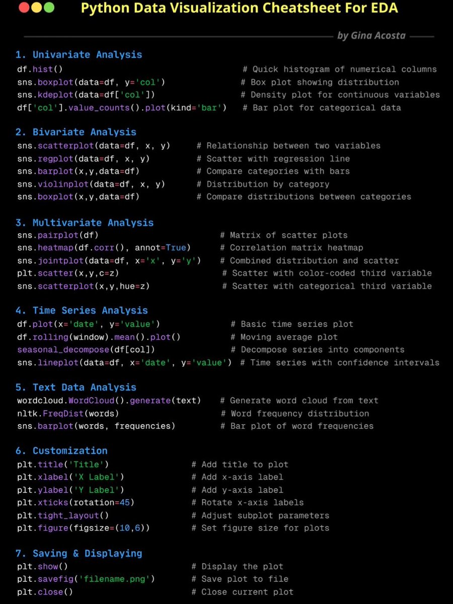
Python Data Visualisation CheatSheet for Exploratory Data Analysis (EDA).


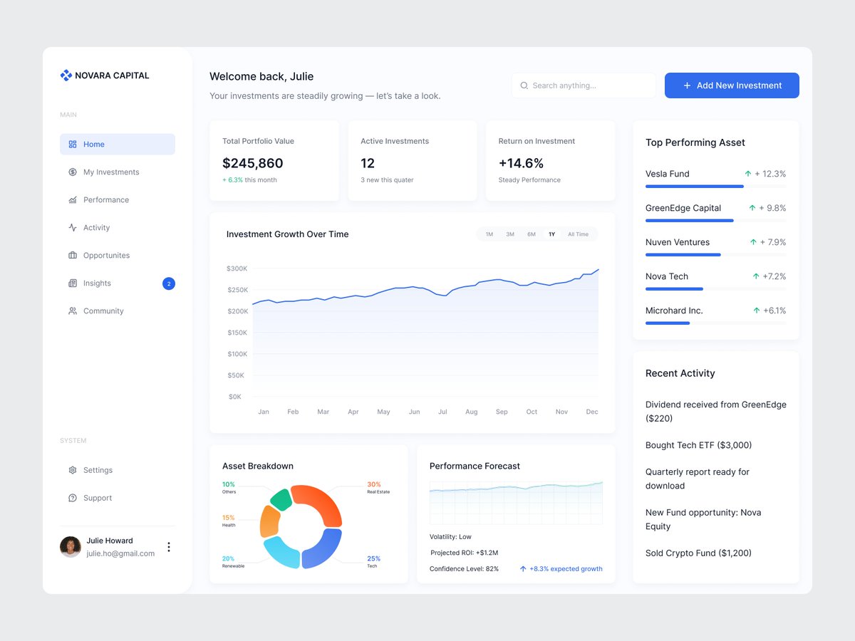
designed a clean, data-driven investment dashboard where investors can track their growth, explore new opportunities, and make smarter decisions. what do you guys think?

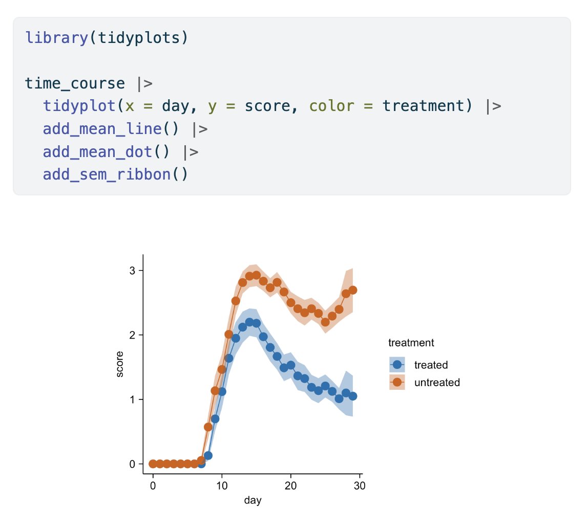
Here are some graphs that we've created in my recent live webinar. Topic: Data Analysis & Visualization in R I’ve developed a mini-course based on this webinar, where I provide the live session recording, exercises with solutions, and additional resources. Learn more by…
Python Data Visualisation Cheatsheet for Exploratory Data Analysis (EDA)

This is the complete data visualisation guide for Data Analysts:


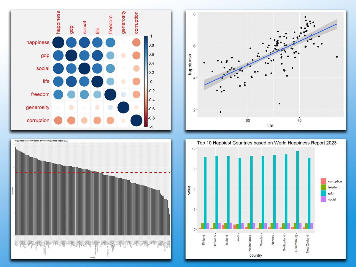
Found this really cool project, 1 dataset 100 visualizations. 100.datavizproject.com
100.datavizproject.com
1 dataset. 100 visualizations.
1 dataset. 100 visualizations.


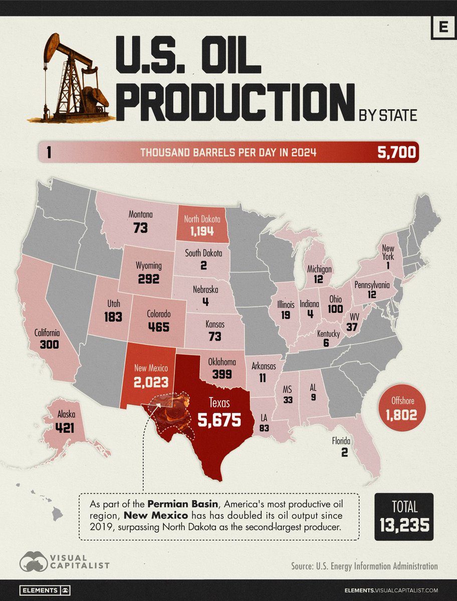
Mapped: U.S. Oil Production by State 🛢️ From @VCElements—bridging the gap between global trends shaping our future, and the raw materials powering them ⚡️ elements.visualcapitalist.com/mapped-u-s-oil…

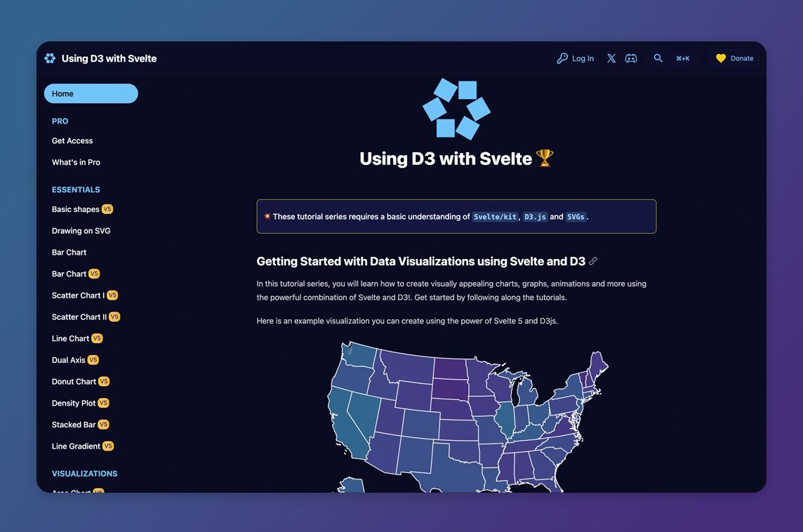
The tutorial series @datavizsvelte guides you through building data visualizations with Svelte & D3 📈 - madewithsvelte.com/datavisualizat…

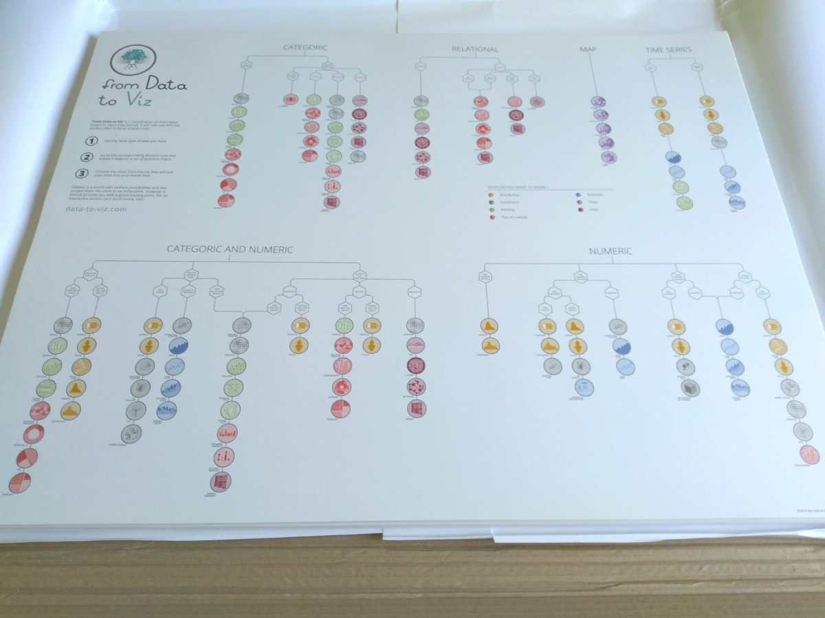
🤔How to pick the best graphic representation? ➡️data-to-viz.com is a classification of chart types based on their input format! It also provides link to R, Python and D3 examples. And a list of #dataviz caveats 🙈 The third batch of posters just arrived😍


Master Data Visualisation with Python Pandas. Get for free in the thread:


Dharma visualized through data and geometry.


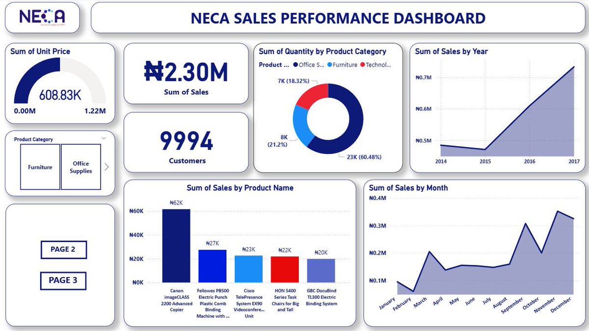
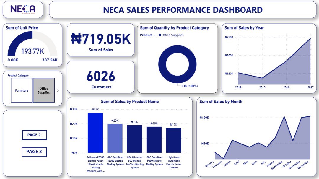
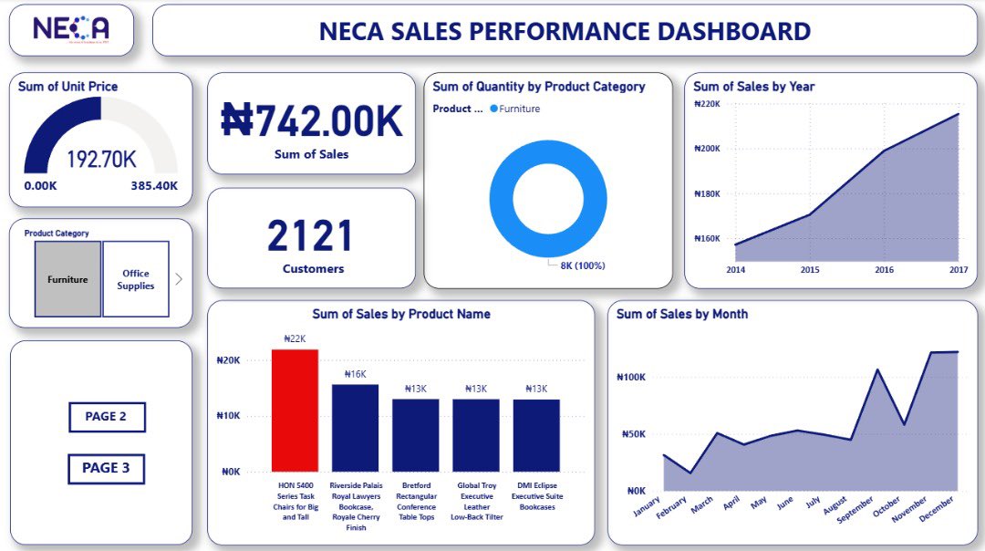
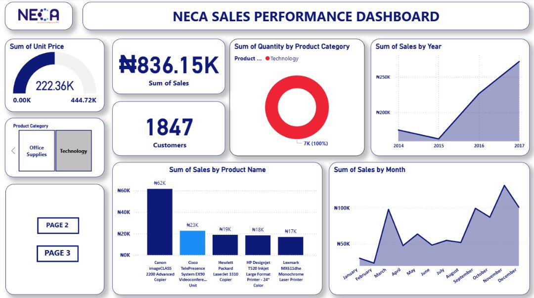
I started learning Power BI and I’ve been able to Build this insightful dashboard after transforming a transaction dataset on power BI and I’m nothing short of proud of myself, it’s my third visualization since i started learning power BI for analysis. #NECAAcademy 🧵 A thread

Python Data Visualisation Cheatsheet for Exploratory Data Analysis!


Infografix - the free AI infographics generator ✨ Use pre-loaded template options to instantly visualize data in alternative ways 😊 Try out a template ➡️ infografix.app #Infografix #AIInfographicsGenerator #VisualizeData #InfographicTemplates

Gain instant clarity from your data with our new Chart View 📊 This powerful feature makes your board come alive, turning complex numbers into actionable insights. Find out more: cake.com/updates/chart-… #ChartView #DataMadeEasy #VisualizeData


📈 Dive into data with precision! From Bar to Line, Stacked Areas to Polar Bars and beyond 🌠 #VisualizeData - Bar: Compare easily 🏧 - Line: Track changes #chartstudio 👉apps.apple.com/app/apple-stor…


Word clouds look good but can mislead decisions if used wrong. Learn how to make word clouds that show real insights and support better outcomes. #DataVisualization #VisualizeData #TextVisualization #VisualAnalytics #DataViz #StoryWithData #WordCloud chartexpo.com/blog/word-cloud
chartexpo.com
Word Cloud: A Visual Everyone Uses, and Often Misuses -
Word clouds look good but can mislead decisions if used wrong. Learn how to make word clouds that show real insights and support better outcomes.
Poor data visualization leads to wrong calls and missed chances. Want visuals that guide, not confuse? See how clarity drives better business moves—read on! #DataVisualization #VisualizeData #InformationDesign #VisualAnalytics #DataViz #StoryWithData chartexpo.com/blog/data-visu…
chartexpo.com
Data Visualization: Focus on the Outcome, Not the Tool -
Poor data visualization leads to wrong calls and missed chances. Want visuals that guide, not confuse? See how clarity drives better business moves—read on!

📊 Elevate Your Data Game with These Top 5 FREE Visualization Tools! 🚀✨ We are proud to have expertise in these tools that can help you create wonders in no time! 🎨📈 #DataVisualization 📊 #AnalyticsTools 🔍 #VisualizeData 🎨 #DataDrivenResults 📈 #MetaSenseMarketing 🚀


Observability is the ability to understand a system's internal state by analyzing its external outputs, such as logs, metrics, and traces. Read more 👉 lttr.ai/AajCR #IngestLogs #VisualizeData #Observability #Docker

Data Prepper is an open-source tool for ingesting logs, metrics, and traces to OpenSearch. Read more 👉 lttr.ai/AajCH #IngestLogs #VisualizeData #Observability #Docker


🌟 Sankey mastery unveiled! 📊 Discover the art of Sankey charts, a dynamic tool for analyzing complex flow data. #DataViz #SankeyMaster #VisualizeData ✨ Transform your data storytelling with these #sankeymaster #sankey 👉apps.apple.com/app/sankeymast…

Mastering Observability in 10 Minutes Using OpenSearch ▸ lttr.ai/AajB3 #IngestLogs #VisualizeData #Observability #Docker

You have set up OpenSearch and Data Prepper to ingest and visualize logs in less than 10 minutes. Read the full article: Mastering Observability in 10 Minutes Using OpenSearch ▸ lttr.ai/AajB0 #IngestLogs #VisualizeData #Observability #Docker

📊 From bar graphs to sunburst charts: Dive into the world of visual data! 🌟 Explore the array of infographics: line charts, pie charts, organ charts, & more! #DataViz #VisualizeData #chartstudio 👉chartstudio.top
📊🎨 Unveil the secrets behind data visualization! From bar charts that break down trends to sunburst charts that reveal nested insights, explore the art of data storytelling. 🌟 #VisualizeData # #chartstudio 👉apps.apple.com/app/chartstudi…


🏆 Visualize Success with Spinify + #SQL! Bring your SQL data to life! Spinify turns abstract numbers into visual success stories, displaying achievements and milestones directly from your databases on engaging, dynamic leaderboards. #VisualizeData #SQLGamification

Tired of theory? Our Data Analysis Using Python course offers real-world projects with actual datasets. Experience practical learning like never before! Enroll now, click here to get started: Data Analysis Using Python | somX #DataAnalysis #DataSkills #VisualizeData #somX


Premier test de google cloud datalab #visualizeData, a tester la facilité (ou pas) de créer des notebook #bigquery


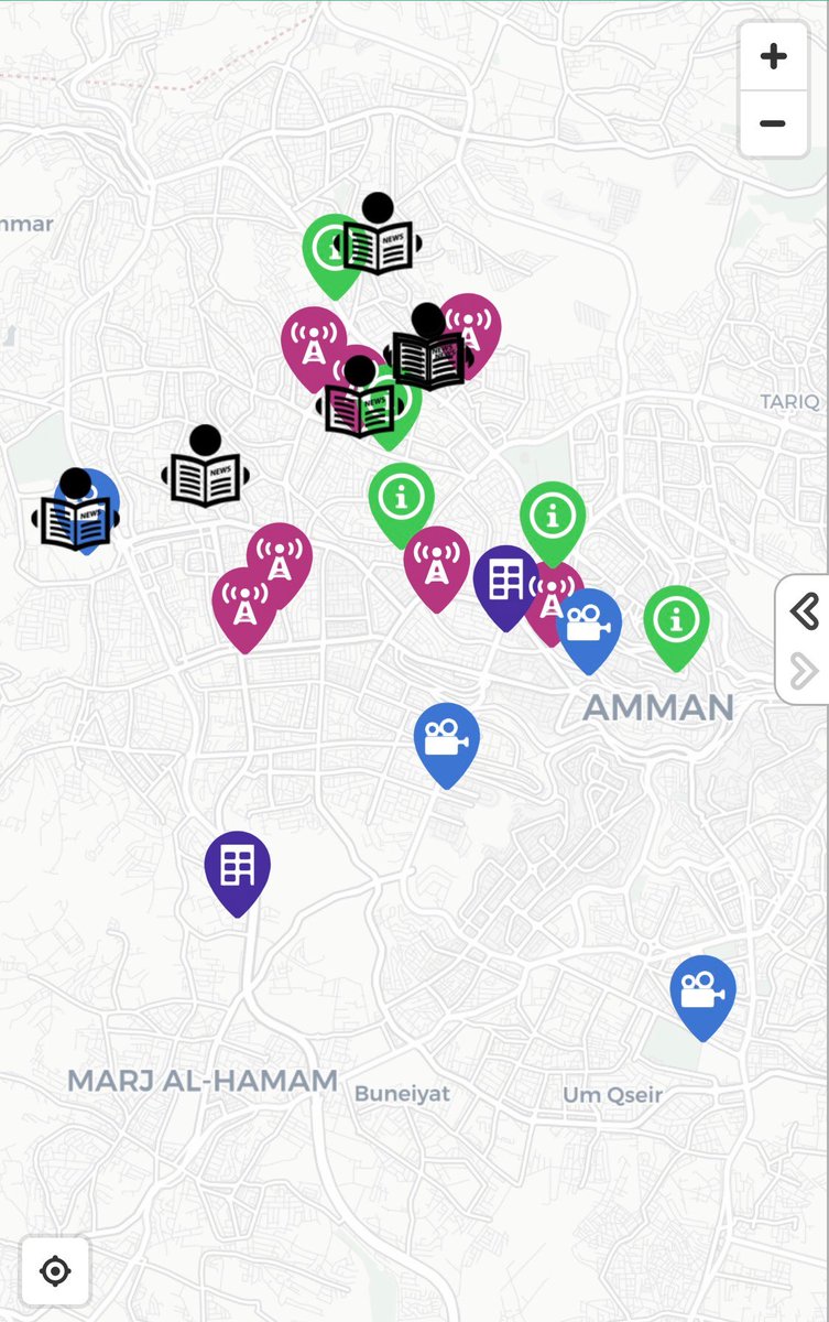
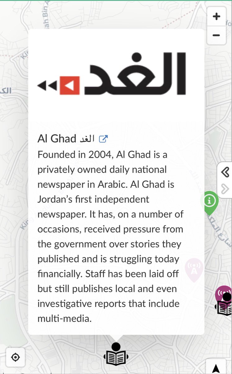
#InteractiveMaps #VisualizeData, locations and bring information to life. We present our latest creation, shedding light on the #media landscape in #Jordan maphub.net/Wishbox-Media/… #Maps #MiddleEast #Journalism #Press #SundayThoughts #pressfreedom #Journalism #SundayMorning #JO


How we partnered with the Yale School of Medicine’s Center for Outcomes Research & Evaluation (CORE) to #visualizedata📈 and communicate #healthcare👩⚕️ outcomes on a national level. Learn more about our work: bit.ly/3zGfqid


Dive into Data Visualization with our expert services. We transform intricate data into clear visuals, empowering you to grasp insights effortlessly. Enhance your decision-making process now. #DataVisualization #VisualizeData #DataInsights #VisualAnalytics #DataDrivenDecisions


Thanks SPS Department of Tech Services for your work with SPS Student Services on the Atlas Report Center. #SPSConnects #Dots #VisualizeData


Transform data into insights with our powerful Data Visualization services. From complex datasets to impactful visuals, we make information understandable and decisions informed. Elevate your analytics game! #DataVisualization #VisualizeData #DataInsights #VisualAnalytics
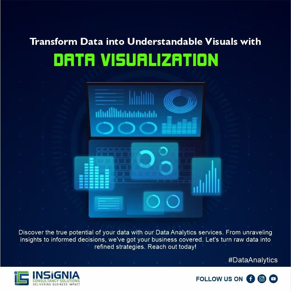
Harness the power of data with our robust Data Visualization services. From intricate datasets to compelling visuals, we translate information into understanding and empower informed decision-making. #DataVisualization #VisualizeData #DataInsights #VisualAnalytics


Happy #InternationalDayOfMathematics! Math makes the world go round... and it certainly keeps our world spinning at @throughlineinc! 🌎 Without math, there are no algorithms, and without algorithms, there's no AI... and without this innovative tech, how would we #VisualizeData?


📊 Want to master data storytelling? Join our hands-on workshop by Rasagy Sharma! Become a data ninja, no laptops needed—just pen, paper, and your creative vibe! 🚀✨ #DataNinja #VisualizeData #HandsOnWorkshop #makemytrip #paytm #goibibo #redbus #uxdesign #uxnow


Visual design is a universal language that can help you do just that - connect the dots between important marketing data points and business conclusions that everyone sitting in that presentation can follow. #visualizedata #data #design #visualdesign #visualdata #powerpoint


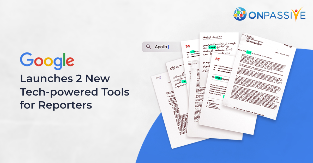
#Google is launching two tech-powered tools for reporters. It also includes two advanced tools to search for large documents and #visualizedata. More: onpassive.com/blog/onpassive/ #OnPassive #ArtificialIntelligenceTechnology #GoogleLaunchesTools2020 #AITools2020 #JournalistStudio

Unlocking complexity with clarity - that's the power of infographics. 📊✨ #VisualizeData #simplifyinformation. 👉Get Instant Help! wa.me/+61390160028 #assignmenthelpuk #assignmenthelper #assignmenthelpers #assignmenthelpcanada #assignmenthelponline #assignmenthelpservice

Something went wrong.
Something went wrong.
United States Trends
- 1. #UFC321 19.5K posts
- 2. Chris Barnett N/A
- 3. #CollegeGameDay N/A
- 4. #OctHealingStreamsDay2 N/A
- 5. Maksum 1,041 posts
- 6. Sunderland 38.6K posts
- 7. Raposo 1,087 posts
- 8. #SaturdayVibes 4,845 posts
- 9. Garnacho 26.8K posts
- 10. Good Saturday 32.1K posts
- 11. Neto 19.1K posts
- 12. #Caturday 4,360 posts
- 13. Mizuki 16.5K posts
- 14. Hamdy 1,003 posts
- 15. Armorion Smith N/A
- 16. Amorim 24.3K posts
- 17. Prime Rib N/A
- 18. Joao Pedro 8,610 posts
- 19. Timothy Mellon 1,186 posts
- 20. TAEHYUNG GOES TO HOLLYWOOD 73.9K posts