#matplotlib hasil pencarian

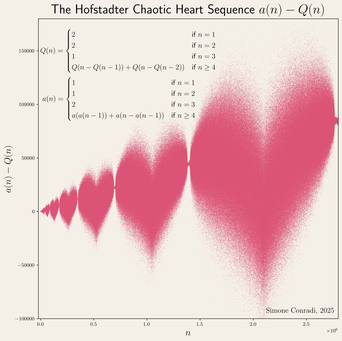
"I used to feel guilty in Cambridge that I spent all day playing games, while I was supposed to be doing mathematics. Then I realized that playing games is math." John H. Conway Made with #python #numpy #matplotlib


The Bak-Sneppen model: species in a circle, each with random fitness. Replace the weakest species (and its neighbors) with new random values. Cascading evolutionary avalanches emerge, showing self-organized criticality from simple rules. Made with #python #numpy #matplotlib


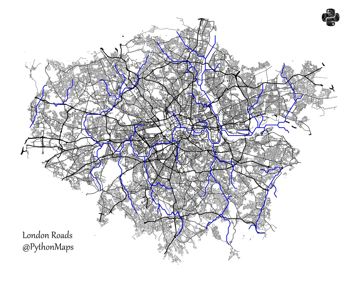
Roads of London! This map was generated using #Matplotlib #Numpy #Geopandas. #Python #DataScience #Data #DataVisualization #London.


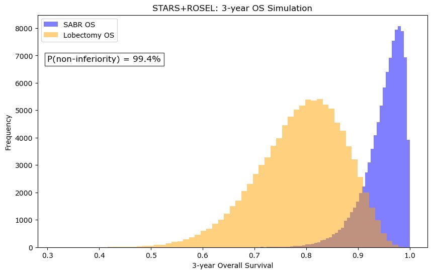
❗️ As VALOR accrues, what is the existing data from STARS ROSEL that SBRT is non-inferior to lobectomy? Using beta moment matching and sampling from this, assuming 5% NI margin, my bet is on SBRT #numpy #matplotlib


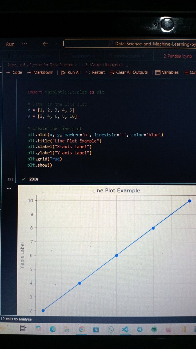
Day 2 of my #DataScience Dove into #Matplotlib. I love how I can visualize data with Python. Using labels for clear axes, colours to style, and line widths to make my plots pop. Tweaking parameters like linestyle & markers is so fun! #Python #LearningDataScience

Use Colormaps and Outlines in #Matplotlib Scatter Plots pythonguides.com/colormaps-and-…
pythonguides.com
Use Colormaps and Outlines in Matplotlib Scatter Plots
Learn how to use colormaps and outlines in Matplotlib scatter plots using Python. Create visually appealing and professional data visualizations easily.

Day 46 of #100DaysOfCode Launched my MERN project (final fixes, responsiveness, detailed README) Added 2 more queries in Netflix data viz (Matplotlib) Trained & deployed Linear + Multi Regression models on Streamlit #MERN #Matplotlib #MachineLearning #Streamlit


New project underway! Can't wait to share it with you all soon. #python #matplotlib #pandas #stats #dataanalysis #dataanalyst #dataviz
Use Colormaps and Outlines in #Matplotlib Scatter Plots pythonguides.com/colormaps-and-…
pythonguides.com
Use Colormaps and Outlines in Matplotlib Scatter Plots
Learn how to use colormaps and outlines in Matplotlib scatter plots using Python. Create visually appealing and professional data visualizations easily.

Day 23: Learned histograms in Matplotlib — distribution basics, edge colors for clarity, and adding reference lines using axvline(). Distributions finally make sense! 🚀📊#DataScience #Matplotlib #Python #LearningInPublic

Grouping & aggregation: df.groupby(), df.agg() – Mini Checkpoint: Build a data cleaning script for a messy CSV file. Add comments to explain every step. Step 3: #DataVisualization with #Matplotlib Nobody wants raw tables. Learn to tell stories through charts.
#Matplotlib log-log: Use Base 2 and Handle Negative Values pythonguides.com/matplotlib-log…
pythonguides.com
Matplotlib log-log: Use Base 2 and Handle Negative Values
Learn how to use Matplotlib loglog plots with base 2 scaling and handle negative values in Python. Includes step-by-step methods with full code examples.
📊 Learn how to create powerful visualizations with Matplotlib in Python! From line charts to scatter plots, this playlist has it all. Watch here: youtube.com/playlist?list=… #Python #Matplotlib #DataScience #DataVisualization #MachineLearning
Last 2 days: Learned stack plots in Matplotlib — what they are, how they differ from pie charts, and when to use them. Great for showing composition over time. 🚀📊#DataScience #Matplotlib #Python #LearningInPublic
#Matplotlib Plotting Multiple Lines in 3D pythonguides.com/matplotlib-plo…
Add Vertical Line at Specific Date in #Matplotlib pythonguides.com/matplotlib-add…
pythonguides.com
Add Vertical Line at Specific Date in Matplotlib
Learn how to add a vertical line at a specific date in Matplotlib using Python. Includes full example code, step-by-step explanation, and multiple methods.
Plot a Best Fit Line in #Matplotlib pythonguides.com/matplotlib-bes…
Log‑Log Scale in #Matplotlib with Minor Ticks and Colorbar pythonguides.com/loglog-scale-m…
pythonguides.com
Log‑Log Scale in Matplotlib with Minor Ticks and Colorbar
Learn how to create log‑log plots in Python Matplotlib with colorbars and minor ticks. Step‑by‑step guide with practical code examples and two easy methods.
Plot Multiple Graphs Generated Inside a For Loop in #Matplotlib pythonguides.com/plot-multiple-…
Day 20: Learned pie charts in Matplotlib — explode, wedgeprops, shadow, startangle, autopct & why overcrowding pie charts hurts readability. Choosing the right chart matters! 🚀📊 #DataScience #Matplotlib #Python #LearningInPublic

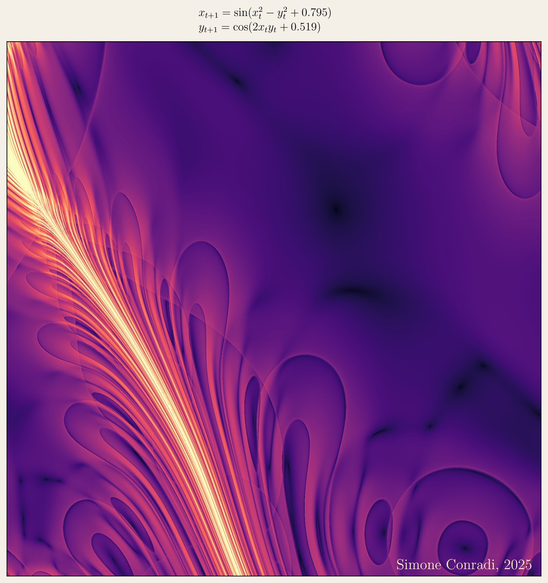
It's amazing to see the beauty of mathematics, try to reproduced this with runcell AI Agent, it's real! Try it runcell.dev #math #visualization #matplotlib
How to Rotate Tick Labels in #Matplotlib pythonguides.com/matplotlib-rot…
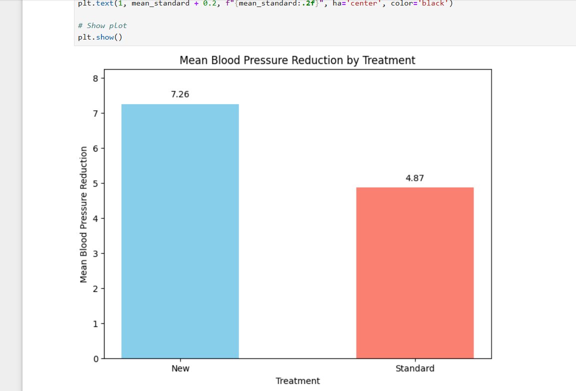
Day 19: Learned more about bar charts — bar width, side-by-side bars, horizontal charts with barh(), and adding labels using plt.text(). Bar charts are more powerful than they look! 🚀📊 #DataScience #Matplotlib #LearningInPublic
Date Format and Convert Dates in #Matplotlib plot_date pythonguides.com/matplotlib-plo…
pythonguides.com
Date Format and Convert Dates in Matplotlib plot_date
Learn how to change date format and convert dates in Matplotlib plot_date using Python. Step-by-step guide with examples for US-based time-series data.
Something went wrong.
Something went wrong.
United States Trends
- 1. #doordashfairy N/A
- 2. Vanity Fair 48.1K posts
- 3. Susie Wiles 103K posts
- 4. Mick Foley 29.5K posts
- 5. $TSLA 44K posts
- 6. Michelea Ponce 21.2K posts
- 7. Mustapha Kharbouch 5,176 posts
- 8. Olive Garden N/A
- 9. Raphinha 57.2K posts
- 10. Larian 8,793 posts
- 11. Brookline 4,350 posts
- 12. Disclosure Day 19.1K posts
- 13. Brad Johnson N/A
- 14. Spielberg 26.3K posts
- 15. Alan Jackson 1,068 posts
- 16. Gittens 4,431 posts
- 17. Cardiff 18.9K posts
- 18. My Fellow Americans 4,034 posts
- 19. Philo 2,413 posts
- 20. Doug Williams N/A