#matplotlib résultats de recherche

The Bak-Sneppen model: species in a circle, each with random fitness. Replace the weakest species (and its neighbors) with new random values. Cascading evolutionary avalanches emerge, showing self-organized criticality from simple rules. Made with #python #numpy #matplotlib


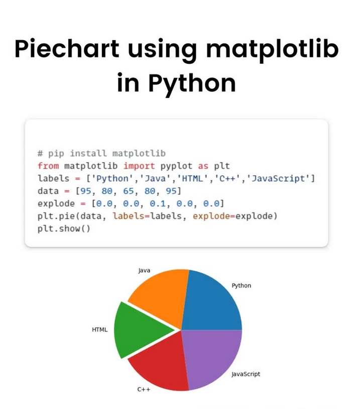
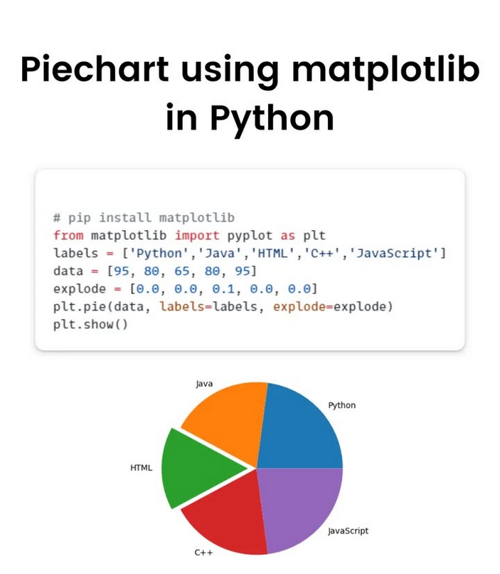
📈 Create Charts Using Matplotlib in Just Seconds Perfect for beginners and anyone building tools for analysis or algorithmic trading. 👇 Try it yourself and tell me what chart you want to learn next! 📍 For More Details: tradehull.com . . . #matplotlib #python
"I used to feel guilty in Cambridge that I spent all day playing games, while I was supposed to be doing mathematics. Then I realized that playing games is math." John H. Conway Made with #python #numpy #matplotlib

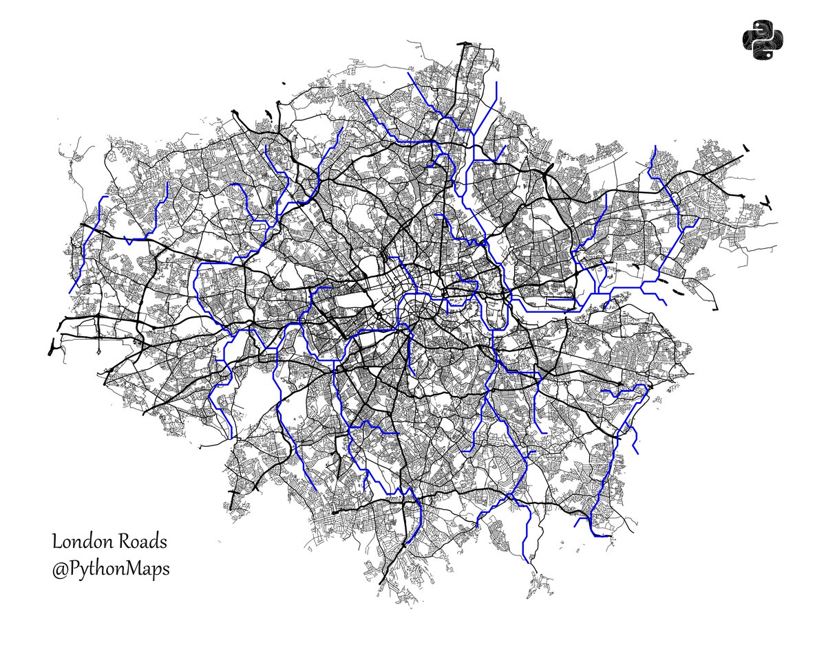
Roads of London! This map was generated using #Matplotlib #Numpy #Geopandas. #Python #DataScience #Data #DataVisualization #London.
Bak, Tang & Wiesenfeld's sandpile model demonstrates Self-Organized Criticality perfectly: one grain triggers massive avalanches! Small events, large and non-local consequences - maybe also in markets, politics, ecology. Made with #python #numpy #matplotlib


📊 Pythonで「ちょっとしたグラフ」を書きたい? matplotlib なら数行でOK。 売上データを折れ線グラフにしてみると直感的に分かりやすい。 数字の表より一目で伝わる。 #Python #matplotlib #データ可視化


Day 46 of #100DaysOfCode Launched my MERN project (final fixes, responsiveness, detailed README) Added 2 more queries in Netflix data viz (Matplotlib) Trained & deployed Linear + Multi Regression models on Streamlit #MERN #Matplotlib #MachineLearning #Streamlit


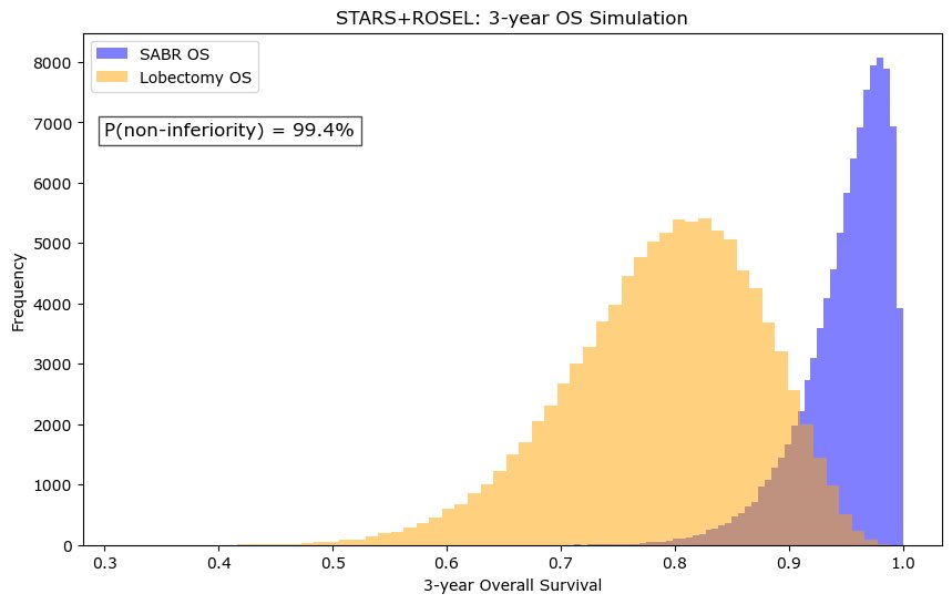
❗️ As VALOR accrues, what is the existing data from STARS ROSEL that SBRT is non-inferior to lobectomy? Using beta moment matching and sampling from this, assuming 5% NI margin, my bet is on SBRT #numpy #matplotlib


New project underway! Can't wait to share it with you all soon. #python #matplotlib #pandas #stats #dataanalysis #dataanalyst #dataviz

Day 11 of my AI Journey 📊 Started with the basics of Data Visualization today! Learned simple plots with Matplotlib: line, bar, and scatter. Next → Seaborn for advanced charts. #AI #Python #Matplotlib #100DaysOfCode #DataScience

Change Marker Size in 3D Scatter Plot using #Matplotlib pythonguides.com/matplotlib-3d-…
pythonguides.com
Change Marker Size in 3D Scatter Plot using Matplotlib
Learn how to change marker size in a 3D scatter plot using Python Matplotlib. Includes step-by-step examples, code, and practical visualization tips.
📈 Create Charts Using Matplotlib in Just Seconds Perfect for beginners and anyone building tools for analysis or algorithmic trading. 👇 Try it yourself and tell me what chart you want to learn next! 📍 For More Details: tradehull.com . . . #matplotlib #python
#Matplotlib log-log: Use Base 2 and Handle Negative Values pythonguides.com/matplotlib-log…
pythonguides.com
Matplotlib log-log: Use Base 2 and Handle Negative Values
Learn how to use Matplotlib loglog plots with base 2 scaling and handle negative values in Python. Includes step-by-step methods with full code examples.

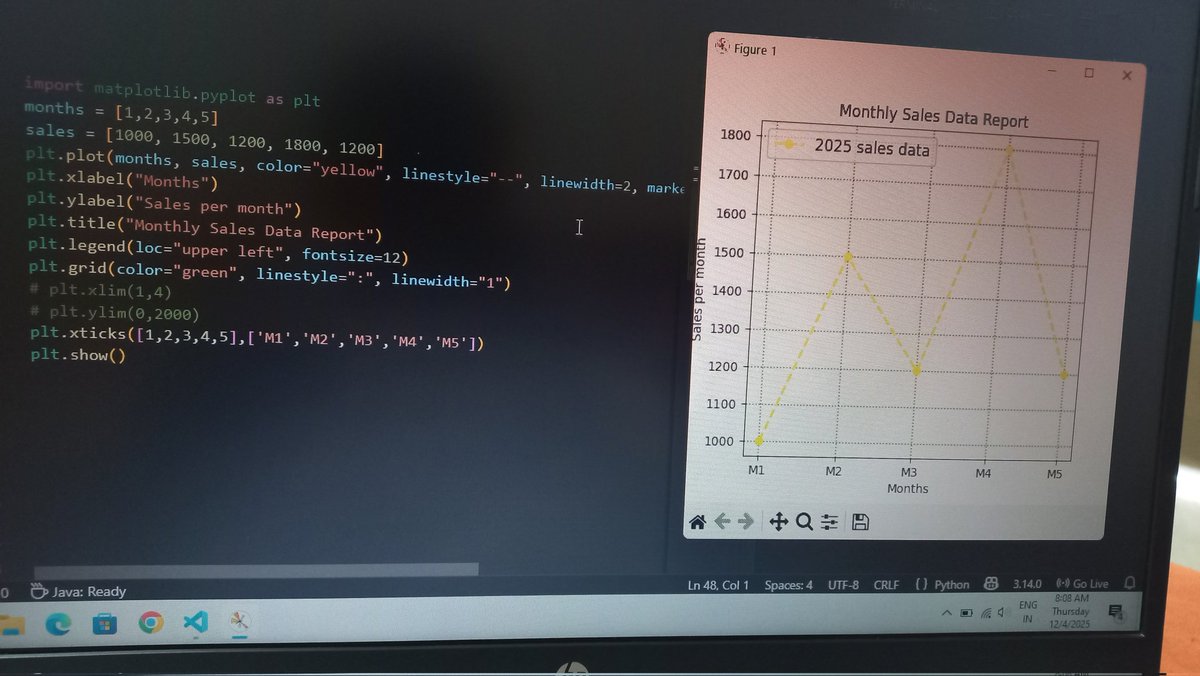
Created a Monthly Sales Data Report using Python Matplotlib. Loving how coding turns numbers into meaningful stories. #PythonLearner #DataVisualization #Matplotlib #CodingJourney
#Matplotlib Errorbar with Horizontal Line in #Python pythonguides.com/matplotlib-err…
pythonguides.com
Matplotlib Errorbar with Horizontal Line in Python
Learn how to use Matplotlib errorbar with a horizontal line in Python. Step-by-step tutorial with practical code examples for clear data visualization.

How to Set Axis Range in #Matplotlib pythonguides.com/matplotlib-set…
How to Share Axis and Axis Labels in #Matplotlib Subplots pythonguides.com/share-axis-and…
pythonguides.com
How to Share Axis and Axis Labels in Matplotlib Subplots
Learn how to share axis and axis labels in Matplotlib subplots using Python. Step-by-step examples with code to create clean, professional visualizations.
Create a Bar Chart with Values in #Matplotlib pythonguides.com/matplotlib-bar…
pythonguides.com
Create a Bar Chart with Values in Matplotlib
Learn step-by-step how to create a bar chart with values in Matplotlib using Python. Add labels, customize charts, and make professional visualizations.

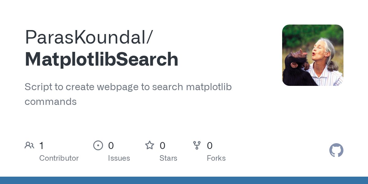
The python script to automatically generate the webpage: github.com/ParasKoundal/M… #matplotlib #github
Got tired of digging for the right Matplotlib command using matplotlib search, so I built my own search tool to do it for me 😎📊 Give it a spin: paraskoundal.com/funProjects/pl… #Python #Matplotlib #DataViz #buildinpublic
How to Create Multiple Plots in #Matplotlib pythonguides.com/matplotlib-mul…
How to Draw Horizontal Lines in #Matplotlib pythonguides.com/horizontal-lin…
How to Change #Matplotlib Legend Font Size pythonguides.com/matplotlib-leg…
#Matplotlib Subplot Title Style – Change Position and Padding pythonguides.com/matplotlib-sub…
pythonguides.com
Matplotlib Subplot Title Style – Change Position and Padding
Learn how to customize Matplotlib subplot title style in Python. Step-by-step guide to change font size, make bold, adjust position, and padding with examples.
Plot Multiple Lines with Legends in #Matplotlib pythonguides.com/python-plot-mu…
Plot Log-Log Scatter and Histogram Charts in #Matplotlib pythonguides.com/log-log-scatte…
pythonguides.com
Plot Log-Log Scatter and Histogram Charts in Matplotlib
Learn to plot log-log scatter and histogram charts in Python Matplotlib with 2 simple methods each. Step-by-step examples with full code for data visualization.
How to Draw a Vertical Line in #Matplotlib pythonguides.com/draw-vertical-…


📊 Pythonで「ちょっとしたグラフ」を書きたい? matplotlib なら数行でOK。 売上データを折れ線グラフにしてみると直感的に分かりやすい。 数字の表より一目で伝わる。 #Python #matplotlib #データ可視化
Roads of London! This map was generated using #Matplotlib #Numpy #Geopandas. #Python #DataScience #Data #DataVisualization #London.

Whitebox Workflows can now interact with #matplotlib to make beautiful visualization of raster, vector, and #lidar #geospatial data. #geopython #gis #gischat #geovis More examples here: whiteboxgeo.com/manual/wbw-use…


制限付きランダムウォークを並列して実行した軌跡をプロットした。 互いの初期位置が近いこともあってか、行き場を無くした点が意外と早く出現するらしく、ステップ数を多くしてもすぐに実行が終わってしまう。 #matplotlib #python


#30DayMapChallenge Day 1: Points Incendios activos en Sudamérica las últimas 24 h. Source: VIIRS Active Fires #matplotlib #geopandas


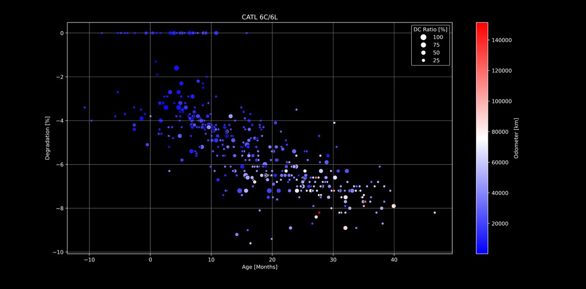
🔋#Tesla Battery Degradation - Next level dive!🪫 Using #Matplotlib I have added two more axis to the evaluations that you already know. I will continue with other packs and values, but LFP was interesting as a start 🙂 Any ideas what to combine next? docs.google.com/spreadsheets/d…


matplotlib豆知識 subplots で作成した余分な Axes を remove() で簡単に除外できます! 中身のないグラフ枠を削除して、見やすいレイアウトに仕上げられます #Python #matplotlib


Wondering how to make your legend more popular than ever? Add some new friends! 🕺📚 Source: devhubby.com/thread/how-to-… #PythonData #DataScienceCommunity #Matplotlib #AICommunity #items #legend

Data Visualization with Python: Create Stunning Graphs and Visualizations with Matplotlib and Seaborn amzn.to/4msXIbc #DataVisualization #Python #Matplotlib #Seaborn

Something went wrong.
Something went wrong.
United States Trends
- 1. Warner Bros 97.2K posts
- 2. HBO Max 46.5K posts
- 3. #FanCashDropPromotion N/A
- 4. Good Friday 52.6K posts
- 5. #FridayVibes 4,019 posts
- 6. Paramount 27K posts
- 7. $NFLX 4,561 posts
- 8. RED Friday 4,397 posts
- 9. #FridayMotivation 4,008 posts
- 10. Jake Tapper 56K posts
- 11. NO U.S. WAR ON VENEZUELA 2,551 posts
- 12. The EU 133K posts
- 13. #FridayFeeling 1,734 posts
- 14. Ted Sarandos 2,535 posts
- 15. Happy Friyay 1,034 posts
- 16. Pickens 17.1K posts
- 17. $WBD 1,949 posts
- 18. National Security Strategy 9,591 posts
- 19. #FlashbackFriday N/A
- 20. Cloudflare 39.1K posts