#matplotlib 検索結果


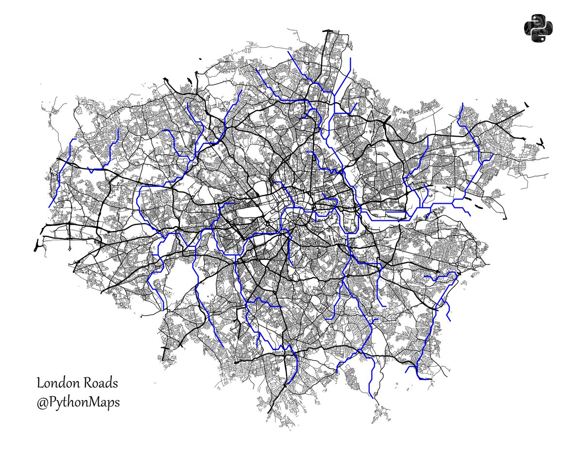
Roads of London! This map was generated using #Matplotlib #Numpy #Geopandas. #Python #DataScience #Data #DataVisualization #London.


Whitebox Workflows can now interact with #matplotlib to make beautiful visualization of raster, vector, and #lidar #geospatial data. #geopython #gis #gischat #geovis More examples here: whiteboxgeo.com/manual/wbw-use…


matplotlib豆知識 subplots で作成した余分な Axes を remove() で簡単に除外できます! 中身のないグラフ枠を削除して、見やすいレイアウトに仕上げられます #Python #matplotlib


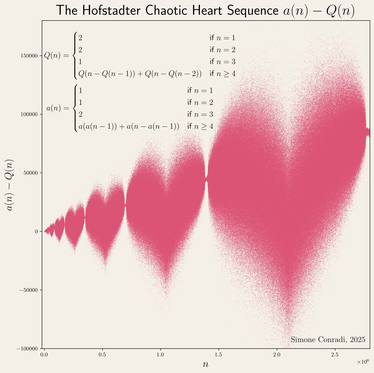
制限付きランダムウォークを並列して実行した軌跡をプロットした。 互いの初期位置が近いこともあってか、行き場を無くした点が意外と早く出現するらしく、ステップ数を多くしてもすぐに実行が終わってしまう。 #matplotlib #python


#30DayMapChallenge Day 1: Points Incendios activos en Sudamérica las últimas 24 h. Source: VIIRS Active Fires #matplotlib #geopandas


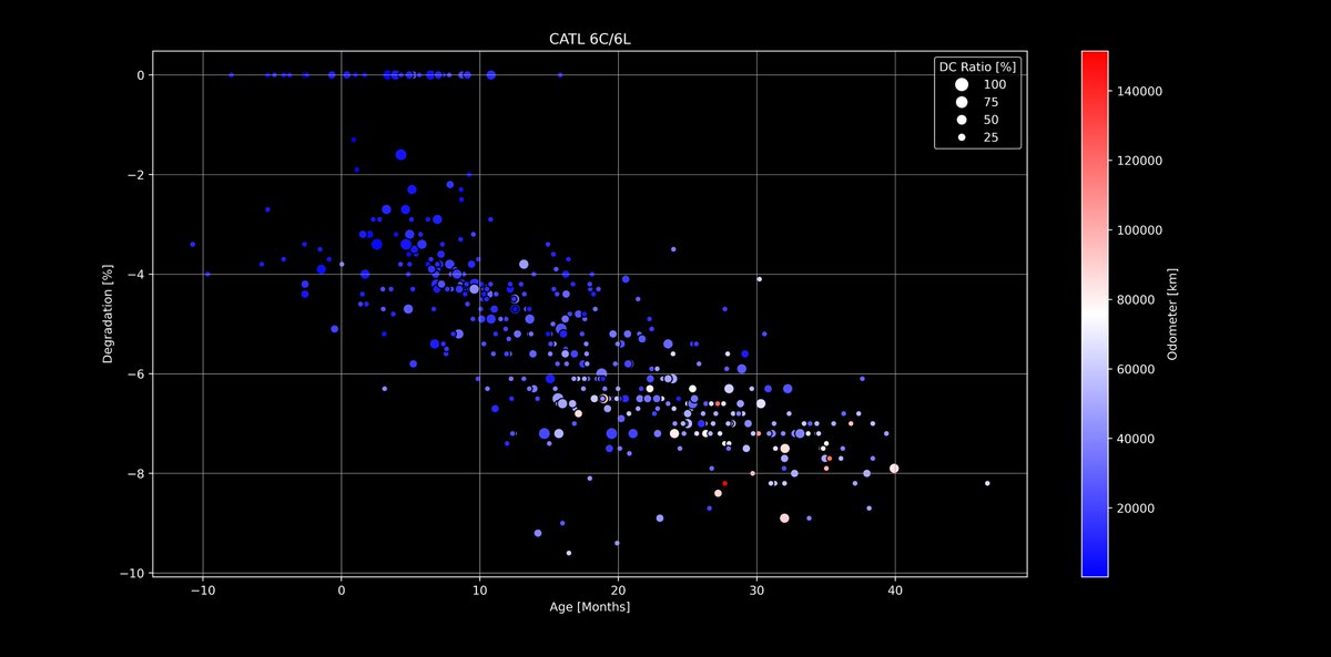
🔋#Tesla Battery Degradation - Next level dive!🪫 Using #Matplotlib I have added two more axis to the evaluations that you already know. I will continue with other packs and values, but LFP was interesting as a start 🙂 Any ideas what to combine next? docs.google.com/spreadsheets/d…


Wondering how to make your legend more popular than ever? Add some new friends! 🕺📚 Source: devhubby.com/thread/how-to-… #PythonData #DataScienceCommunity #Matplotlib #AICommunity #items #legend

Data Visualization with Python: Create Stunning Graphs and Visualizations with Matplotlib and Seaborn amzn.to/4msXIbc #DataVisualization #Python #Matplotlib #Seaborn


Introduction to Matplotlib for Complete Beginners ⏱️ 1.9 hours ⭐ 4.53 👥 2,829 🔄 Jun 2024 💰 FREE comidoc.com/udemy/introduc… #Matplotlib #Python #DataViz #udemy

Something went wrong.
Something went wrong.
United States Trends
- 1. Rob Reiner 234K posts
- 2. #ITWelcomeToDerry 159K posts
- 3. Cowboys 37.8K posts
- 4. All in the Family 28.4K posts
- 5. Stand By Me 18.1K posts
- 6. When Harry Met Sally 18.3K posts
- 7. Meathead 7,184 posts
- 8. The Princess Bride 16.1K posts
- 9. Spinal Tap 16.2K posts
- 10. Brentwood 19.7K posts
- 11. Pennywise 58.6K posts
- 12. LAPD 9,159 posts
- 13. JJ McCarthy 8,492 posts
- 14. Dillon Brooks 11.7K posts
- 15. Eberflus 6,639 posts
- 16. Richie 35.6K posts
- 17. Vikings 29.8K posts
- 18. #BaddiesUSA 21.7K posts
- 19. Toluca 65.5K posts
- 20. Steph 32.7K posts