#matplotlib risultati di ricerca

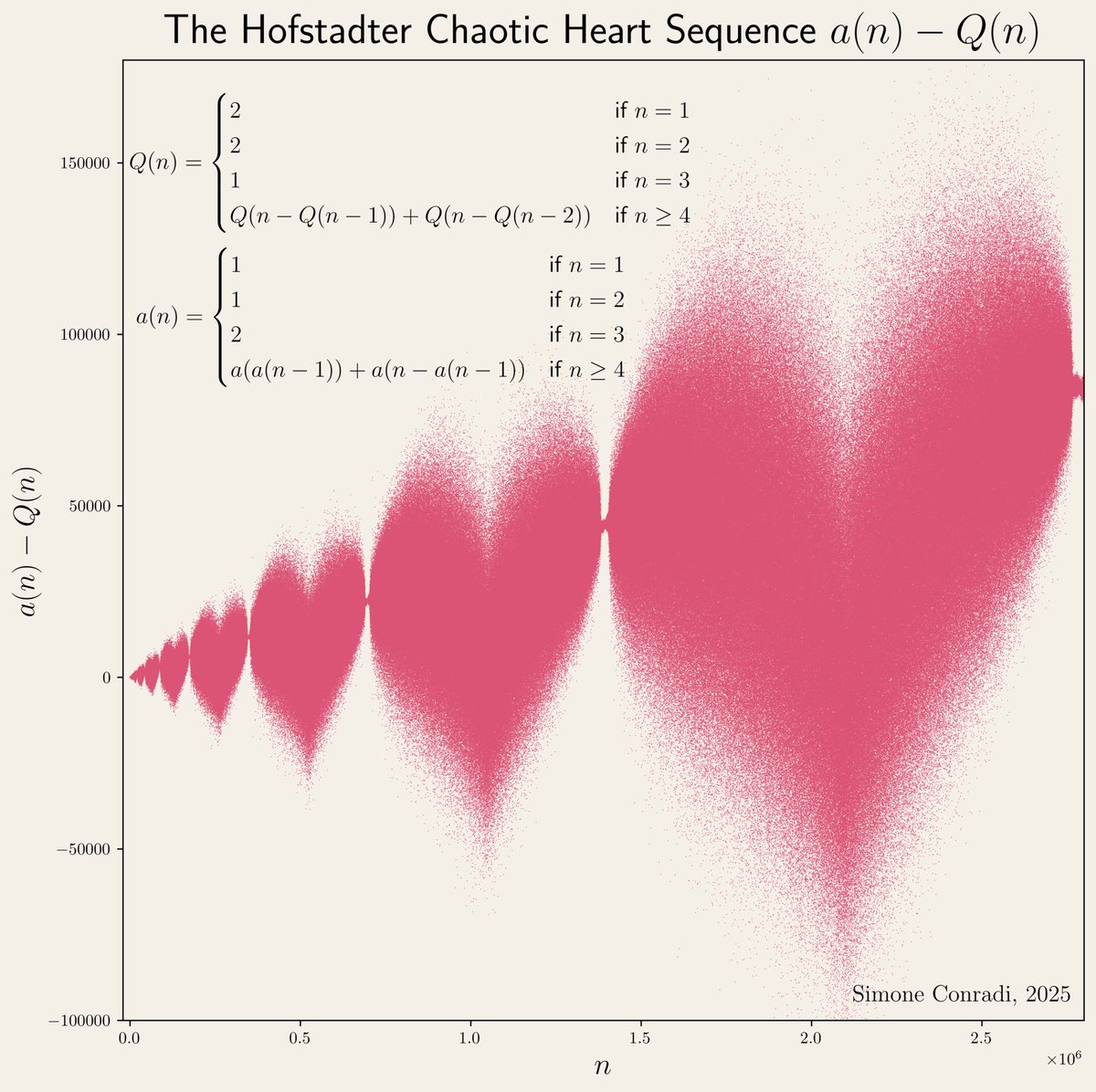
"I used to feel guilty in Cambridge that I spent all day playing games, while I was supposed to be doing mathematics. Then I realized that playing games is math." John H. Conway Made with #python #numpy #matplotlib


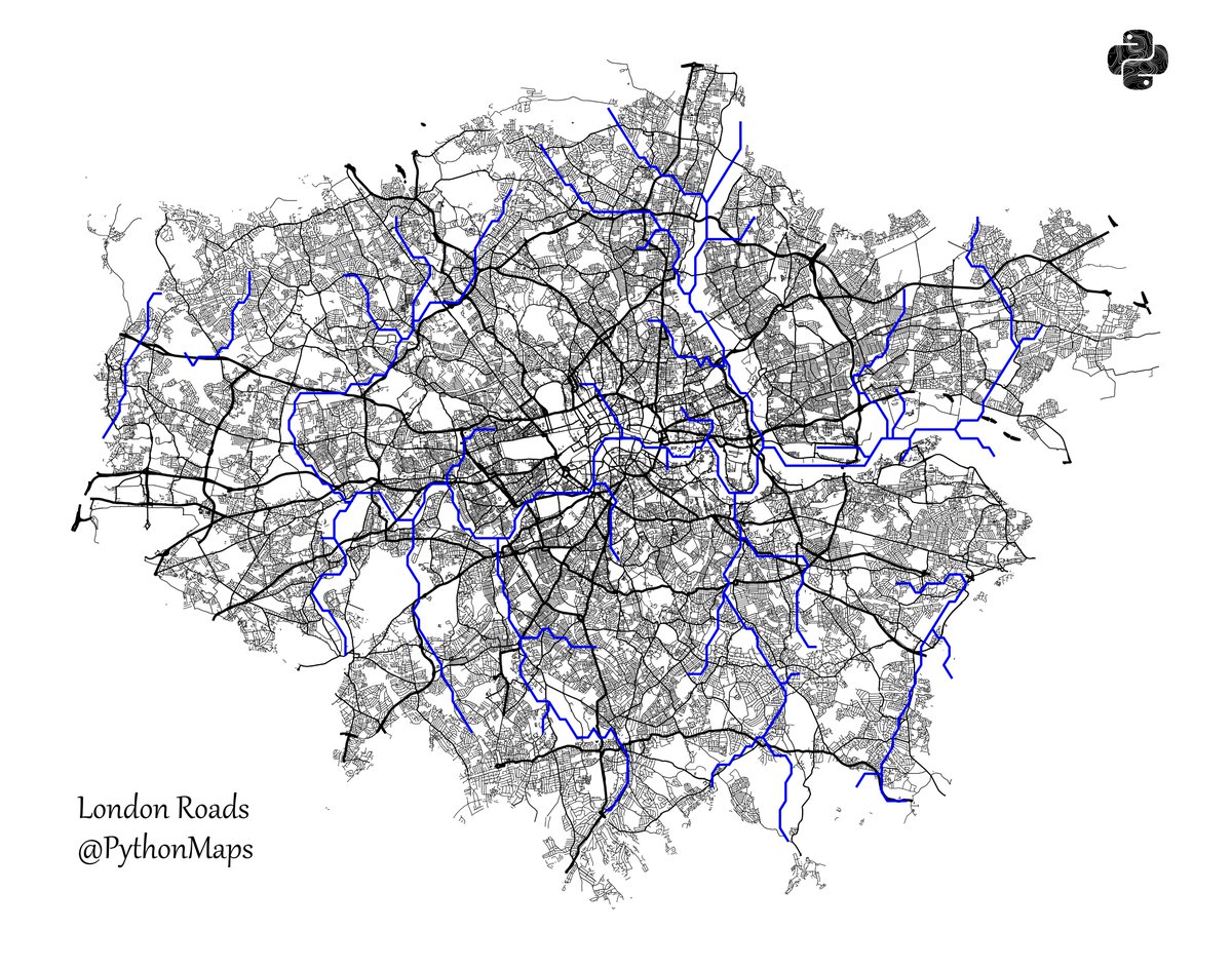
Roads of London! This map was generated using #Matplotlib #Numpy #Geopandas. #Python #DataScience #Data #DataVisualization #London.
The Bak-Sneppen model: species in a circle, each with random fitness. Replace the weakest species (and its neighbors) with new random values. Cascading evolutionary avalanches emerge, showing self-organized criticality from simple rules. Made with #python #numpy #matplotlib


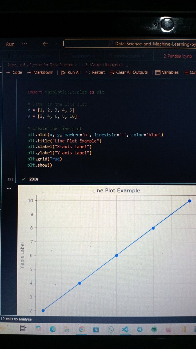
Day 2 of my #DataScience Dove into #Matplotlib. I love how I can visualize data with Python. Using labels for clear axes, colours to style, and line widths to make my plots pop. Tweaking parameters like linestyle & markers is so fun! #Python #LearningDataScience


Python Matplotlib Basics: freecomputerbooks.com/Python-Matplot… Look for "Read and Download Links" section to download. Follow me if you like this post. #Python #programming #Matplotlib #Pandas #NumPy #SciPy #DeepLearning #PyTorch #TensorFlow #LLMs #GenAI #GenerativeAI #BigData #DataScience


Day 11 of my AI Journey 📊 Started with the basics of Data Visualization today! Learned simple plots with Matplotlib: line, bar, and scatter. Next → Seaborn for advanced charts. #AI #Python #Matplotlib #100DaysOfCode #DataScience

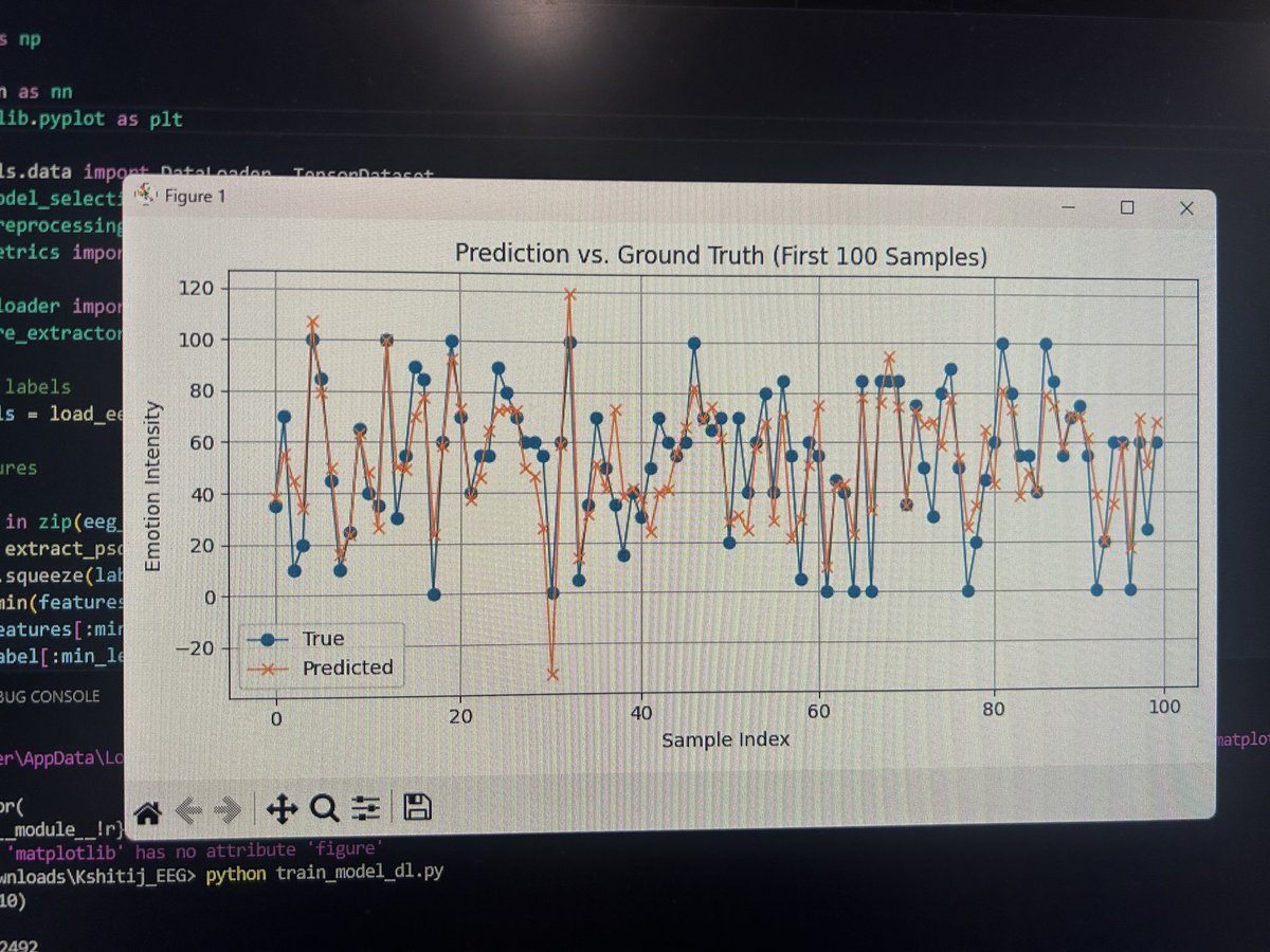
It worked 🎉 istg it feels soo good when you are trying to make a model for a research and the visualisation from @matplotlib makes you feel like you are getting somewhere! #matplotlib #Research #machinelearning

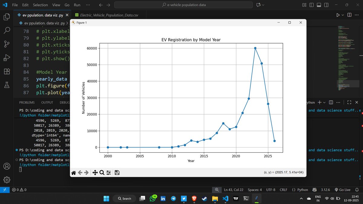
🚀 Day 34 #DataScience Journey! Practiced Python matplotlib on EV dataset today 📊 Getting better at data visualization! Tomorrow exploring new dataset - excited for fresh challenges 💪 Consistency = Growth! 📈 #Python #Matplotlib #DataVisualization #LearningInPublic

Creating publication-ready scientific figures requires tedious manual formatting and precise adherence to journal standards. SciencePlots instantly transforms #matplotlib plots into journal-compliant figures with a single line of code.

(Open Access) SciPy Lecture Notes: lnkd.in/esxvnXhp Look for "Read and Download Links" section to download. Follow me if you like. #Python #programming #Matplotlib #Pandas #NumPy #SciPy #DeepLearning #PyTorch #TensorFlow #LLMs #GenAI #GenerativeAI #BigData #DataScience


Roads of London! This map was generated using #Matplotlib #Numpy #Geopandas. #Python #DataScience #Data #DataVisualization #London.

#30DayMapChallenge Day 1: Points Incendios activos en Sudamérica las últimas 24 h. Source: VIIRS Active Fires #matplotlib #geopandas


Day 11 of my AI Journey 📊 Started with the basics of Data Visualization today! Learned simple plots with Matplotlib: line, bar, and scatter. Next → Seaborn for advanced charts. #AI #Python #Matplotlib #100DaysOfCode #DataScience
It worked 🎉 istg it feels soo good when you are trying to make a model for a research and the visualisation from @matplotlib makes you feel like you are getting somewhere! #matplotlib #Research #machinelearning
🚀 Day 34 #DataScience Journey! Practiced Python matplotlib on EV dataset today 📊 Getting better at data visualization! Tomorrow exploring new dataset - excited for fresh challenges 💪 Consistency = Growth! 📈 #Python #Matplotlib #DataVisualization #LearningInPublic

matplotlib豆知識 subplots で作成した余分な Axes を remove() で簡単に除外できます! 中身のないグラフ枠を削除して、見やすいレイアウトに仕上げられます #Python #matplotlib


📊⌨️ ¡Con el taller de Ciencia de Datos continuamos con el tercer día del seminario de #IA! Durante el taller, impartido por el Dr. Eric Castro de @SUNEO_UNSIS, desarrollamos competencias para analizar datos con herramientas como #pandas y #matplotlib para la toma de decisiones.


📊 Pythonで「ちょっとしたグラフ」を書きたい? matplotlib なら数行でOK。 売上データを折れ線グラフにしてみると直感的に分かりやすい。 数字の表より一目で伝わる。 #Python #matplotlib #データ可視化


Python Matplotlib Basics: freecomputerbooks.com/Python-Matplot… Look for "Read and Download Links" section to download. Follow me if you like this post. #Python #programming #Matplotlib #Pandas #NumPy #SciPy #DeepLearning #PyTorch #TensorFlow #LLMs #GenAI #GenerativeAI #BigData #DataScience


Something went wrong.
Something went wrong.
United States Trends
- 1. FINALLY DID IT 334K posts
- 2. The PENGU 163K posts
- 3. The BONK 77K posts
- 4. The Jito 33.1K posts
- 5. The JUP 38.9K posts
- 6. Good Wednesday 29.8K posts
- 7. The WET 28.4K posts
- 8. Mariah 38.3K posts
- 9. #NoWarYesPeace 1,991 posts
- 10. #keyboard 1,897 posts
- 11. #wednesdaymotivation 1,823 posts
- 12. #voyager 2,437 posts
- 13. #Wednesdayvibe 1,366 posts
- 14. Hump Day 11K posts
- 15. Hut 8 1,135 posts
- 16. Robert E Lee 12.1K posts
- 17. Happy Hump 7,032 posts
- 18. Buck Rogers 5,904 posts
- 19. Thug 27.5K posts
- 20. Knicks 87.3K posts