#columnchart search results


Clearly differentiate lines and columns using distinct colors, line styles, and marker shapes! 🎨 #linecharts #columnchart

Use combo charts when you have trends (lines) and comparisons/values (columns) for the same data points! #linecharts #columnchart

Avoid information overload! 🙇 Don't include too much data or use excessive visual elements – this can be confusing. #linechart #columnchart

If your line and column data values differ greatly, using a single Y-axis can distort one or the other. Opt for separate axes.💡 #linecharts #columnchart


How to show more then 4 columns in Column chart using Interop PowerPoint? stackoverflow.com/questions/6420… #columnchart #officeinterop #interop #powerpoint #powerpointinterop


Conditonal column chart in excel #excel #columnchart #vikominstitute youtube.com/shorts/gzmWAFV… Follow for more information

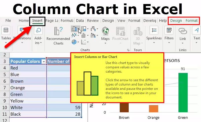
Want to create stunning column #charts for your dashboard? Discover how to create an impactful #ColumnChart in your dashboard with these simple steps! #DataVisualization #DashboardDesign #DataAnalytics

Easily create a column chart and customize it using our Blazor Charts component. #blazor #chart #columnchart #customization

With so many ways to visualize and analyze data in BI dashboards, it can be difficult to decide the best approach for the final result. Learn how to create and customize 4 types of column charts in a Wyn Enterprise dashboard: bit.ly/2WlEEVe #bidashboards #columnchart


📊 Create a Column Chart | Visualize Your Data Like a Pro! 🌟📈Discover how to create a column chart in Access and turn your tables into clear, colorful visuals! 🎨 Data storytelling made easy!#ColumnChart #DataVisualization #AccessCharts #MicrosoftAccess #VisualData


A column chart is used to compare one or more categories or data sets over time. They are an amazing way to portray your data and gain insights from them. ritz7.com #googlesheets #hetsmarterwithgooglesheets #columnchart #charts #bar #graph #column #new #trending


Analyze data using #PieChart and #ColumnChart within Dynamics 365 CRM with Heat Maps buff.ly/3ke51pi #HeatMaps #PowerPlatform #MSDyn365 #Datavisualization #Dynamics365

Project Heat Map analysis of Dynamics 365 data on map in the form of #PieChart or #ColumnChart buff.ly/3gxkLAU #heatMaps #PowerPlatform #MSDyn365 #datavisualization #mapanalytics #Dynamics365 #msdynCRM #CRMData #powerapps

Present Heat Map analysis of Dynamics 365 data on map in the form of #PieChart or #ColumnChart buff.ly/3LjxO6t #heatMaps #PowerPlatform #MSDyn365 #datavisualization #mapanalytics #Dynamics365 #msdynCRM #CRMData #powerapps

Heat Map analysis of Dynamics 365 data on map via #PieChart and #ColumnChart to build market presence! buff.ly/3zrhrii #heatMaps #PowerPlatform #MSDyn365 #datavisualization #mapanalytics


Create awesome column charts with @VizzuHQ! 😇 This script allows you to quickly create beautiful column charts with Vizzu for comparing data across different categories or groups. Try it right now: buff.ly/3zQffD5 #columnchart #dataviz #visualization #dataanalytics

Looking for a modern and visually appealing way to showcase data in your #dotnetmaui app? Check out this neumorphic #columnchart! It uses soft shadows and rounded corners to create a tactile, almost physical appearance. #Neumorphism #DataVisualization syncfusion.com/blogs/post/neu…

📊 Create a Column Chart | Visualize Your Data Like a Pro! 🌟📈Discover how to create a column chart in Access and turn your tables into clear, colorful visuals! 🎨 Data storytelling made easy!#ColumnChart #DataVisualization #AccessCharts #MicrosoftAccess #VisualData
📊 Create a Column Chart | Visualize Your Data Like a Pro! 🌟📈Discover how to create a column chart in Access and turn your tables into clear, colorful visuals! 🎨 Data storytelling made easy!#ColumnChart #DataVisualization #AccessCharts #MicrosoftAccess #VisualData
Looking for a modern and visually appealing way to showcase data in your #dotnetmaui app? Check out this neumorphic #columnchart! It uses soft shadows and rounded corners to create a tactile, almost physical appearance. #Neumorphism #DataVisualization syncfusion.com/blogs/post/neu…
Easily create a column chart and customize it using our Blazor Charts component. #blazor #chart #columnchart #customization
Easily create a column chart and customize it using our Blazor Charts component. Watch now: youtube.com/watch?v=IQb0sJ… #blazor #chart #columnchart #customization
youtube.com
YouTube
How to Create and Customize the Column Chart in Blazor Charts...
If your line and column data values differ greatly, using a single Y-axis can distort one or the other. Opt for separate axes.💡 #linecharts #columnchart
Clearly differentiate lines and columns using distinct colors, line styles, and marker shapes! 🎨 #linecharts #columnchart
Avoid information overload! 🙇 Don't include too much data or use excessive visual elements – this can be confusing. #linechart #columnchart
Use combo charts when you have trends (lines) and comparisons/values (columns) for the same data points! #linecharts #columnchart
Conditonal column chart in excel #excel #columnchart #vikominstitute youtube.com/shorts/gzmWAFV… Follow for more information

Check out our three-step methodology to declutter a #ColumnChart: 1️⃣ Analyze Data 2️⃣ Delete Useless Data 3️⃣ Approximate Remaining Data #DataViz #DataStorytelling #Altair #Python #DataCommunication #SimplifyCharts #Python 🌐 Learn More: medium.com/towards-artifi…
pub.towardsai.net
How to Tailor A Column Chart for Communication
A practical example showing the simplification process in Python Altair

Column Chart Compare data categories and display variations with a column chart. Highlight key information effectively! coderstool.com/column-chart-m… #ColumnChart #DataRepresentation #Analytics #dataviz #Statistics #DataScientist #Programming #Coding #100DaysofCode
Want to create stunning column #charts for your dashboard? Discover how to create an impactful #ColumnChart in your dashboard with these simple steps! #DataVisualization #DashboardDesign #DataAnalytics
Create awesome column charts with @VizzuHQ! 😇 This script allows you to quickly create beautiful column charts with Vizzu for comparing data across different categories or groups. Try it right now: buff.ly/3zQffD5 #columnchart #dataviz #visualization #dataanalytics
Clearly differentiate lines and columns using distinct colors, line styles, and marker shapes! 🎨 #linecharts #columnchart
Use combo charts when you have trends (lines) and comparisons/values (columns) for the same data points! #linecharts #columnchart
Avoid information overload! 🙇 Don't include too much data or use excessive visual elements – this can be confusing. #linechart #columnchart
If your line and column data values differ greatly, using a single Y-axis can distort one or the other. Opt for separate axes.💡 #linecharts #columnchart

Static & Dynamic #ColumnChart In #WPF With #MVVM Pattern Using Prism Library by @RahulBansal1987 cc @CsharpCorner goo.gl/5bCBS5

How to show more then 4 columns in Column chart using Interop PowerPoint? stackoverflow.com/questions/6420… #columnchart #officeinterop #interop #powerpoint #powerpointinterop
With so many ways to visualize and analyze data in BI dashboards, it can be difficult to decide the best approach for the final result. Learn how to create and customize 4 types of column charts in a Wyn Enterprise dashboard: bit.ly/2WlEEVe #bidashboards #columnchart

Average human height #data visualized as an #interactive #ColumnChart with #ErrorBars anychart.com/products/anych… #javascript #charting #dataviz
Looking for a modern and visually appealing way to showcase data in your #dotnetmaui app? Check out this neumorphic #columnchart! It uses soft shadows and rounded corners to create a tactile, almost physical appearance. #Neumorphism #DataVisualization syncfusion.com/blogs/post/neu…
A column chart is used to compare one or more categories or data sets over time. They are an amazing way to portray your data and gain insights from them. ritz7.com #googlesheets #hetsmarterwithgooglesheets #columnchart #charts #bar #graph #column #new #trending
Average human height #data visualized as an #interactive #ColumnChart with #ErrorBars anychart.com/products/anych… #javascript #charting #dataviz
Analyze data using #PieChart and #ColumnChart within Dynamics 365 CRM with Heat Maps buff.ly/3ke51pi #HeatMaps #PowerPlatform #MSDyn365 #Datavisualization #Dynamics365
Present Heat Map analysis of Dynamics 365 data on map in the form of #PieChart or #ColumnChart buff.ly/3LjxO6t #heatMaps #PowerPlatform #MSDyn365 #datavisualization #mapanalytics #Dynamics365 #msdynCRM #CRMData #powerapps
Project Heat Map analysis of Dynamics 365 data on map in the form of #PieChart or #ColumnChart buff.ly/3gxkLAU #heatMaps #PowerPlatform #MSDyn365 #datavisualization #mapanalytics #Dynamics365 #msdynCRM #CRMData #powerapps

Here's a #chart that shows America's love for #Christmastrees. And we have made this using a #columnchart in #Excel. Wanna find out how? Check this blog where we discuss image embedded charts: thefinexhub.com/2019/06/19/cha… #excelcharts #imagecharts #exceltutorial

Create awesome column charts with @VizzuHQ! 😇 This script allows you to quickly create beautiful column charts with Vizzu for comparing data across different categories or groups. Try it right now: buff.ly/3zQffD5 #columnchart #dataviz #visualization #dataanalytics

'Top 15 World tallest buildings.' 🌇 🔎 insights.datylon.com/stories/nIWdVH… The design was created with Datylon for Illustrator, a chart maker AI plug-in for dataviz & graphic designers. #designthinking #datavisualization #columnchart #bargraph #dataviz #chartmaker #graphicdesign

Something went wrong.
Something went wrong.
United States Trends
- 1. Veterans Day 185K posts
- 2. Veterans Day 185K posts
- 3. Luka 65.7K posts
- 4. Nico 106K posts
- 5. Mavs 23.5K posts
- 6. #csm220 2,953 posts
- 7. #MFFL 1,877 posts
- 8. Wike 40.1K posts
- 9. Dumont 17.8K posts
- 10. Kyrie 5,435 posts
- 11. Vets 17.7K posts
- 12. United States Armed Forces 1,294 posts
- 13. Armistice Day 16.7K posts
- 14. Tomb of the Unknown Soldier 4,867 posts
- 15. Shams 3,536 posts
- 16. Made in China 4,387 posts
- 17. Cyclops 3,432 posts
- 18. Michael Finley N/A
- 19. Mantis 2,834 posts
- 20. NextNRG Inc N/A