#dataviz 搜尋結果


🎨 Event Alert: Enhance your ggplot2 Data Visualization Skills! 📅 Join expert Nicola Rennie, author of “The Art of Visualization with ggplot2.” Learn to craft effective R visuals from exploring data to polishing charts. 🗓️ RSVP here: meetup.com/rladies-rome/e… #DataViz #RStats


💯🌟❤️📊📈 Beautifully published #DataViz books by @jschwabish Better Data Visualizations: amzn.to/3s2jIMX Others (e.g, Data Visualization in Excel): amzn.to/3sPSLCt ————— #DataStorytelling #DataLiteracy #Statistics #DataScience #DataScientists #BI #Analytics


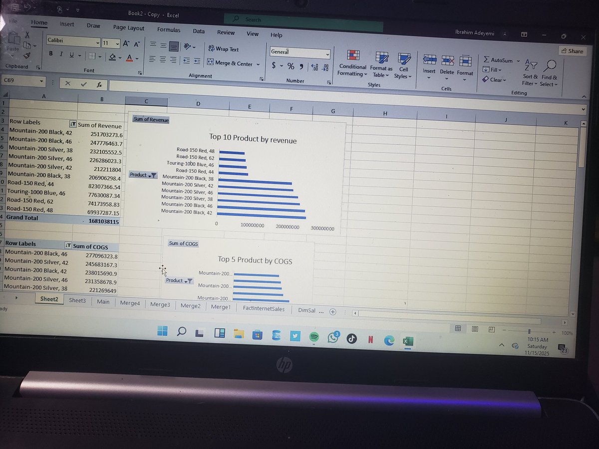
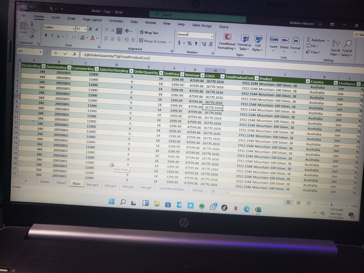
I rebuilt (and lightly re-imagined) a Sales Performance dashboard after watching @iam_daniiell's YouTube walkthrough. See thread for highlights, design choices, and what I optimized for decision speed. #DataViz #Excel #Analytics #DataAnalytics #DashboardDesign #SalesAnalysis

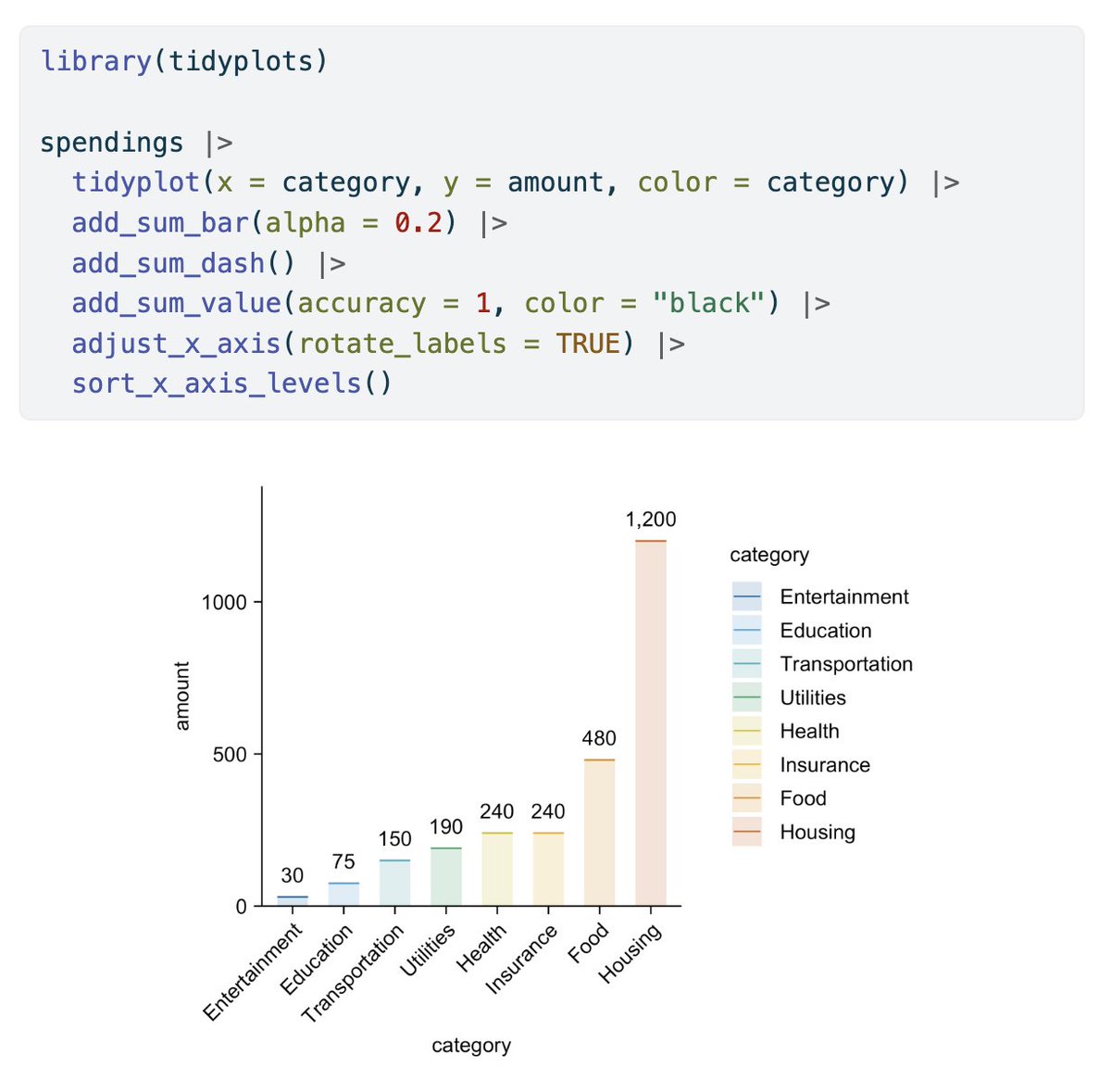
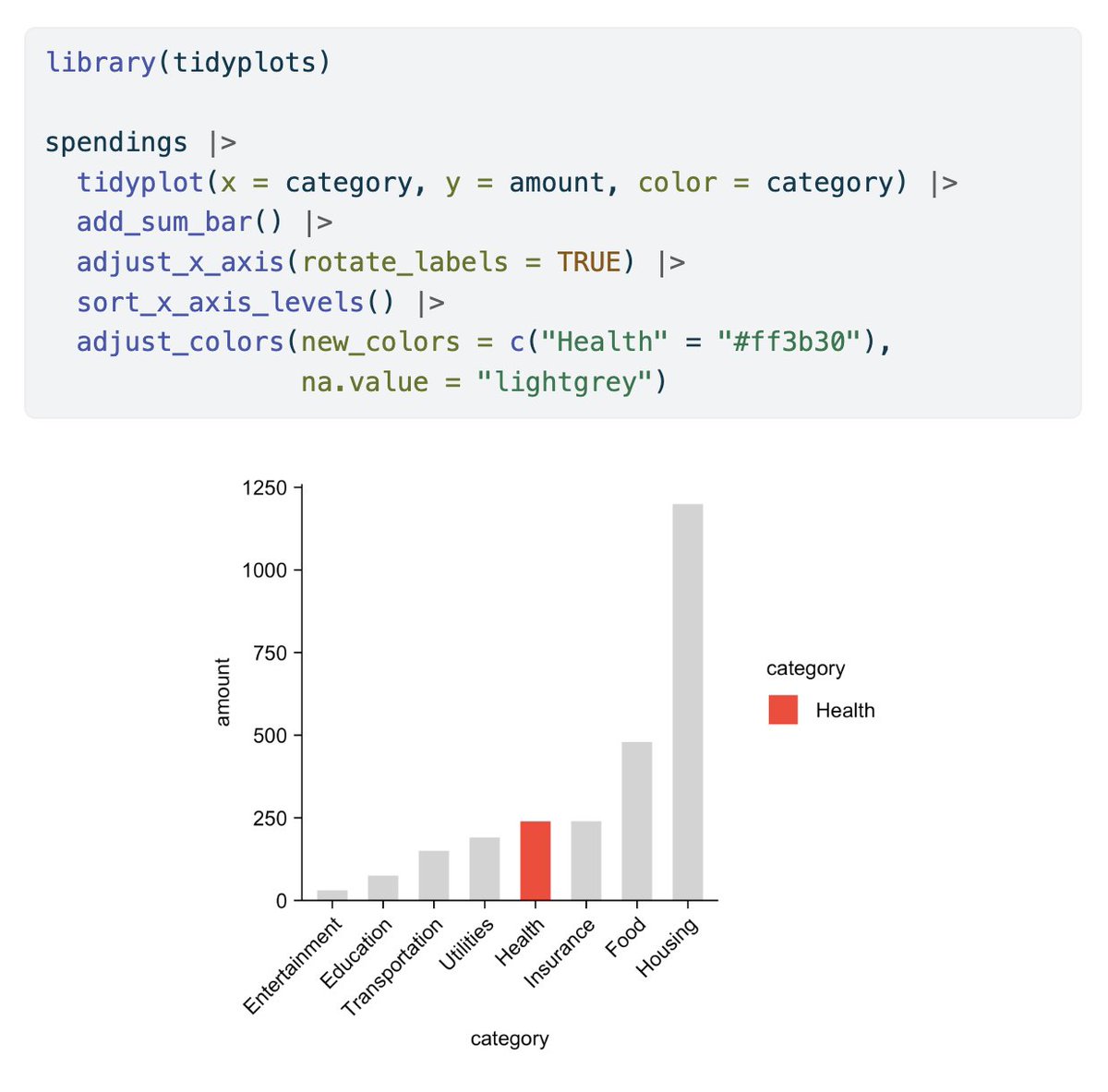
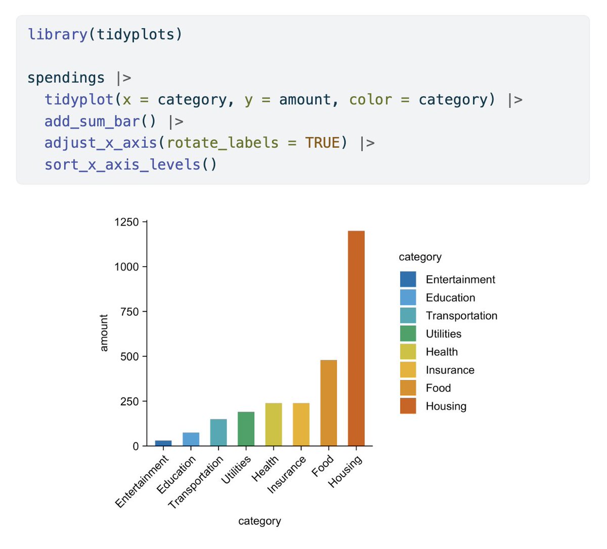
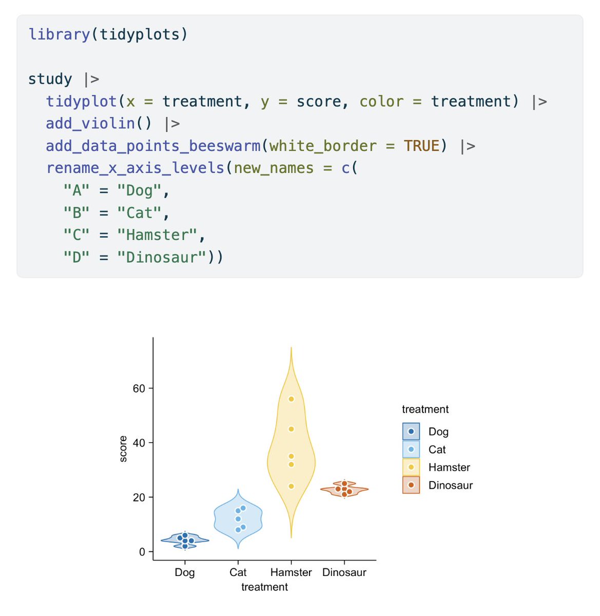
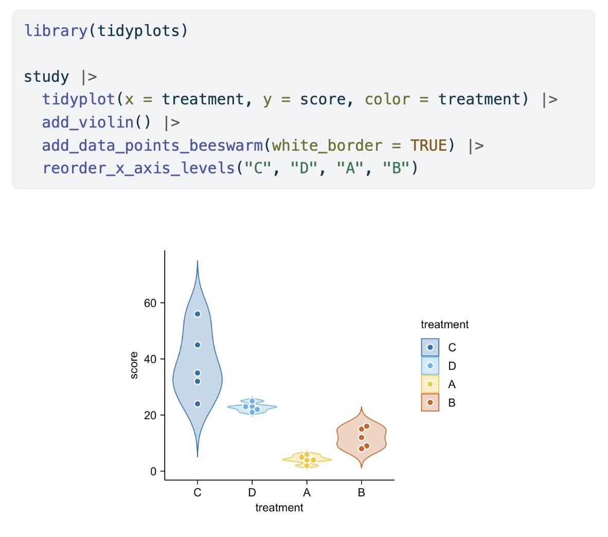
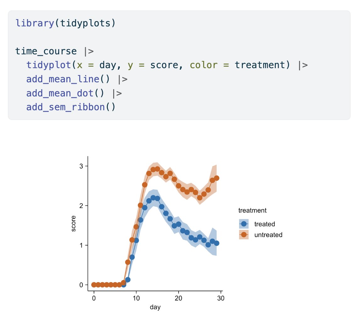
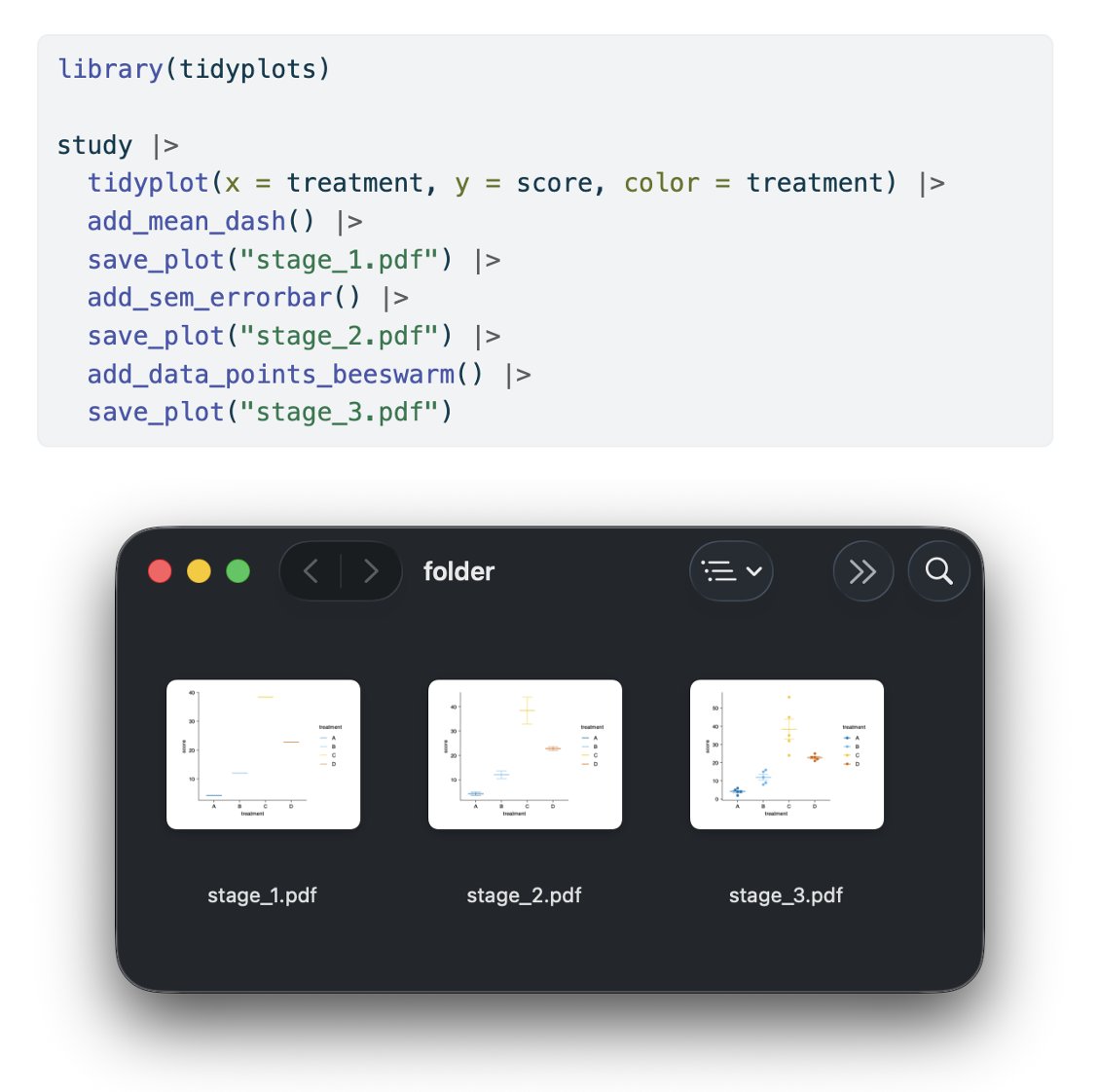
In its first year tidyplots.org has become the go-to data viz for many life science researchers, got 620+ stars on Github, ~30K CRAN downloads, and 11 citations. Thank you for using, sharing, citing, and feedback! There is more to come 🤩 #rstats #dataviz #phd


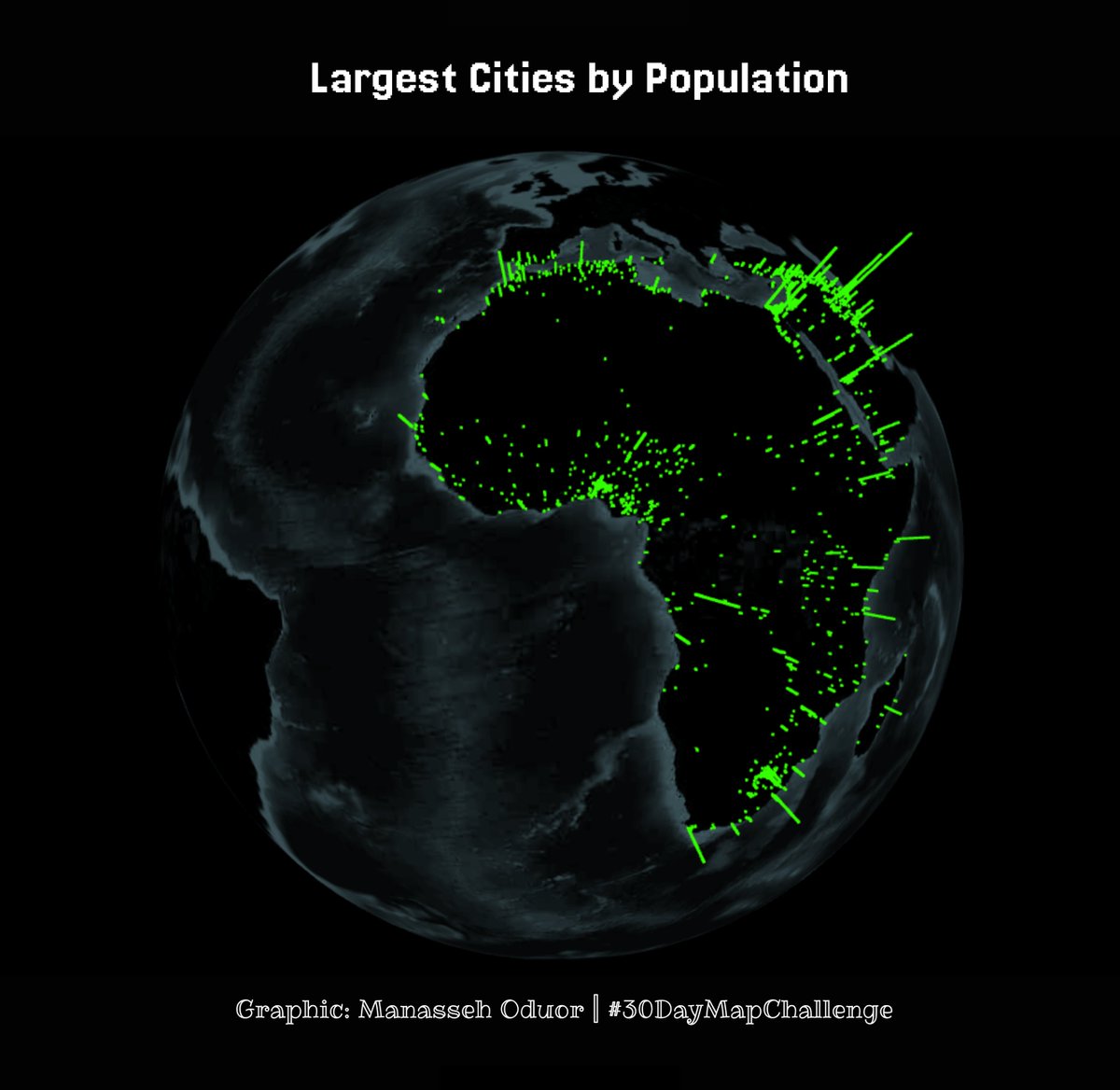
Day 17 of #30DayMapChallenge ~ A new tool. threejs library. #rstats #dataviz #gis #map #spatial #world

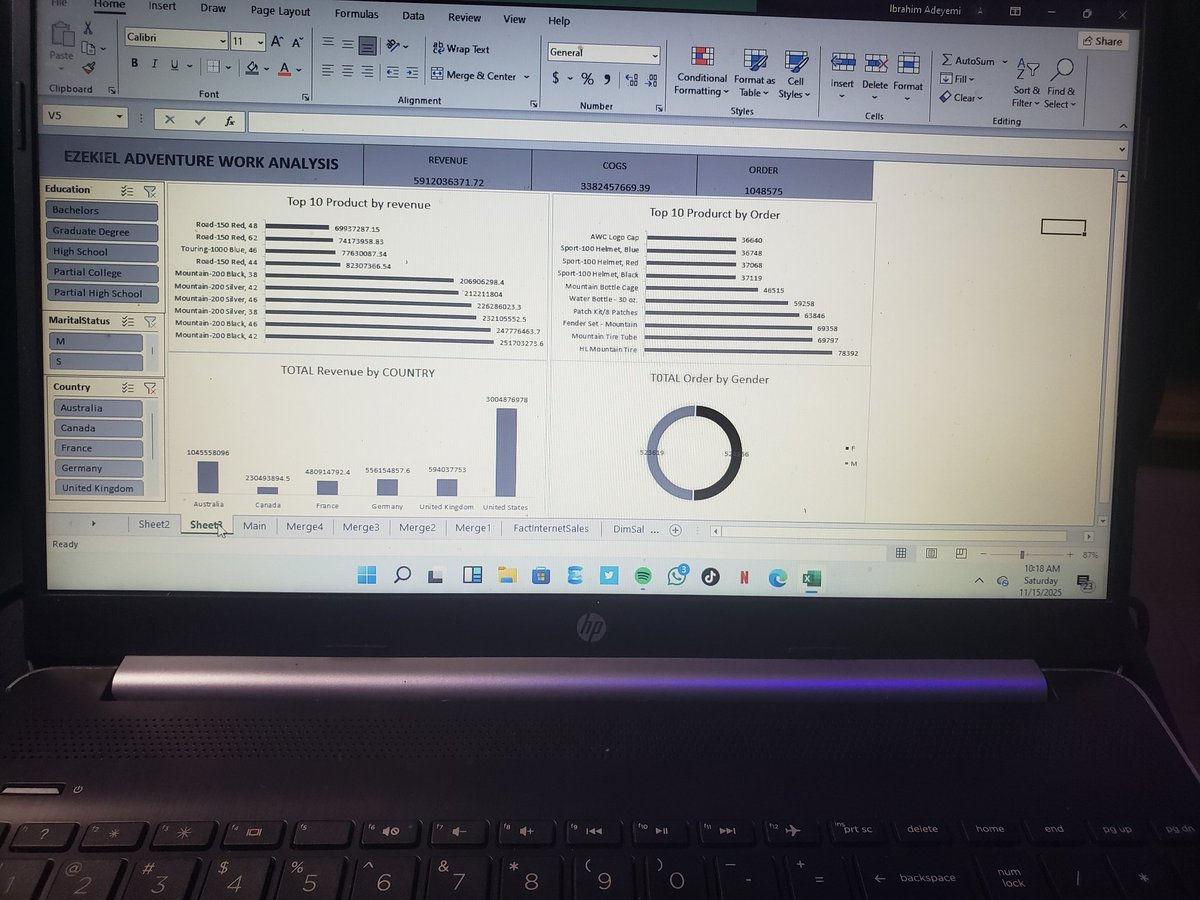
From raw data to a full-blown interactive dashboard! 🤩 Just finished building my first Data Analysis dashboard at @TechCrushHQ. It feels great to see all the Power Query and PivotTable work pay off in actionable visuals. Look at the transformation! 👇 #DataAnalytics #DataViz

Built this interactive dashboard to track global renewable energy trends! It filters capacity, investment, and jobs by continent and energy type (Solar, Wind, Hydro). Love how data visualization can make complex topics so clear. #DataViz #RenewableEnergy #Excel #Analytics


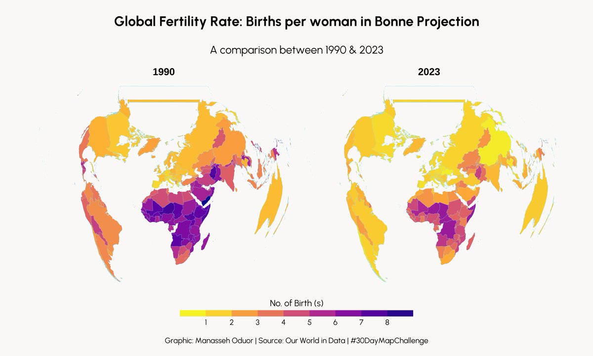
Day 19 of #30DayMapChallenge ~ Projections. Global Fertility Rate in Bonne projection. #rstats #dataviz #gis #map #spatial #world


A woman's age vs. the age of the men who look best to her vs the same chart for men. (classic #dataviz of @Okcupid data)


#Datalove | 😱🤖 ¿Le tienes miedo a la #IA Generativa? 💻 Este módulo de @EscueladeDatos te ayudará a... 📂 Cargar y analizar bases de datos 📈 Crear #dataviz para analizar tendencias 👩🏽💻 Usar IA de forma crítica, segura y con propósito 💻 Chécalo YA ➡️ bit.ly/M031414G


Gemini 3 is the "world's most capable model". Key insight: Its multimodal ability let a user turn a screenshot of raw benchmark data into a custom, interactive dashboard. AI is now a "thought partner". #Gemini #MultimodalAI #DataViz

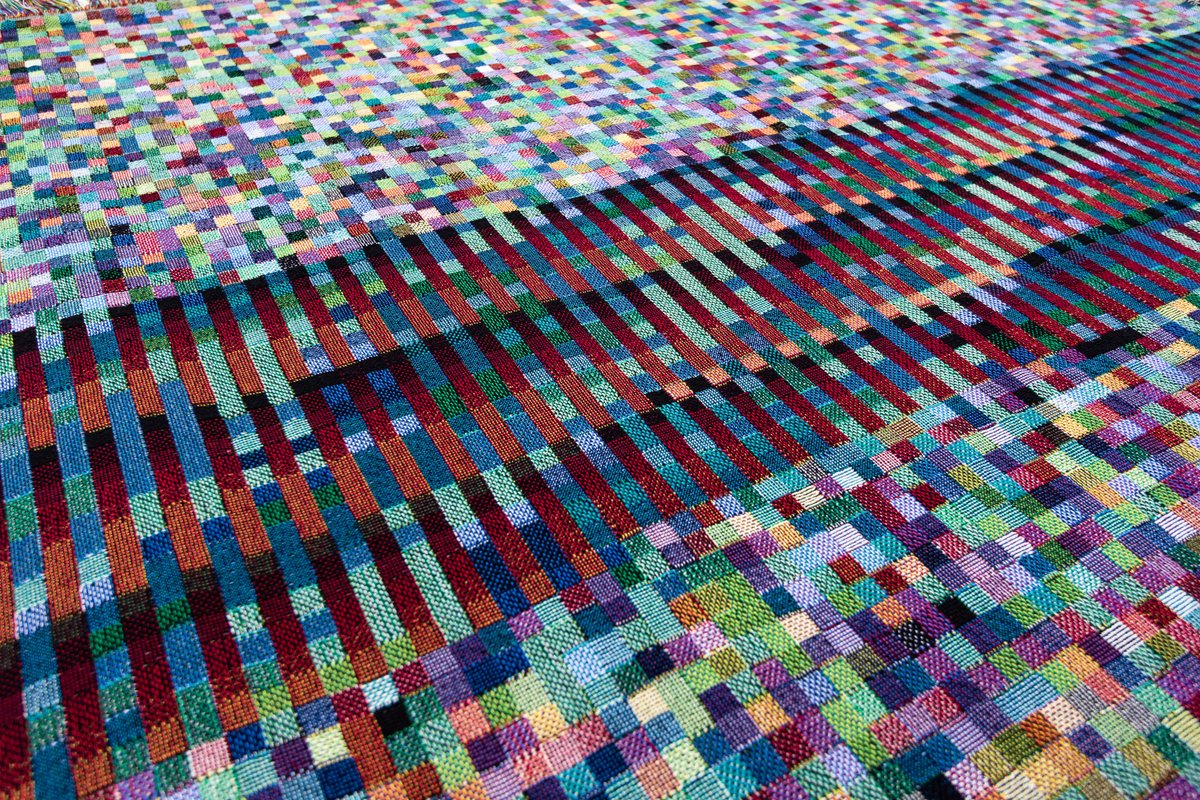
Blockchain Collection Ethereum Blockchain Dark Throw - Detail glitchtextiles.com/woven-throws/e… #processing #blockchain #dataviz #cryptocurrency #ethereum #glitchtextiles #textiles #textiledesign #textileart #woven

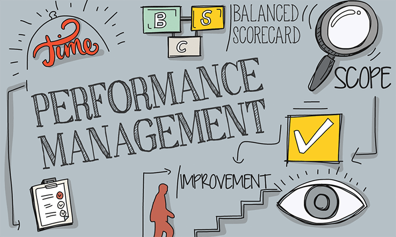
What is performance management? A super simple explanation for everyone;When properly designed and implemented, performance management techniques and processes enable an 7wdata.be/data-science/w… #dataviz #AR #Businessintelligence #dataquality

Day 20 of the #30DayMapChallenge Water We mapped access to Piazza San Marco by walking + water taxi. The 30-minute isochrones show how boats connect Venice’s islands slow maybe, but vital for connectivity! #DataViz #Mapping #Accessibility


🚨 Exclusive #SankeyMaster Alert! 🚨 Discover the ultimate #DataViz tool that’s taking the analytics world by storm—Sankey Charts! 📈 These visually stunning flow diagrams make complex data easy #sankeymaster #sankey 👉apps.apple.com/app/apple-stor…

🚀 Excel Master Class: Beginner to Advanced! Level up with Microsoft Excel, Financial Modeling & Power BI Data Visualization. 📊 Join live online or in-person training to master your data skills! #ExcelTraining #PowerBI #DataViz opencastlabs.co.ke/advanced-micro…

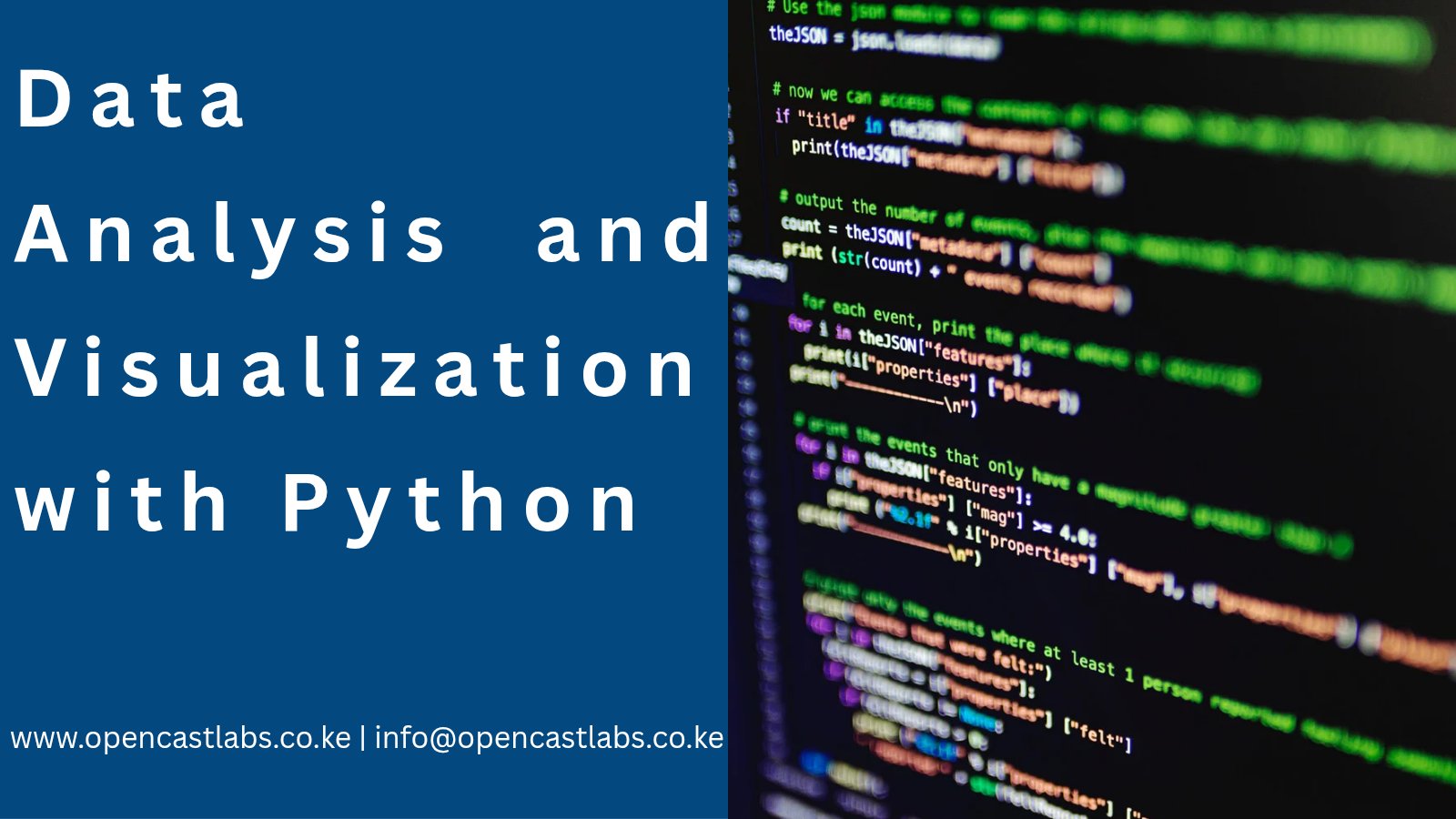
Master Python Data Analysis! Learn to collect, clean, analyze & visualize data with pandas, numpy, matplotlib, seaborn & plotly. 📊 Hands-on training with real-world datasets to create pro reports & dashboards. #Python #DataAnalysis #DataViz opencastlabs.co.ke/data-analysis-…

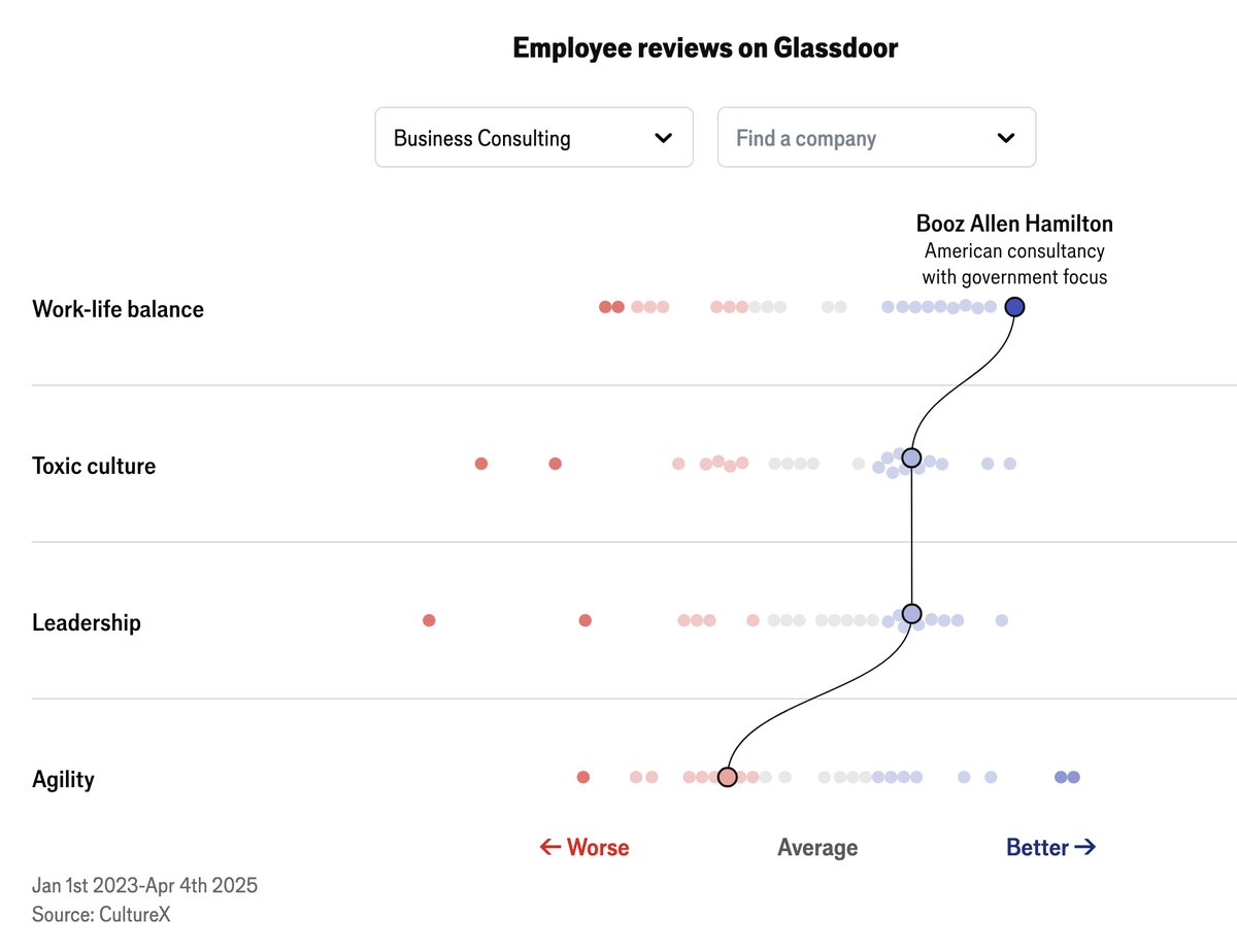
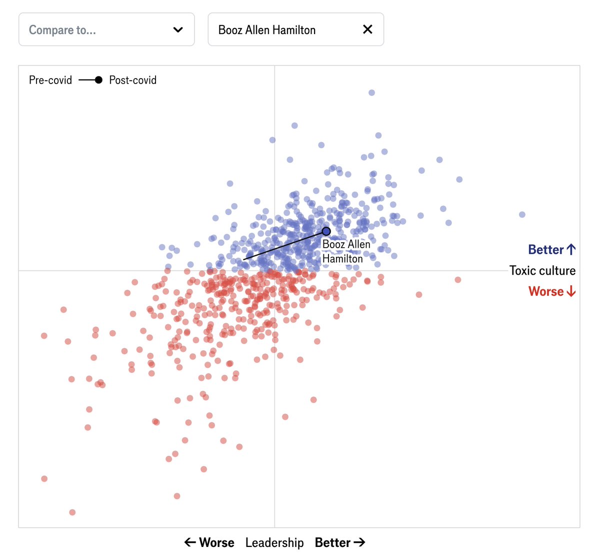
Digging these #dataviz from @TheEconomist analyzing Glassdoor reviews of 900 major firms to evaluate leadership and toxic workplace culture economist.com/interactive/bu…

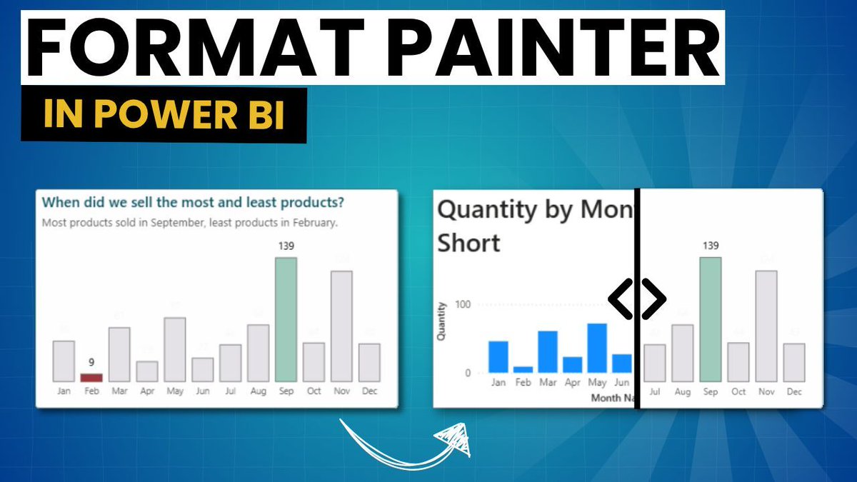
The Format Painter in Power BI is underrated. It copies formatting, conditional rules, and styles across visuals, fast and consistent. I made a short video showing how it works: youtube.com/watch?v=Q4YA_G… #PowerBI #DataViz #MicrosoftFabric #DataVisualization


📊 Mejora tus #DataViz y cuenta historias claras que realmente impacten. Recursos clave para gráficos claros, interactivos y bien diseñados: desde ggplot2 hasta dashboards en R y Python. 🚀 💡 Te dejo mi lista con el top 16👇 #RStats #Python #VisualizaciónDeDatos #Storytelling

🎨 Event Alert: Enhance your ggplot2 Data Visualization Skills! 📅 Join expert Nicola Rennie, author of “The Art of Visualization with ggplot2.” Learn to craft effective R visuals from exploring data to polishing charts. 🗓️ RSVP here: meetup.com/rladies-rome/e… #DataViz #RStats
In its first year tidyplots.org has become the go-to data viz for many life science researchers, got 620+ stars on Github, ~30K CRAN downloads, and 11 citations. Thank you for using, sharing, citing, and feedback! There is more to come 🤩 #rstats #dataviz #phd

Goos evening! @Hyperpiexyz_io isn’t just a tool. It’s a shortcut to clarity. Visualize data, spot insights, and share stories faster than ever. Not many know it yet — but those who do? They move quicker. ⚡🥧 #HyperPie #DataViz #NextLevel

A woman's age vs. the age of the men who look best to her vs the same chart for men. (classic #dataviz of @Okcupid data)
From raw data to a full-blown interactive dashboard! 🤩 Just finished building my first Data Analysis dashboard at @TechCrushHQ. It feels great to see all the Power Query and PivotTable work pay off in actionable visuals. Look at the transformation! 👇 #DataAnalytics #DataViz
💯🌟❤️📊📈 Beautifully published #DataViz books by @jschwabish Better Data Visualizations: amzn.to/3s2jIMX Others (e.g, Data Visualization in Excel): amzn.to/3sPSLCt ————— #DataStorytelling #DataLiteracy #Statistics #DataScience #DataScientists #BI #Analytics

My #dataviz, "APT :Voices For Human Dignity" has won the second place in the 2025 #DataViz Competition🎉 🥈 Thank you @womenindataorg @DataConnectConf @wia_community and @ApexonGlobal for organizing the event. #WomenInAnalytics #DataConnectConf #DataStorytelling #DCC2025


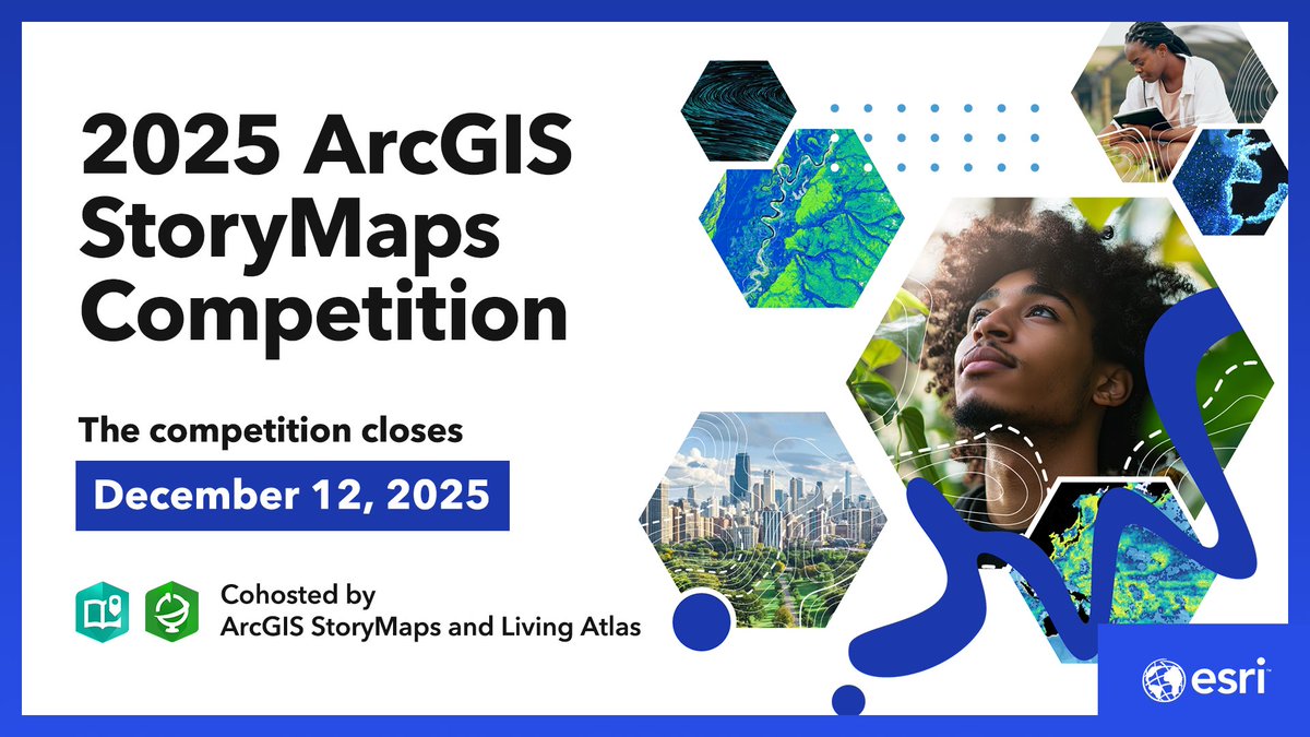
Looking for ways to celebrate #GISDay2025? The 2025 ArcGIS StoryMaps Competition is now open! 🥳 Join the fun, learn #dataviz skills, and submit your story. ow.ly/kQCM50X12Bc
Something went wrong.
Something went wrong.
United States Trends
- 1. Good Thursday 29.1K posts
- 2. #WeekndTourLeaks N/A
- 3. #thursdaymotivation 1,782 posts
- 4. Happy Friday Eve N/A
- 5. #ThursdayThoughts 1,739 posts
- 6. #thursdayvibes 2,446 posts
- 7. FEMA 83.2K posts
- 8. Nnamdi Kanu 70.4K posts
- 9. #หลิงออมปฏิทินช่อง3ปี2569 813K posts
- 10. LINGORM CH3 CALENDAR SIGN 802K posts
- 11. Crockett 62.2K posts
- 12. The 2024 90.8K posts
- 13. NO CAP 15K posts
- 14. The 1990 7,795 posts
- 15. FREE HAT 1,985 posts
- 16. But Jesus 22.6K posts
- 17. Alignerz 216K posts
- 18. Shamet 3,255 posts
- 19. Lee Zeldin 14.1K posts
- 20. Hire American 5,673 posts