#mapvisualization search results

Can you see all the colors in this map? Not everyone can. Here's how #cartographers are designing #maps for the visually impaired p.ctx.ly/r/8dn7 #MapVisualization


Not everyone can enjoy the beauty and usefulness of #maps. There might be several reasons why p.ctx.ly/r/875z #Cartography #MapVisualization


Fascinating #mapvisualization #uptodate #weather info. #WindMap #TropicalStormSimon earth.nullschool.net @cambecc

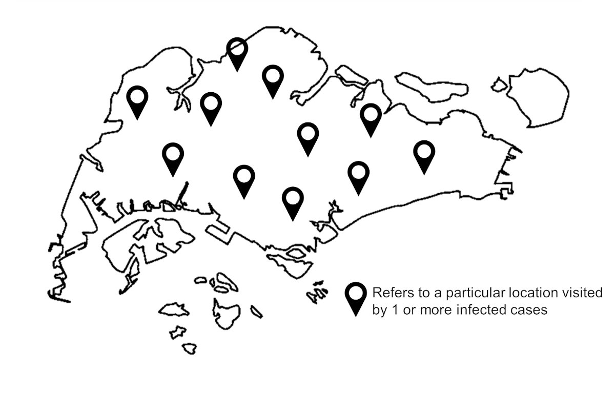
Finally, the newest #mapvisualization has been published! What can the #streets names reveal about #Singapore's community and identity? 🇸🇬 Visit str.sg/sgstreets and learn about the history, culture, and society of your streets. 🛣 💚 Made with @Mapbox & @vuejs

今日ご紹介するのは【MapVisualization】の動画です😊 HoloLensを用いて場所に紐づく情報を可視化・共有するコンテンツなのですが、操作するときに出る音がイイ感じなのです!💡 ぜひ聞いてみてください~🔊🎶 #HoloLens #MR #MapVisualization ※ 音が出ます


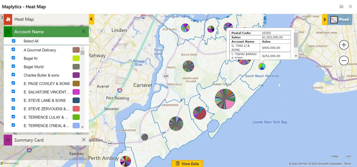
Analyze data using Pie-Chart and Column-Chart within Dynamics 365 CRM with Heat Maps buff.ly/3ctZvKi #mapvisualization #PowerPlatform #MSDyn365 #datavisualization #heatmaps #MSDynCRM #Dynamics365 #piechart #powerapps #dataverse


Unlock the power of location in Microsoft #PowerBI for your whole organization! Now you can with the all-new organizational Plus subscription in ArcGIS Maps for Power BI. Learn more p.ctx.ly/r/7ke8 #mapvisualization #mapping


RT Using Turf.js to Geocode coordinates with custom boundaries dlvr.it/S2Jvrz #tableau #geospatialintelligence #mapvisualization
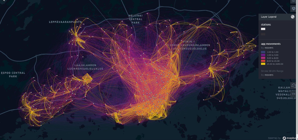
RT Visualization of Bike Sharing System movements in Helsinki with an interactive flow-map dlvr.it/S41JxZ #mapvisualization #flowmap #bikesharing #keplergl #geospatial
Use Heat Maps in Dynamics 365 CRM to analyse data using Pie-Charts and Column-Charts. To know how? Visit our website: buff.ly/3yPxSXI #mapvisualization #MSDyn365 #datavisualization #heatmaps #MSDynCRM #Dynamics365 #piechart #powerapps

Editor's Choice A Multi-Scale Representation of Point-of-Interest (#POI) Features in Indoor #MapVisualization by Yi Xiao, Tinghua Ai, Min Yang and Xiang Zhang 👉mdpi.com/2220-9964/9/4/… #IndoorMap #AdaptiveVisualization


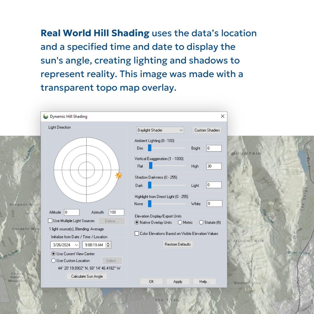
🌄 Elevate your map game with our dynamic hill shading tool! Learn how to create stunning visualizations in just a few steps. - #GlobalMapper #MapVisualization #Cartography #GIS #Geospatial #DataViz #DataVisualization
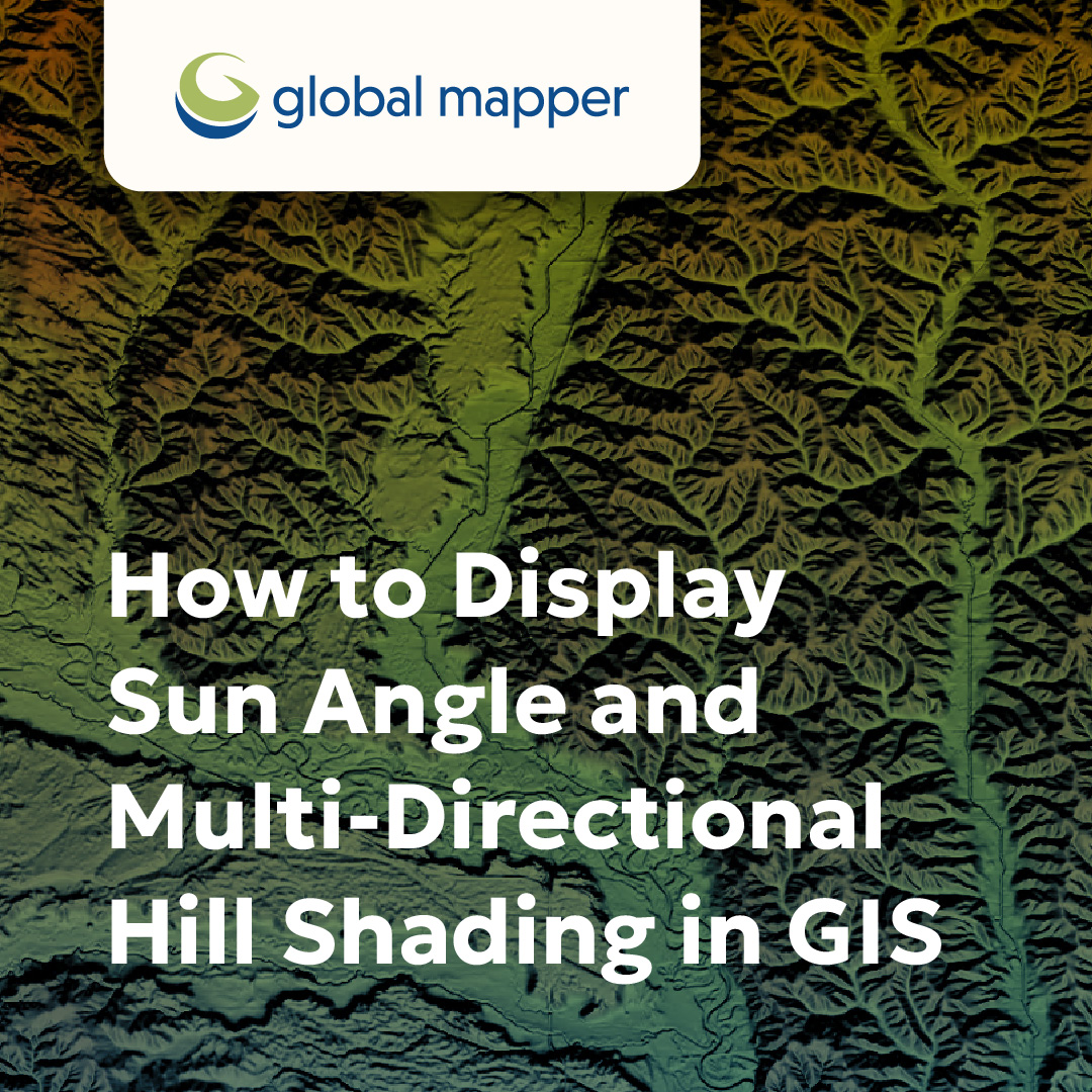
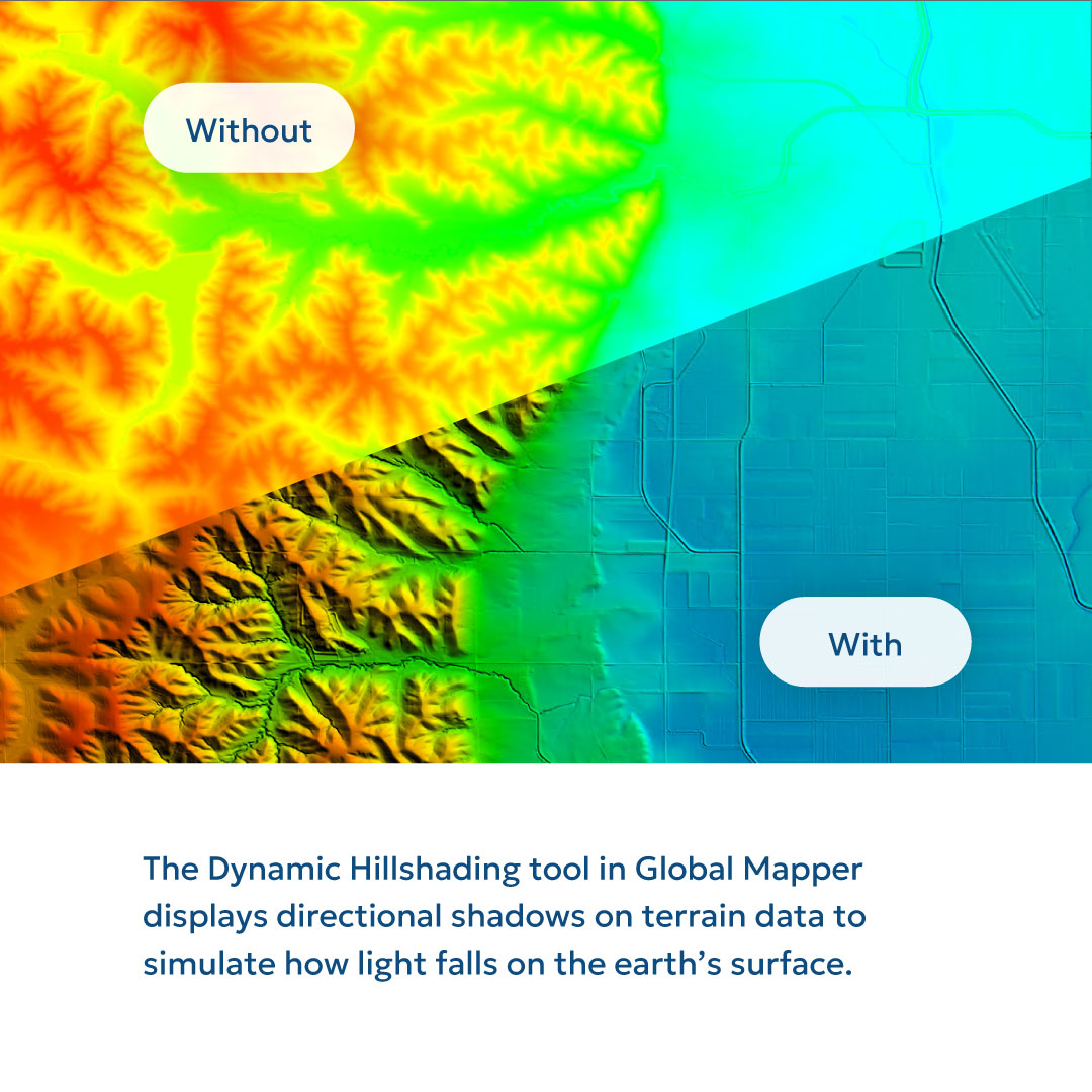
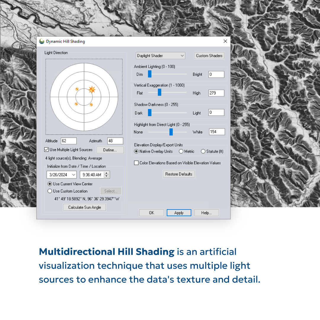

🌄 Elevate your map game with Global Mapper's dynamic hill shading tool! Learn how to create stunning visualizations in just a few steps. - #GlobalMapper #MapVisualization #Cartography #GIS #Geospatial #DataViz #DataVisualization

🌄 Elevate your map game with our dynamic hill shading tool! Learn how to create stunning visualizations in just a few steps. - #GlobalMapper #MapVisualization #Cartography #GIS #Geospatial #DataViz #DataVisualization


How to Enable #MapVisualization in #PAW? To create Map Visualization the view must include a defined geography dimension & this dimension needs to be in the Row axis of the view. There is a limitation of having only 3 measures in the column axis of a view: bit.ly/2Wv3Rsr

#30DayMapChallenge Day 30 — Makeover A map makeover done right. During BUILD with Mapbox, in the “Streamlined Map Development Part 2” session, Mathew Anthony showcased an impressive before-and-after — cleaning up styling, simplifying layers, and turning a busy map into a sharp,…
Want a map that looks you? Create your signature CRM mapping style with personalized themes and pushpins! bit.ly/3wUf4ID #CRMmapping #GeoCRM #MapVisualization #d365

The impact? 1stMile cut down on manual planning hours, improved travel speed, and brought transparency to field ops. Bonus? A better experience for customers as well as agents. #FieldService #PowerPlatform #MapVisualization

About equality and women’s rights can perhaps only talk the countries that initially established any women’s rights. In this case the coutries mapped with color - light yellow. #womensrights #mapvisualization #equality #equalpayday brilliantmaps.com/womens-suffrag…
brilliantmaps.com
Women's Suffrage Mapped: The Year Women Got The Vote By Country - Brilliant Maps
Map created by Cuba Holidays

Came across a super sick map animation in a Vox video and I just had to make a video on it! Anyways, here is the result of that. Make sure to check the link below to see how it's done (it's easy I promise:

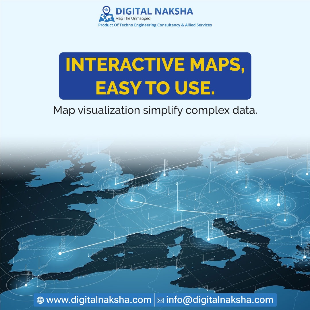
Explore interactive maps! Simplify complex data with user-friendly map visualization tools. Uncover insights effortlessly. For more details, visit 🌐 digitalnaksha.com 📧 [email protected] #InteractiveMaps #DataVisualization #MapVisualization #DataAnalysis
🌄 Elevate your map game with Global Mapper's dynamic hill shading tool! Learn how to create stunning visualizations in just a few steps. - #GlobalMapper #MapVisualization #Cartography #GIS #Geospatial #DataViz #DataVisualization
🌄 Elevate your map game with our dynamic hill shading tool! Learn how to create stunning visualizations in just a few steps. - #GlobalMapper #MapVisualization #Cartography #GIS #Geospatial #DataViz #DataVisualization
🌄 Elevate your map game with our dynamic hill shading tool! Learn how to create stunning visualizations in just a few steps. - #GlobalMapper #MapVisualization #Cartography #GIS #Geospatial #DataViz #DataVisualization

Engrain @engrain Raises $12 Million in Series A #SaaS #PropertyTouring and #MapVisualization #seriesA to drive platform improvements for property mapping tech #funding thesaasnews.com/news/engrain-r…


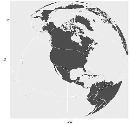
Did you know that visualizing maps is possible in #R? It is! It's called geospatial analysis. AND, I made a short tutorial on maps with #ggplot2 to help get you started. Article: bit.ly/3jKjL16 #rstats

Did you know that visualizing maps is possible in #R? It is! It's called geospatial analysis. AND, I made a short tutorial on maps with #ggplot2 to help get you started. Article: bit.ly/3gHbVV3 #rstats

Use Heat Maps in Dynamics 365 CRM to analyse data using Pie-Charts and Column-Charts. To know how? Visit our website: buff.ly/3yPxSXI #mapvisualization #MSDyn365 #datavisualization #heatmaps #MSDynCRM #Dynamics365 #piechart #powerapps
Did you know that visualizing maps is possible in #R? It is! It's called geospatial analysis. AND, I made a short tutorial on maps with #ggplot2 to help get you started. Article: bit.ly/3QRTiJV #rstats

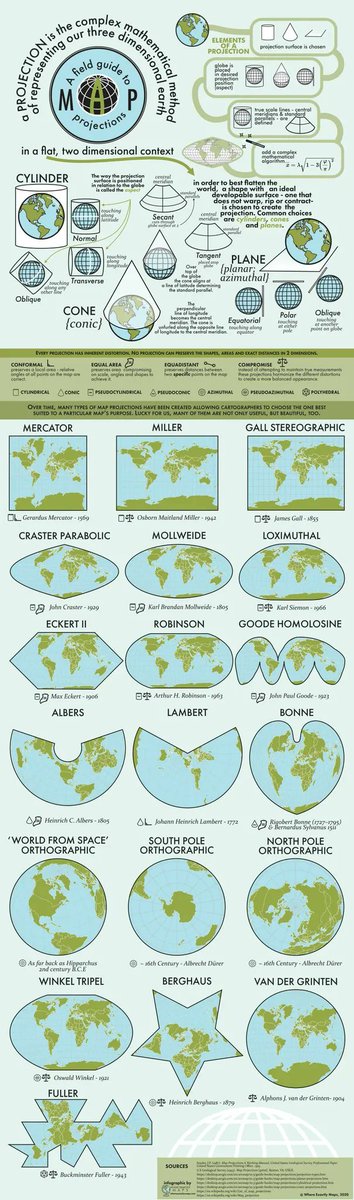
I haven’t posted about different map projections in a while so here is a lovely infographic (and nice little blog post) on the workings of map projections. Source: buff.ly/31RfCvp

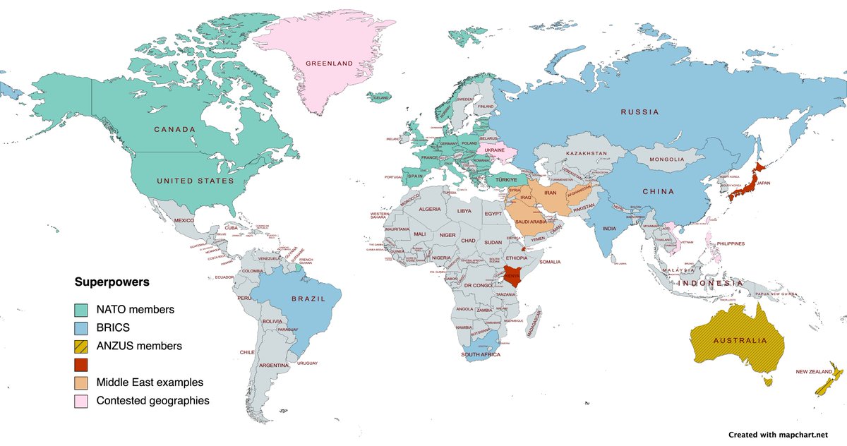
Came across this website mapchart.net/index.html which allows you to create bespoke maps. I have now been able to map out our case studies and explored places on the A Level. Useful for displays and future revision activities.

Did you know that visualizing maps is possible in #R? It is! It's called geospatial analysis. AND, I made a short tutorial on maps with #ggplot2 to help get you started. Article: bit.ly/3R8oOnD #rstats


El geógrafo @tjukanov ha hecho un mapa interactivo en el que puedes ver dónde han nacido personas importantes. ¡Venga, busca tu casa a ver a quién tienes! Accede aquí tjukanovt.github.io/notable-people #mapbox #GIS #mapvisualization
Did you know that visualizing maps is possible in #R? It is! It's called geospatial analysis. AND, I made a short tutorial on maps with #ggplot2 to help get you started. Article: buff.ly/3SqPwZR #rstats

Did you know that visualizing maps is possible in #R? It is! It's called geospatial analysis. AND, I made a short tutorial on maps with #ggplot2 to help get you started. Article: buff.ly/3HR0dAf #rstats

Not everyone can enjoy the beauty and usefulness of #maps. There might be several reasons why p.ctx.ly/r/875z #Cartography #MapVisualization
Can you see all the colors in this map? Not everyone can. Here's how #cartographers are designing #maps for the visually impaired p.ctx.ly/r/8dn7 #MapVisualization
Fascinating #mapvisualization #uptodate #weather info. #WindMap #TropicalStormSimon earth.nullschool.net @cambecc
Unlock the power of location in Microsoft #PowerBI for your whole organization! Now you can with the all-new organizational Plus subscription in ArcGIS Maps for Power BI. Learn more p.ctx.ly/r/7ke8 #mapvisualization #mapping
🌄 Elevate your map game with our dynamic hill shading tool! Learn how to create stunning visualizations in just a few steps. - #GlobalMapper #MapVisualization #Cartography #GIS #Geospatial #DataViz #DataVisualization
RT Using Turf.js to Geocode coordinates with custom boundaries dlvr.it/S2Jvrz #tableau #geospatialintelligence #mapvisualization
🌄 Elevate your map game with our dynamic hill shading tool! Learn how to create stunning visualizations in just a few steps. - #GlobalMapper #MapVisualization #Cartography #GIS #Geospatial #DataViz #DataVisualization
RT Visualization of Bike Sharing System movements in Helsinki with an interactive flow-map dlvr.it/S41JxZ #mapvisualization #flowmap #bikesharing #keplergl #geospatial
Editor's Choice A Multi-Scale Representation of Point-of-Interest (#POI) Features in Indoor #MapVisualization by Yi Xiao, Tinghua Ai, Min Yang and Xiang Zhang 👉mdpi.com/2220-9964/9/4/… #IndoorMap #AdaptiveVisualization
Analyze data using Pie-Chart and Column-Chart within Dynamics 365 CRM with Heat Maps buff.ly/3ctZvKi #mapvisualization #PowerPlatform #MSDyn365 #datavisualization #heatmaps #MSDynCRM #Dynamics365 #piechart #powerapps #dataverse
How to Enable #MapVisualization in #PAW? To create Map Visualization the view must include a defined geography dimension & this dimension needs to be in the Row axis of the view. There is a limitation of having only 3 measures in the column axis of a view: bit.ly/2Wv3Rsr
Explore interactive maps! Simplify complex data with user-friendly map visualization tools. Uncover insights effortlessly. For more details, visit 🌐 digitalnaksha.com 📧 [email protected] #InteractiveMaps #DataVisualization #MapVisualization #DataAnalysis
Use Heat Maps in Dynamics 365 CRM to analyse data using Pie-Charts and Column-Charts. To know how? Visit our website: buff.ly/3yPxSXI #mapvisualization #MSDyn365 #datavisualization #heatmaps #MSDynCRM #Dynamics365 #piechart #powerapps

Wondering how to use ArcGIS with @MSPowerBI? Check out this article about the main features of @ArcGISOnline and discover how it conveniently represents multiple levels of different data visually on a map: bit.ly/3cVpecQ. #PowerBI #mapvisualization #datavisualizations

Check out our new post on how to use ArcGIS with @MSPowerBI. We dive deep into its main features and see how it can conveniently represent multiple levels of different data visually on a map: bit.ly/3cVpecQ. @ArcGISOnline #PowerBI #mapvisualization #datavisualizations

Something went wrong.
Something went wrong.
United States Trends
- 1. #AEWDynamite 19K posts
- 2. Giannis 76.8K posts
- 3. #Survivor49 2,504 posts
- 4. #TheChallenge41 1,885 posts
- 5. Ryan Leonard N/A
- 6. Claudio 28.5K posts
- 7. Jamal Murray 5,234 posts
- 8. Will Wade N/A
- 9. Kevin Overton N/A
- 10. Ryan Nembhard 3,145 posts
- 11. #SistasOnBET 1,904 posts
- 12. #iubb 1,189 posts
- 13. Achilles 5,238 posts
- 14. Steve Cropper 4,584 posts
- 15. Tyler Herro 1,675 posts
- 16. Bucks 51.2K posts
- 17. Dark Order 1,711 posts
- 18. Yeremi N/A
- 19. Jericho Sims N/A
- 20. Isaiah Stewart 1,173 posts