#datavisualization 搜索结果

It’s the final day of Phase 3 of our Environmental Reporting Skills for Impact training! Today, participants are visiting @statisticsRW to explore how data is processed and transformed into visuals that make complex information easy to understand. #DataVisualization


The right JavaScript Gantt chart library can save weeks of development. A new deep dive reviews six top options across features, integration, and real-world fit. 🧩 Which one stands out for you? 👉 anychart.com/blog/2025/11/0… #ProjectManagement #DataVisualization #JavaScriptCharts

Beyond numbers, infographics help summarize information on a given topic — and they look even more beautiful. A good example is this article on plastics’ statistics ➡️ informationisbeautiful.net/visualizations… Data visualization makes data easy to understand and impactful. #DataVisualization

Why Visualizing #EnvironmentalData? 📊 Environmental data can be complex and overwhelming 🧩 Visuals simplify information for audiences 🔬 Data visualization bridges scientists and the public 💥 A well-designed chart can make a stronger impact than long text #DataVisualization


From #DataEntry to visual manipulation, participants are using Flourish to create visually appealing data visuals. Swipe through to see one participant’s beautiful work: 📊 Picture 1: Data entry 🧩 Picture 2: Visual manipulation 🎨 Picture 3: Final visual #DataVisualization


Herramientas IA para Visualización de datos 🌟 En los últimos meses he estado experimentando bastante con plataformas de IA para distintas funciones dentro de la Visualización de datos Las que mejor resultado me dan 👇 : #AI #dataviz #datavisualization

This is not the only participant who created amazing visuals with Flourish. Check out this one too! 📊 Picture 1: Data entry 🧩 Picture 2: Visual manipulation 🎨 Picture 3: Final visual #DataVisualization


What is Data Visualization? It is the representation of information in the form of a chart, diagram, picture, etc. 📊 Data visualization can also be used as a reporting tool — helping journalists present facts clearly and creatively. #DataVisualization #DataDrivenJournalism


I'm in my 𝗹𝗮𝘀𝘁 𝗱𝗮𝘆𝘀 of building dashboards for "him" 👀 So I'll be trying a 𝗹𝗼𝘁 𝗼𝗳 𝘀𝘁𝘂𝗳𝗳 in the coming months 🚀 Check out this 𝘄𝗶𝗿𝗲𝗳𝗿𝗮𝗺𝗲 and tell me what you think 👇 #Datafam #PowerBI #DataVisualization


Finished modeling the impact of invasive species on local lake water quality for a class project.Seeing the impact of our work makes the long hours worth it. #StudentLife #DataVisualization #researcher


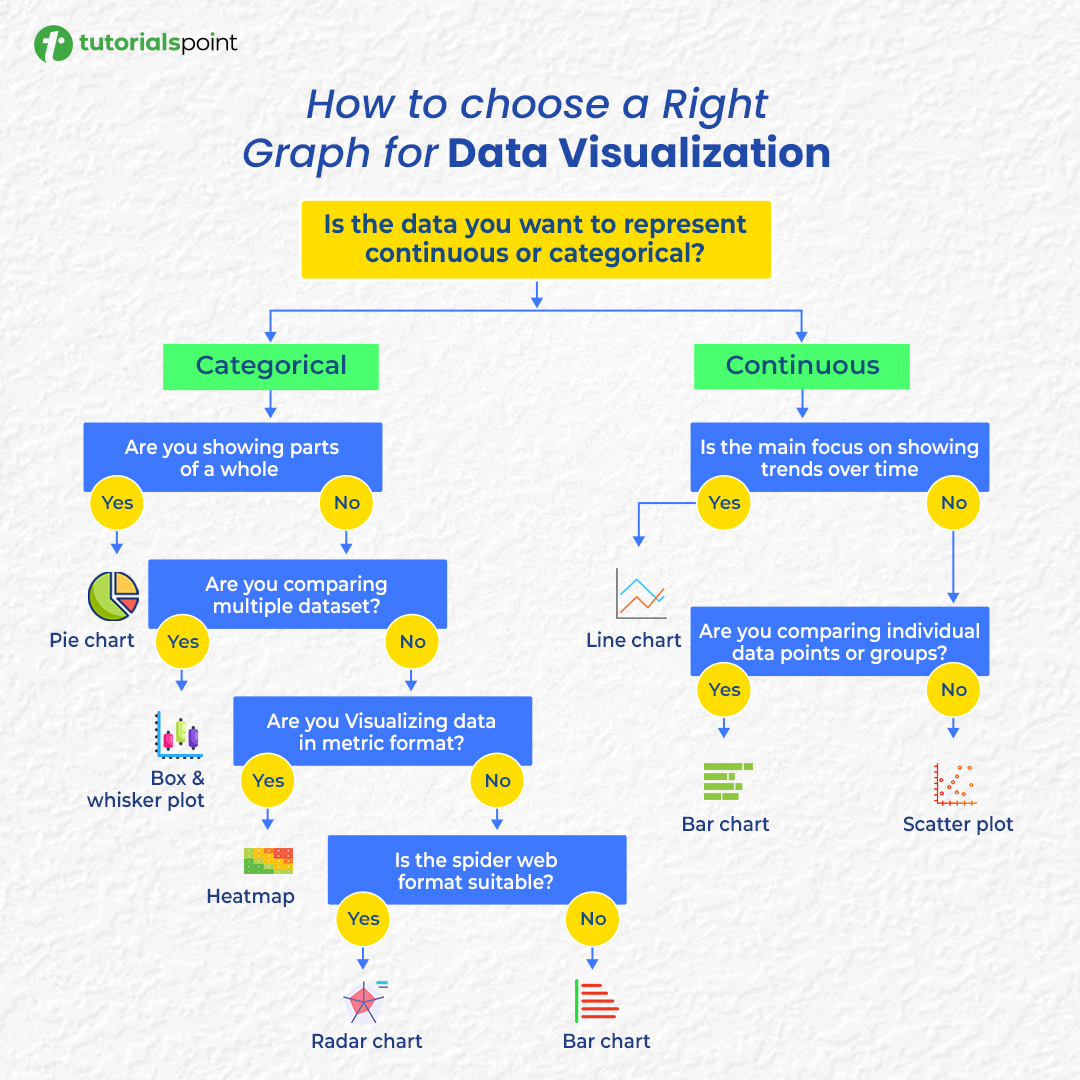
Confused about which chart to use? 📊 Here’s your cheat sheet to choose the right graph for any data visualization! #DataVisualization #DataAnalysis #DataScience #Infographics

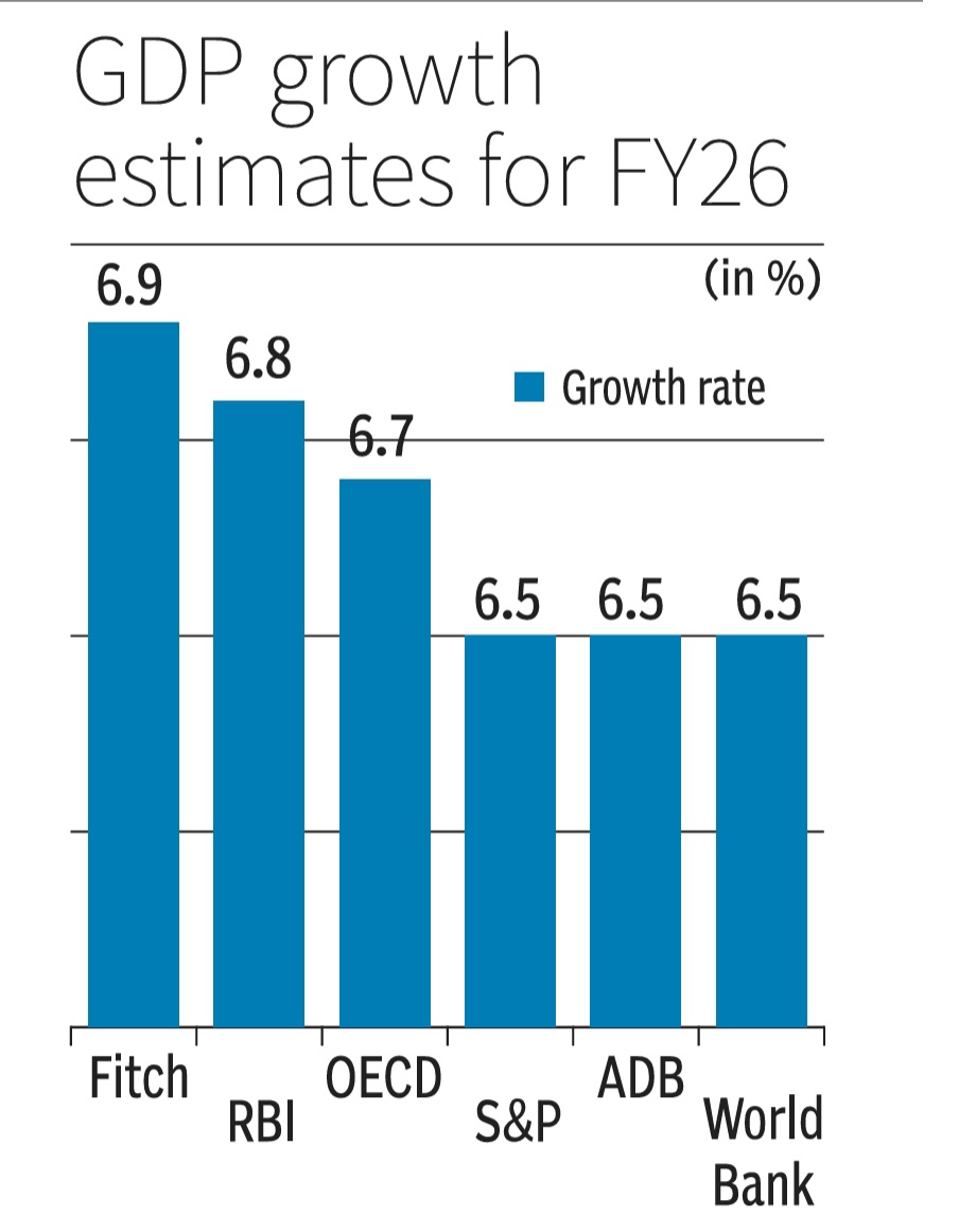
How to NOT make a GDP growth bar chart. Scaling distorts & skews data comparisons with wonky scales in this one. This GDP growth bar chart makes 6.7% or 6.9% look way bigger vs 6.5%.Starting scales near data's min vs max values is a must for fair visuals/charts #DataVisualization
“The more you learn, if you learn it properly, the more clear you become and the more you know.” — Leonard Peikoff #Day2 is focusing on mastering #DataVisualization tools like Flourish & Excel, with hands-on support from the facilitator. #DataDrivenJournalism📊


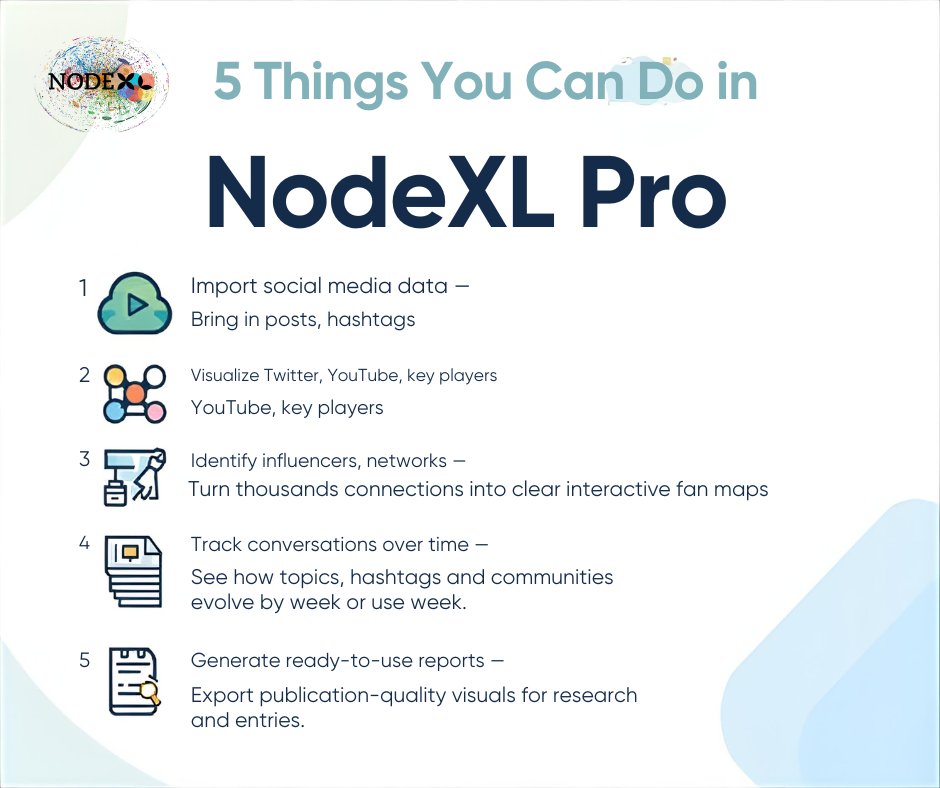
Do More with Data — Try These 5 Powerful NodeXL Pro Features! Book Now (NodeXL network consultant) : nuel.ink/cMta10 #DataVisualization #SocialMediaAnalysis #NodeXLPro #InfluenceMapping #TrendSpotting #AnalyticsTools

Power BI can visualize your data just a little differently, here's how The Power BI Visual Marketplace lets you move beyond standard charts with custom visuals like Word Clouds, Zebra BI tables, and even niche infographics. #PowerBI #DataVisualization

Hey #datafam Update from our project for this week,built this wireframes to track cost drivers, reveal profit gaps, and measure year-over-year supply chain efficiency. Read my LinkedIn post: linkedin.com/posts/victor-c… #Datavisualization #PowerBI #Excel #BusinessIntelligence


Hi 👋 #datafam What are you building this week? As a data storyteller, I built this visuals to illustrate how storytelling should be and why it is essential in communication with stakeholders. Quote this post with what you're building this week? #BusinessIntelligence #Data


34% of users find dashboards too cluttered to extract insights. 43% bypass them entirely and use Excel instead. Your Power BI dashboard is costing you 4-5 minutes per session. Per user. Every day. #PowerBI #DataVisualization #BusinessIntelligence #UX sanjaydey.com/power-bi-dashb…


📈 Report tip: Color-code your dashboards. Green/yellow/red indicators let you spot problems at a glance instead of hunting through numbers. Your eyes process visual patterns faster than raw data. #Manufacturing #Dashboards #DataVisualization #DRSoftwareServices


Transform your office TVs into powerful data hubs with RocketScreens! 🚀 No IT hassle. Just connect, display, and drive performance. 💡 #DigitalSignage #DataVisualization #RocketScreens #PowerBI #BusinessIntelligence #SmartDisplay #TechInnovation #WorkplaceProductivity


By 2050, more than 1 in 3 women aged 25+ will be obese, according to global projections. A reminder that health challenges are as much about systems and access as they are about habits. #WomensHealth #ObesityAwareness #datavisualization tinyurl.com/4a2cntnv


🌌 Where astrology is banned, booming, or believed. From India’s deep trust to Europe’s quiet skepticism — we mapped how the world regulates and monetizes the stars. 👉 mapthos.org/blog/global-as… #AstrologyMap #Mapthos #DataVisualization #Culture


🚀 Unlock the power of your data with ChartBrick! 📊 Create unlimited stunning charts without any coding. Visualize your Notion, Airtable, or CSV data effortlessly and pay once for lifetime access! Don't miss out! 🔗 #DataVisualization #NoCode #ChartBrick #LifetimeDeal

Building Astrix, a mission-control dashboard for satellite ops! 🚀 Live telemetry, multi-sat management, analytics, and real-time 3D orbits in one modular, dark-themed UI. #SpaceTech #DashboardDesign #DataVisualization #ReactJS #CesiumJS #MissionControl #Golang #Kafka


Herramientas IA para Visualización de datos 🌟 En los últimos meses he estado experimentando bastante con plataformas de IA para distintas funciones dentro de la Visualización de datos Las que mejor resultado me dan 👇 : #AI #dataviz #datavisualization


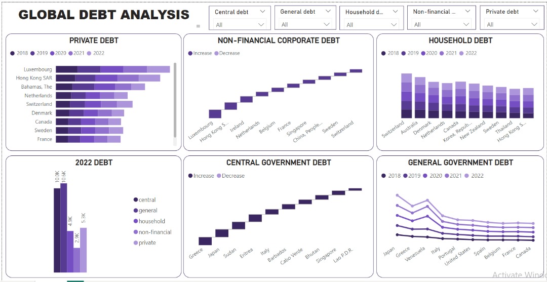
The global debt landscape reveals a delicate balance between leveraging debt for growth and mitigating associated risks. Data made simple, visuals made powerful: my not-so-latest dashboard. bit.ly/3K6It91 #DataAnalytics #Datavisualization #microsoftpowerbi
From #DataEntry to visual manipulation, participants are using Flourish to create visually appealing data visuals. Swipe through to see one participant’s beautiful work: 📊 Picture 1: Data entry 🧩 Picture 2: Visual manipulation 🎨 Picture 3: Final visual #DataVisualization

Every click, every open, every interaction holds a valuable piece of your audience's story. With Vertical Response's Advanced Reporting, those abstract data points transform into clear, actionable insights. Uncover powerful insights. #marketinginsights #datavisualization

Confused about which chart to use? 📊 Here’s your cheat sheet to choose the right graph for any data visualization! #DataVisualization #DataAnalysis #DataScience #Infographics
Why Visualizing #EnvironmentalData? 📊 Environmental data can be complex and overwhelming 🧩 Visuals simplify information for audiences 🔬 Data visualization bridges scientists and the public 💥 A well-designed chart can make a stronger impact than long text #DataVisualization
Finished modeling the impact of invasive species on local lake water quality for a class project.Seeing the impact of our work makes the long hours worth it. #StudentLife #DataVisualization #researcher
Beyond numbers, infographics help summarize information on a given topic — and they look even more beautiful. A good example is this article on plastics’ statistics ➡️ informationisbeautiful.net/visualizations… Data visualization makes data easy to understand and impactful. #DataVisualization
What is Data Visualization? It is the representation of information in the form of a chart, diagram, picture, etc. 📊 Data visualization can also be used as a reporting tool — helping journalists present facts clearly and creatively. #DataVisualization #DataDrivenJournalism

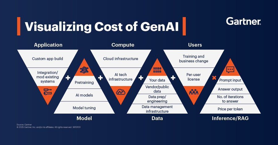
Here is a guide on the visualization cost of GenAI. Source @Gartner_inc #GenAI #ArtificialIntelligence #DataVisualization #GenAIInsights #TechInnovation #DigitalTransformation
It’s the final day of Phase 3 of our Environmental Reporting Skills for Impact training! Today, participants are visiting @statisticsRW to explore how data is processed and transformed into visuals that make complex information easy to understand. #DataVisualization
This is not the only participant who created amazing visuals with Flourish. Check out this one too! 📊 Picture 1: Data entry 🧩 Picture 2: Visual manipulation 🎨 Picture 3: Final visual #DataVisualization
Raw data rarely speaks clearly. Visuals give it a voice 📊 The latest #DataViz Weekly shows great new examples: • Causes of death in reality vs. media • EU healthcare priorities • U.S. school redistricting • Religion & marriage in 🇦🇺 anychart.com/blog/2025/10/1… #DataVisualization


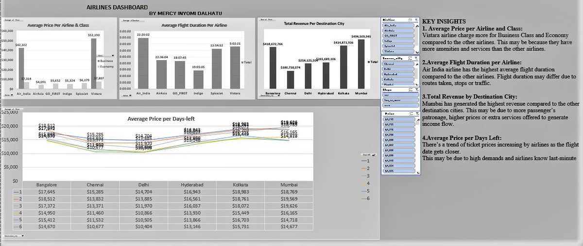
I’ve been working on improving my Excel skills and recently challenged myself with an Airlines Dataset. This new dashboard is a big step up from my very first one and that’s progress for me. Truly, consistency is the real key to improvement. #Excelskills #Datavisualization
I'm in my 𝗹𝗮𝘀𝘁 𝗱𝗮𝘆𝘀 of building dashboards for "him" 👀 So I'll be trying a 𝗹𝗼𝘁 𝗼𝗳 𝘀𝘁𝘂𝗳𝗳 in the coming months 🚀 Check out this 𝘄𝗶𝗿𝗲𝗳𝗿𝗮𝗺𝗲 and tell me what you think 👇 #Datafam #PowerBI #DataVisualization
How to NOT make a GDP growth bar chart. Scaling distorts & skews data comparisons with wonky scales in this one. This GDP growth bar chart makes 6.7% or 6.9% look way bigger vs 6.5%.Starting scales near data's min vs max values is a must for fair visuals/charts #DataVisualization
Something went wrong.
Something went wrong.
United States Trends
- 1. #CARTMANCOIN 1,727 posts
- 2. Broncos 66.3K posts
- 3. yeonjun 221K posts
- 4. Raiders 66.1K posts
- 5. Bo Nix 18.3K posts
- 6. Geno 18.7K posts
- 7. Sean Payton 4,796 posts
- 8. daniela 46.9K posts
- 9. #criticalrolespoilers 5,014 posts
- 10. #TNFonPrime 4,040 posts
- 11. Kehlani 9,704 posts
- 12. Kenny Pickett 1,511 posts
- 13. #Pluribus 2,762 posts
- 14. Pete Carroll 1,991 posts
- 15. Bradley Beal 3,592 posts
- 16. Jalen Green 7,665 posts
- 17. Chip Kelly 1,986 posts
- 18. TALK TO YOU OUT NOW 27.9K posts
- 19. #PowerForce N/A
- 20. Danny Brown 3,090 posts