#datavisualization kết quả tìm kiếm

Herramientas IA para Visualización de datos 🌟 En los últimos meses he estado experimentando bastante con plataformas de IA para distintas funciones dentro de la Visualización de datos Las que mejor resultado me dan 👇 : #AI #dataviz #datavisualization


Why Visualizing #EnvironmentalData? 📊 Environmental data can be complex and overwhelming 🧩 Visuals simplify information for audiences 🔬 Data visualization bridges scientists and the public 💥 A well-designed chart can make a stronger impact than long text #DataVisualization


Beyond numbers, infographics help summarize information on a given topic — and they look even more beautiful. A good example is this article on plastics’ statistics ➡️ informationisbeautiful.net/visualizations… Data visualization makes data easy to understand and impactful. #DataVisualization


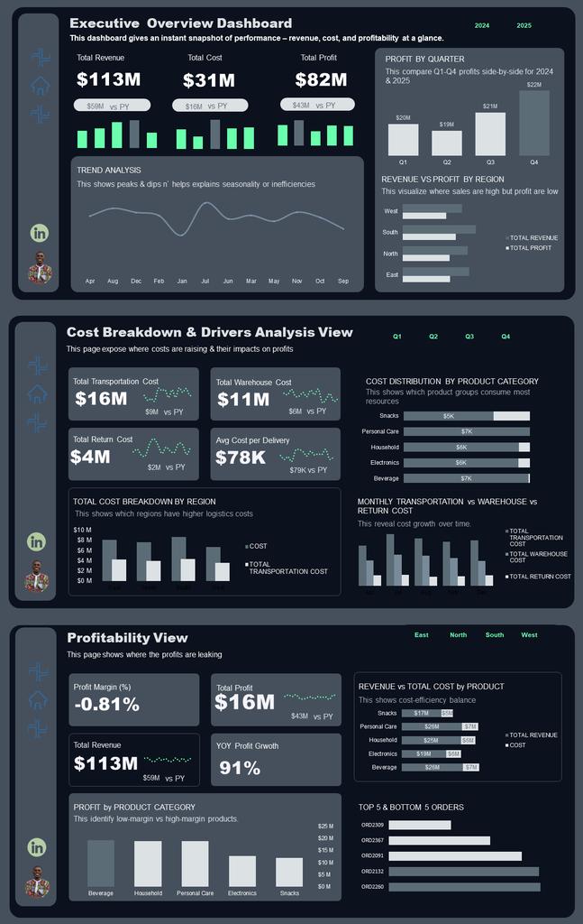
From raw data to clarity 🌍📊 Here’s a Revenue Dashboard I built in Power BI — tracking revenue, profit, and customer insights across states and categories. #PowerBI #DataAnalytics #DataVisualization #BI #Dashboard @analystxcel


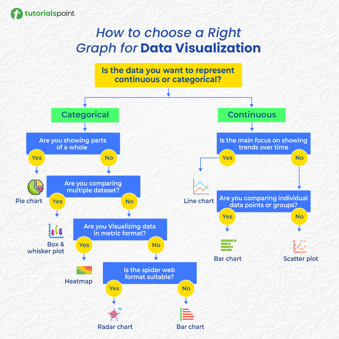
Confused about which chart to use? 📊 Here’s your cheat sheet to choose the right graph for any data visualization! #DataVisualization #DataAnalysis #DataScience #Infographics
Led by our trainer TABARO Jean de la Croix, participants are learning how to use data visualization tools to enhance storytelling and increase the impact of their environmental reporting. 📊 #DataVisualization #EnvironmentalReporting #Storytelling


What is Data Visualization? It is the representation of information in the form of a chart, diagram, picture, etc. 📊 Data visualization can also be used as a reporting tool — helping journalists present facts clearly and creatively. #DataVisualization #DataDrivenJournalism


5️⃣ Easy Data Visualization with Matplotlib 📈 Turn data into stunning visual stories. Visualizations help you see what the numbers can’t say. Visualize trends Spot patterns Present insights #Matplotlib #DataVisualization


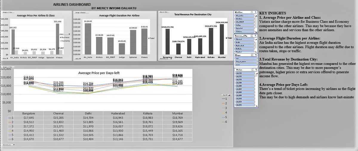
I’ve been working on improving my Excel skills and recently challenged myself with an Airlines Dataset. This new dashboard is a big step up from my very first one and that’s progress for me. Truly, consistency is the real key to improvement. #Excelskills #Datavisualization

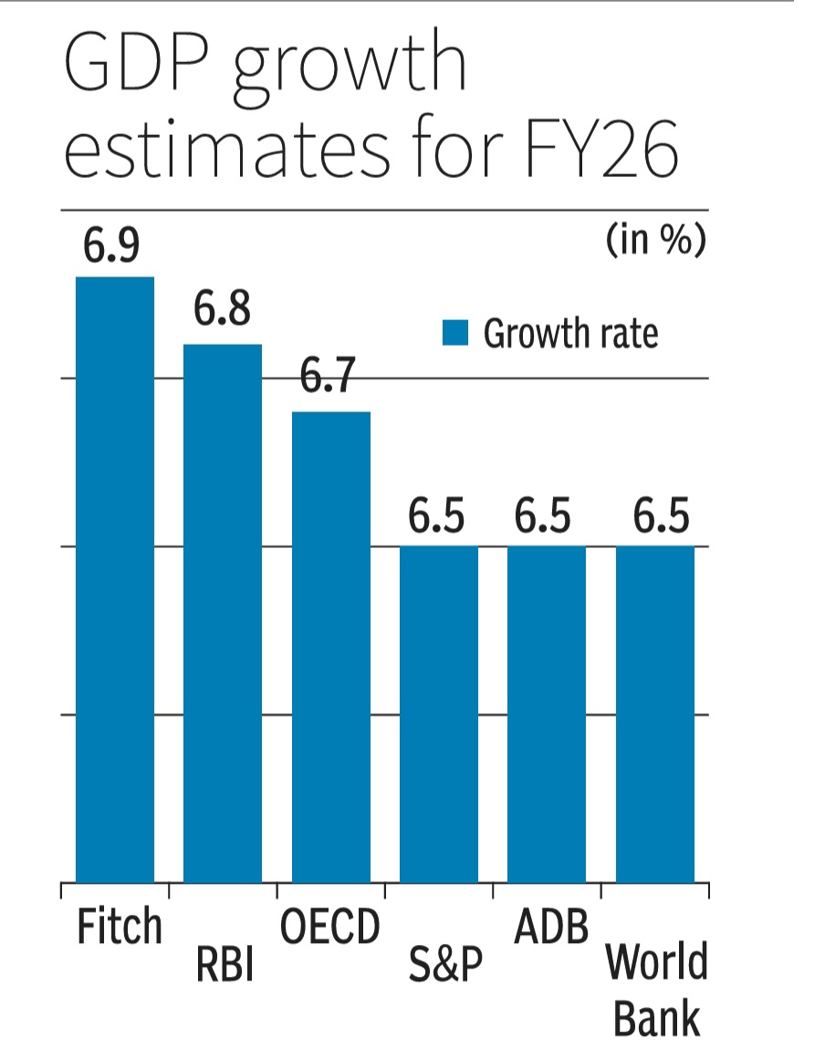
How to NOT make a GDP growth bar chart. Scaling distorts & skews data comparisons with wonky scales in this one. This GDP growth bar chart makes 6.7% or 6.9% look way bigger vs 6.5%.Starting scales near data's min vs max values is a must for fair visuals/charts #DataVisualization

October Dashboard & Report Dump ✨🚀 This month projects was solely on supply chain and logistics, who knows what November projects might be? Tools: @msexcel November up next 🚀 #Datavisualization #Microsoft365 #microsoftdeveloper #BusinessIntelligence #ExcelSpecialist
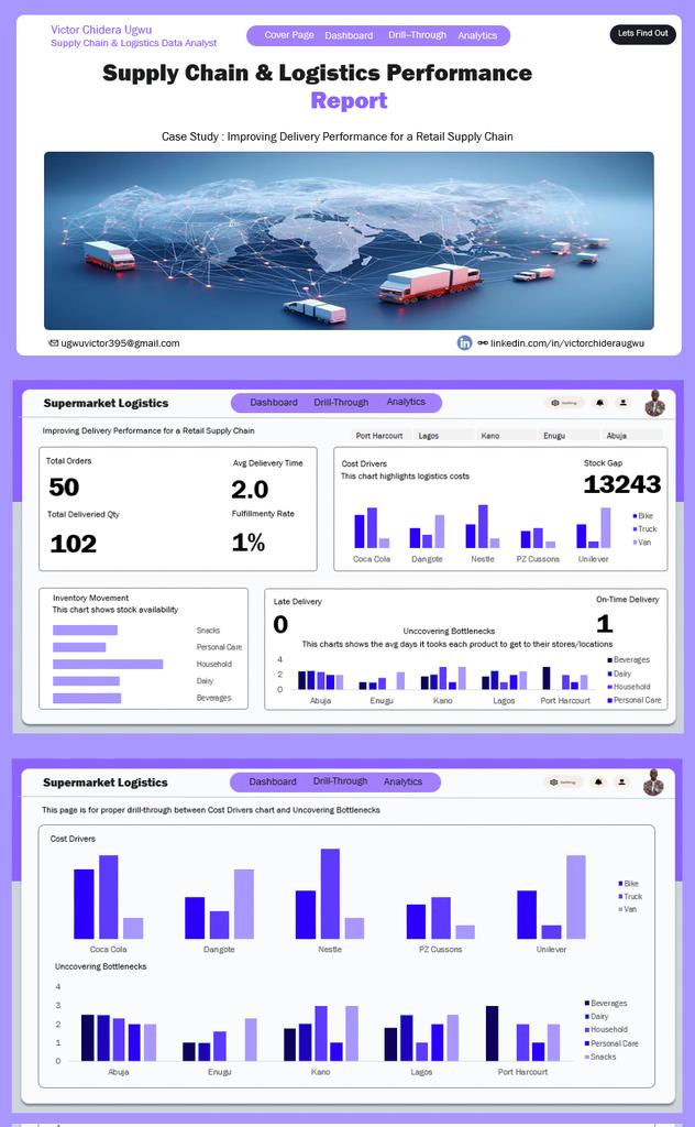


Two months left in 2025. Let’s wrap it up and finish strong 💪✨ October Dashboard & Report Dump Edition 📊 Show workings…let’s go😊 🚀 #datafam
It was a day filled with intensive learning on how to use #Datavisualization in environmental reporting But why is this even important? Learn more from today's highlights ⤵️ @EnvironmentRw @REMA_Rwanda @GovernanceRw @jbrushingabigwi @ankiwood @anneliefrank @SwedeninRW @fojo_int
“I don’t see these as mere trainings, but as opportunities to gain knowledge that enhances reporting. The skills learned here can help transform a five-page story into a simple yet powerful poster.” — Assoumani Ntakirutimana, Fojo Rwanda Media Programme #DataVisualization


It’s fascinating to see how AI evolved—from a simple digital helper to a force shaping science. In our new interactive landing, we visualized this journey through data, storytelling, and design that bridges the past and the future. #AI #DataVisualization

Power BI can visualize your data just a little differently, here's how The Power BI Visual Marketplace lets you move beyond standard charts with custom visuals like Word Clouds, Zebra BI tables, and even niche infographics. #PowerBI #DataVisualization

Raw data rarely speaks clearly. Visuals give it a voice 📊 The latest #DataViz Weekly shows great new examples: • Causes of death in reality vs. media • EU healthcare priorities • U.S. school redistricting • Religion & marriage in 🇦🇺 anychart.com/blog/2025/10/1… #DataVisualization


📊 Don't just look at data. See the story. Register for a class TODAY! Send us a DM or call to get started. 📞 09061420093 #UptechAcademy #DataVisualization #DataAnalysis #DataAnalytics #PowerBI #Tableau #DigitalSkills #TechTraining #Lagos #LearnTech #Dat


#OmniCerveau #CerveauPlanétaire #DataVisualization #VeilleStratégique #IntelligenceCollective #OSINT #IA #Innovation #GeoInt #NewsAnalytics #RealtimeNews #UXDesign


Let us bring your data to life—share your requirements at [email protected] and discover the impact of intelligent visualization. #datavisualization #dataprocessing #charting #dataviz #dataanalytics #decodemr #oncofocus #healthcare #marketresearch

#OmniCerveau #CerveauPlanétaire #DataVisualization #VeilleStratégique #IntelligenceCollective #OSINT #IA #Innovation #GeoInt #NewsAnalytics #RealtimeNews #UXDesign

5️⃣ Easy Data Visualization with Matplotlib 📈 Turn data into stunning visual stories. Visualizations help you see what the numbers can’t say. Visualize trends Spot patterns Present insights #Matplotlib #DataVisualization

📈 Master Power BI with Expert-Led Training at myTectra! 💻✨ 📞 Call Now: +91 8047112411 🌐 Learn More: mytectra.com/power-bi-train… #powerbi #powerbitraining #datavisualization #businessintelligence #dataanalytics #microsoftpowerbi #onlinetraining #dataanalysis #mytectra


Worried about Data Visualization for Field Management? Dynamics 365 + Azure Maps Has You Covered! youtube.com/shorts/_-GKZgP… #DataVisualization #FieldManagement #AzureMaps

youtube.com
YouTube
Worried about Data Visualization for Field Management? Dynamics 365 +...

📊🚀 #SankeyMasterMonday #DataVisualization Get ready to master the visual storytelling with #Sankey Charts! 🚀🇮🇹 In our latest post, we dive deep into the art of #sankeymaster #sankey 👉apps.apple.com/app/apple-stor…


Ever wondered how tall Godzilla really is? Turns out, he could give Taipei 101 a serious stare-down—but Burj Khalifa still wins the height game. #GodzillaDay #Godzilla #datavisualization shorturl.at/g9oyU


¿Sabes cómo resaltar datos clave en tus reportes de Zoho Analytics? Descubre cómo usar el formato condicional para identificar rápidamente la información más importante en tus tablas y vistas dinámicas. El video aquí: zurl.co/v0skH #ZohoAnalytics #DataVisualization


🗺️🔥 Bulgaria is a chord, not a note—alpine peaks, hot springs, and ski towns all within a day’s drive. We mapped the ridges, the bubbles, and the slopes. Dive in. mapthos.org/blog/bulgaria-… #Mapthos #DataVisualization #Bulgaria #TravelData


I'm glad you found my website helpful in creating your chart. If you have any questions or need further assistance, feel free to reach out. #Chart #Website #DataVisualization


Make your Excel sheets interactive in seconds! ⚡ Use Radio Buttons to switch between Data Bars, Heat Maps, and more. No VBA needed, just pure Excel magic. ✨ 📌Get FREE Excel Tips Book! 📚 computergaga.com/free-downloads #ExcelTips #ExcelHacks #DataVisualization #MicrosoftExcel
It was a day filled with intensive learning on how to use #Datavisualization in environmental reporting But why is this even important? Learn more from today's highlights ⤵️ @EnvironmentRw @REMA_Rwanda @GovernanceRw @jbrushingabigwi @ankiwood @anneliefrank @SwedeninRW @fojo_int
``` 🎉 SankeyMaster Alert! 🎉 Discover the power of #SankeyCharts with our latest tutorial! Visualize complex data flows like a pro. #DataVisualization #DataScience #TechTips 📊✨ #sankeymaster #sankey 👉apps.apple.com/app/apple-stor…

𝐄𝐦𝐩𝐨𝐰𝐞𝐫 𝐲𝐨𝐮𝐫 𝐛𝐮𝐬𝐢𝐧𝐞𝐬𝐬 𝐯𝐢𝐬𝐢𝐨𝐧 𝐰𝐢𝐭𝐡 𝐓𝐫𝐢𝐦𝐩𝐥𝐢𝐧! 🤖 Boost productivity and streamline growth with tailored IT solutions, expert integration, and intuitive digital experiences. #AppDevelopment #DataVisualization #SoftwareDevelopment #DataAnalysis


Herramientas IA para Visualización de datos 🌟 En los últimos meses he estado experimentando bastante con plataformas de IA para distintas funciones dentro de la Visualización de datos Las que mejor resultado me dan 👇 : #AI #dataviz #datavisualization


Beyond numbers, infographics help summarize information on a given topic — and they look even more beautiful. A good example is this article on plastics’ statistics ➡️ informationisbeautiful.net/visualizations… Data visualization makes data easy to understand and impactful. #DataVisualization
Why Visualizing #EnvironmentalData? 📊 Environmental data can be complex and overwhelming 🧩 Visuals simplify information for audiences 🔬 Data visualization bridges scientists and the public 💥 A well-designed chart can make a stronger impact than long text #DataVisualization
From raw data to clarity 🌍📊 Here’s a Revenue Dashboard I built in Power BI — tracking revenue, profit, and customer insights across states and categories. #PowerBI #DataAnalytics #DataVisualization #BI #Dashboard @analystxcel
What is Data Visualization? It is the representation of information in the form of a chart, diagram, picture, etc. 📊 Data visualization can also be used as a reporting tool — helping journalists present facts clearly and creatively. #DataVisualization #DataDrivenJournalism
Confused about which chart to use? 📊 Here’s your cheat sheet to choose the right graph for any data visualization! #DataVisualization #DataAnalysis #DataScience #Infographics
I’ve been working on improving my Excel skills and recently challenged myself with an Airlines Dataset. This new dashboard is a big step up from my very first one and that’s progress for me. Truly, consistency is the real key to improvement. #Excelskills #Datavisualization

Every click, every open, every interaction holds a valuable piece of your audience's story. With Vertical Response's Advanced Reporting, those abstract data points transform into clear, actionable insights. Uncover powerful insights. #marketinginsights #datavisualization

Led by our trainer TABARO Jean de la Croix, participants are learning how to use data visualization tools to enhance storytelling and increase the impact of their environmental reporting. 📊 #DataVisualization #EnvironmentalReporting #Storytelling

Every memory a particle, every thought a wave. Beautifully capturing the ethereal energy of the human mind. #DataVisualization #EtherealArt #Memory


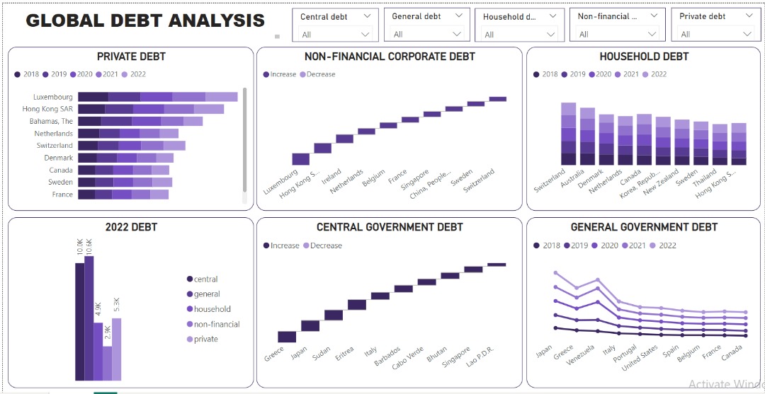
The global debt landscape reveals a delicate balance between leveraging debt for growth and mitigating associated risks. Data made simple, visuals made powerful: my not-so-latest dashboard. bit.ly/3K6It91 #DataAnalytics #Datavisualization #microsoftpowerbi

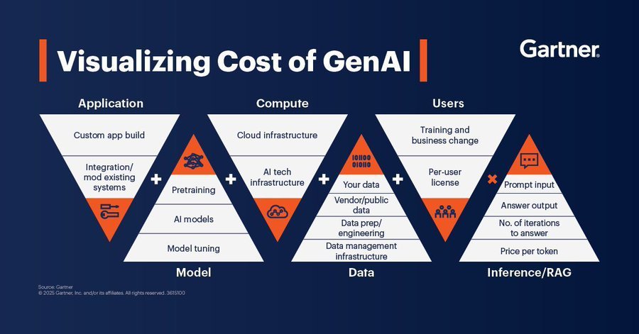
Here is a guide on the visualization cost of GenAI. Source @Gartner_inc #GenAI #ArtificialIntelligence #DataVisualization #GenAIInsights #TechInnovation #DigitalTransformation
Ever wondered how tall Godzilla really is? Turns out, he could give Taipei 101 a serious stare-down—but Burj Khalifa still wins the height game. #GodzillaDay #Godzilla #datavisualization shorturl.at/g9oyU

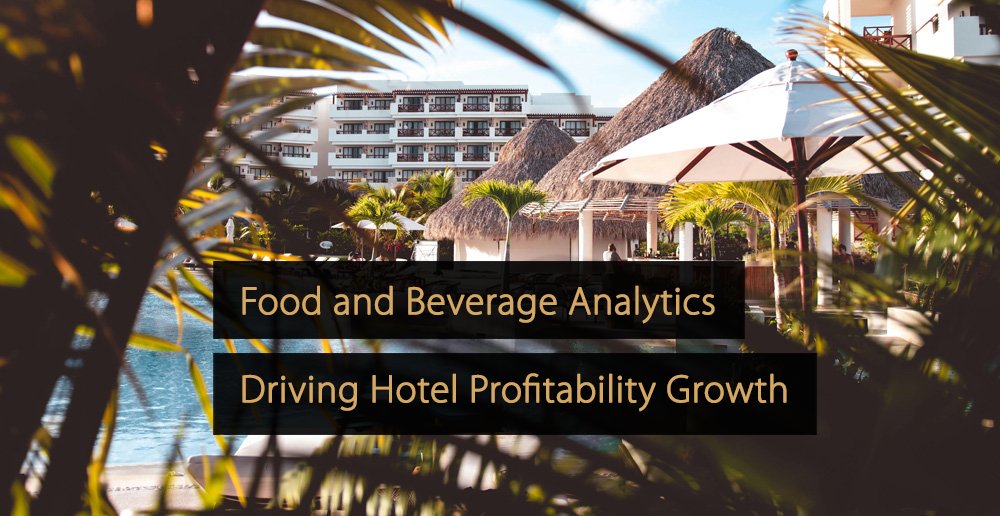
👉 In this article, you’ll learn strategies and tools to optimize F&B performance and profitability. #datavisualization #analytics #BI #hotel #hotelindustry #hospitality revfine.com/food-and-bever…
How to NOT make a GDP growth bar chart. Scaling distorts & skews data comparisons with wonky scales in this one. This GDP growth bar chart makes 6.7% or 6.9% look way bigger vs 6.5%.Starting scales near data's min vs max values is a must for fair visuals/charts #DataVisualization
Something went wrong.
Something went wrong.
United States Trends
- 1. Cowboys 67.9K posts
- 2. Nick Smith Jr 8,738 posts
- 3. Cardinals 30.3K posts
- 4. Kawhi 4,080 posts
- 5. #WWERaw 60.4K posts
- 6. #LakeShow 3,331 posts
- 7. Jerry 45.1K posts
- 8. Kyler 8,226 posts
- 9. Blazers 7,529 posts
- 10. Logan Paul 9,902 posts
- 11. No Luka 3,367 posts
- 12. Jacoby Brissett 5,416 posts
- 13. Jonathan Bailey 17.9K posts
- 14. Pickens 6,640 posts
- 15. Cuomo 170K posts
- 16. Javonte 4,272 posts
- 17. Koa Peat 6,191 posts
- 18. Valka 4,427 posts
- 19. AJ Dybantsa 1,648 posts
- 20. Bronny 14.7K posts