#datavisualization نتائج البحث


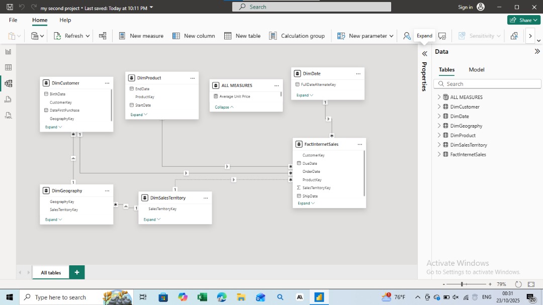
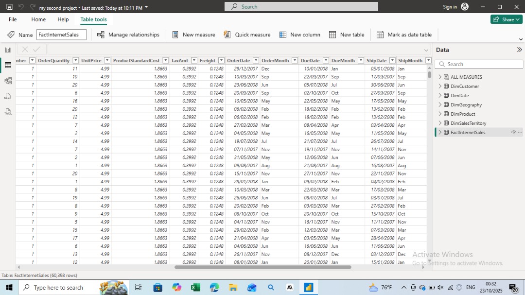
I recently built an interactive Power BI dashboard to analyze business performance and uncover key insights from raw data. #PowerBI #DataAnalysis #DataVisualization #BusinessIntelligence #Analytics #DataDriven #DashboardDesign
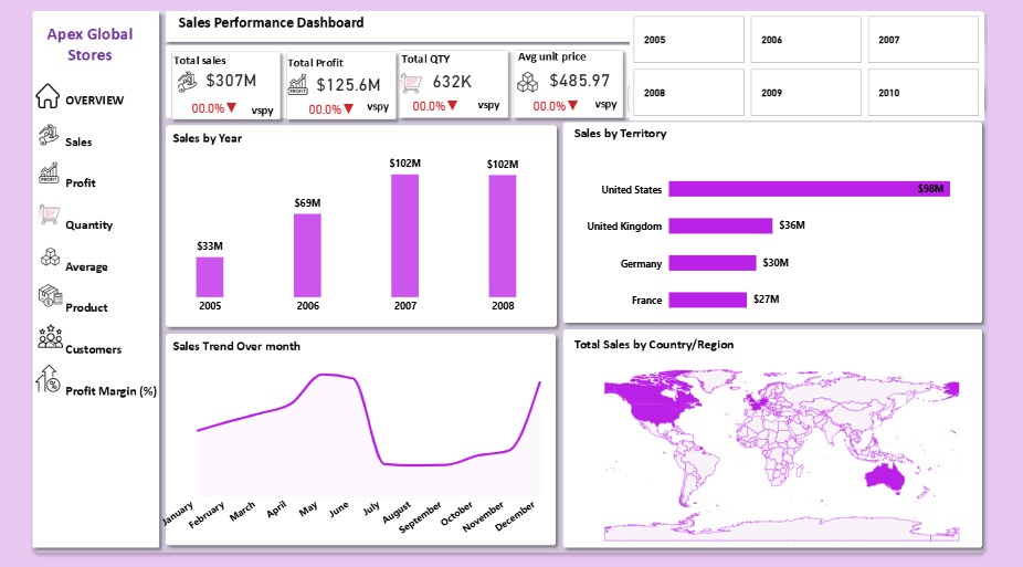
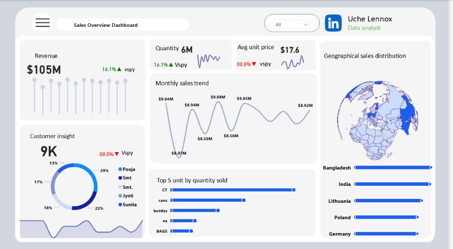
Just wrapped up my Power BI Sales Dashboard 📊 Bringing data to life with KPIs, trends, and geographical insights 🌍 #PowerBI #DataAnalyst #DataVisualization

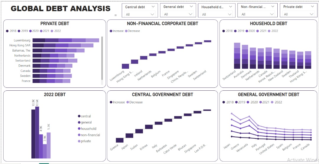
The global debt landscape reveals a delicate balance between leveraging debt for growth and mitigating associated risks. Data made simple, visuals made powerful: my not-so-latest dashboard. bit.ly/3K6It91 #DataAnalytics #Datavisualization #microsoftpowerbi

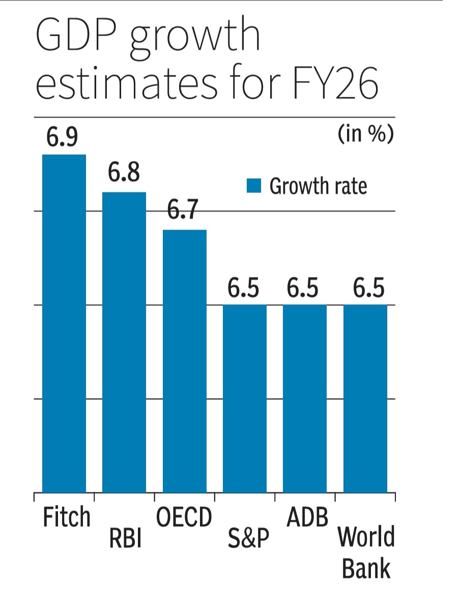
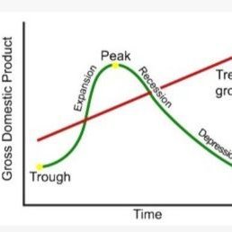
How to NOT make a GDP growth bar chart. Scaling distorts & skews data comparisons with wonky scales in this one. This GDP growth bar chart makes 6.7% or 6.9% look way bigger vs 6.5%.Starting scales near data's min vs max values is a must for fair visuals/charts #DataVisualization

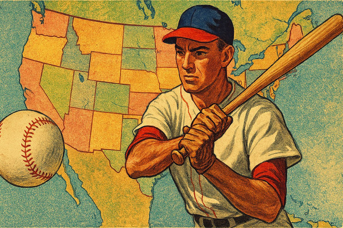
⚾️ How did America really watch the 2025 MLB Fall Classic? From Dodgers Nation in the West to Blue Jays pride in the East — the data tells the story. 👉 mapthos.org/blog/mlb-fall-… #Mapthos #DataVisualization #MLB #SportsAnalytics

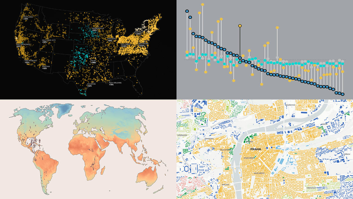
See how visualization brings data to life ✨ #DataVizWeekly spotlights four compelling new projects: 🕊️ Bird migration & climate 💵 U.S. living costs ⚡ AI & electricity prices 🏙️ Urban patterns in Europe 👉 anychart.com/blog/2025/10/1… #DataVisualization #DataAnalytics #DataViz

Herramientas IA para Visualización de datos 🌟 En los últimos meses he estado experimentando bastante con plataformas de IA para distintas funciones dentro de la Visualización de datos Las que mejor resultado me dan 👇 : #AI #dataviz #datavisualization


While data accuracy is paramount in Power BI, the aesthetics of reports significantly impact user engagement. Neglecting UI/UX can hinder the effectiveness of even the most accurate data presentation. #PowerBI #DataVisualization youtube.com/watch?v=i3ZBlE…

Turning complex data into PR wins: How visualization shapes modern storytelling (Deza Drone) hubs.ly/Q03J4c570 #PR #DataVisualization #PRtips


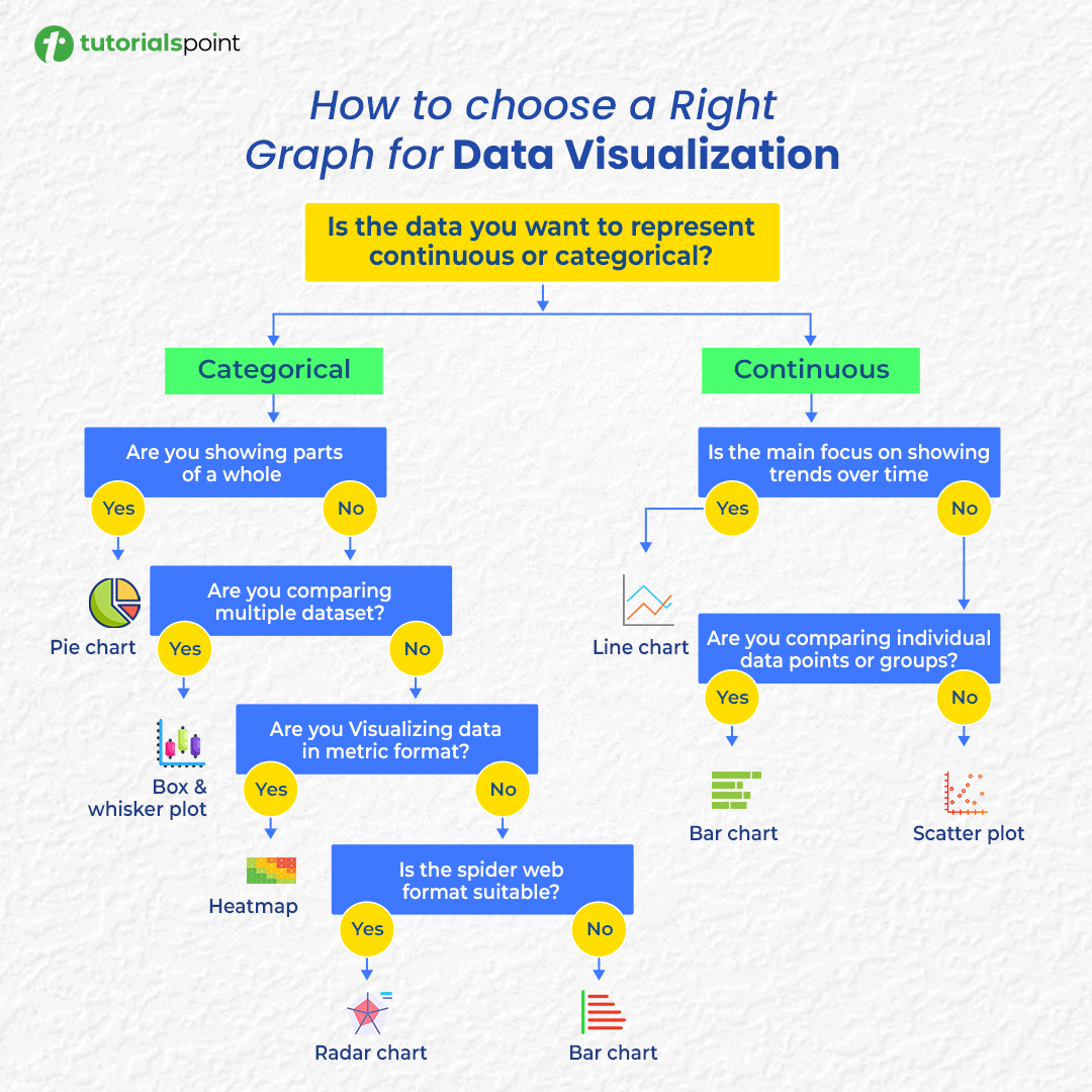
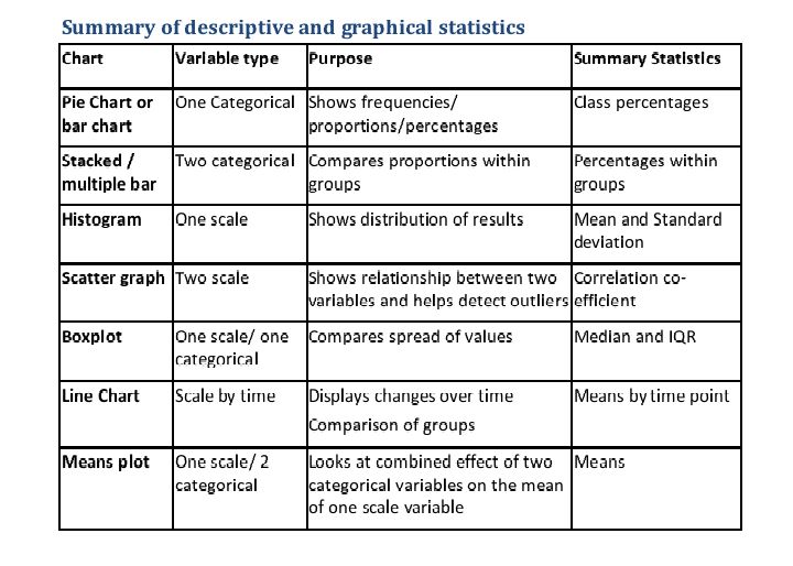
Confused about which chart to use? 📊 Here’s your cheat sheet to choose the right graph for any data visualization! #DataVisualization #DataAnalysis #DataScience #Infographics
Some Power BI visual features, especially core ones, need to be part of the product itself. Users shouldn't have to seek external solutions for basic visual needs like conditional formatting in a matrix. #PowerBI #DataVisualization youtube.com/watch?v=i3ZBlE…

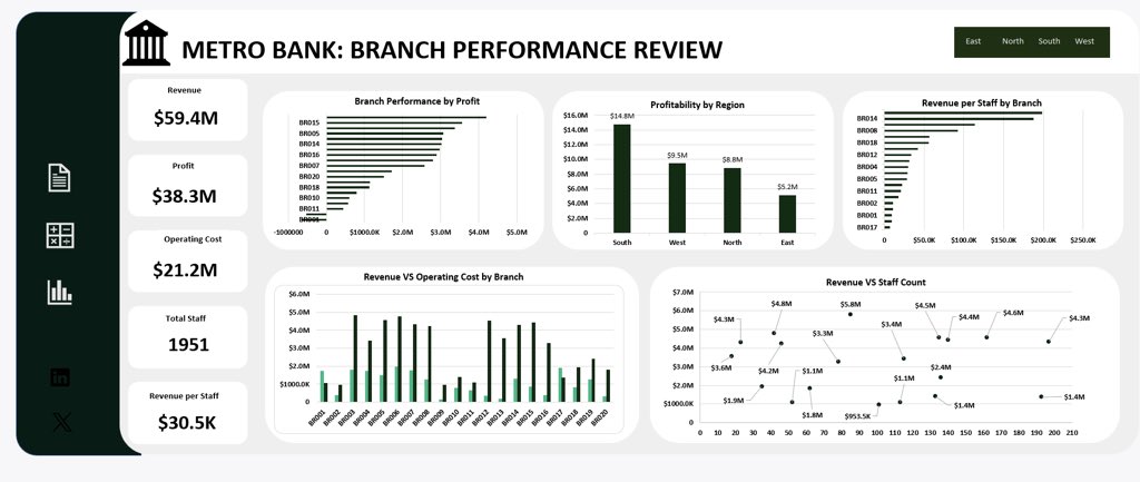
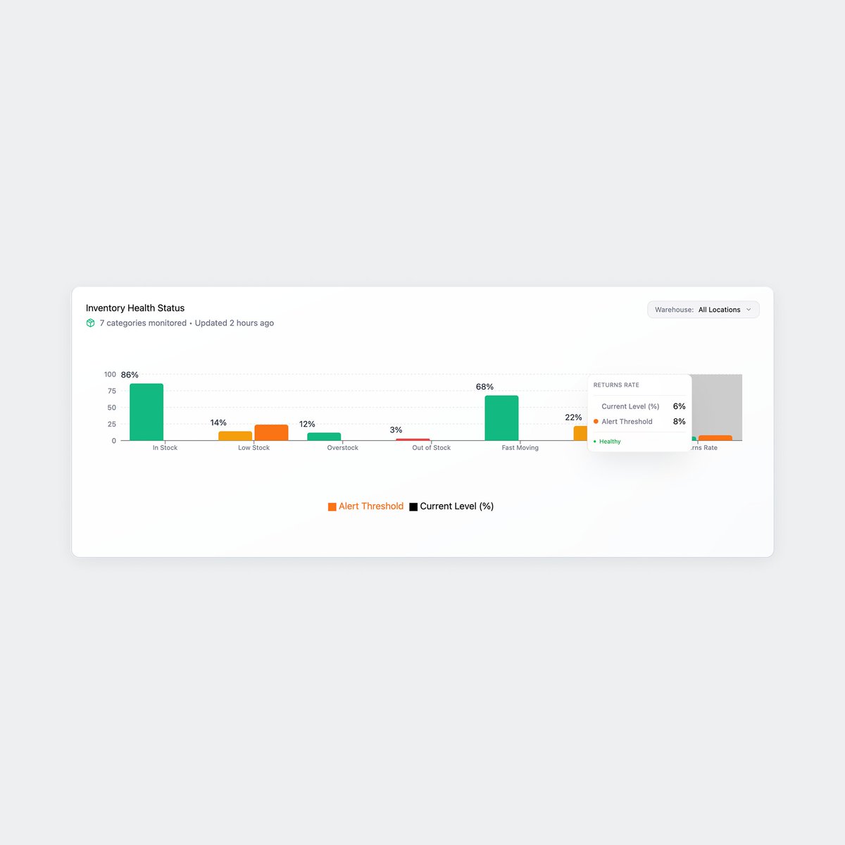
Wrapping up Week 4 of the Metro Bank Analytics Challenge! 📊 This week's dashboard dives deep into branch performance, analyzing profitability, efficiency, and costs to inform strategic decisions.#DataAnalytics #DataVisualization #Excel #MetroBank #LetsTalkExcelWithFreedom

BI tools often add cost, complexity & integration headaches. But when Power BI is built into your accounting system, you get: ✅ Real-time financials ✅ Seamless reporting ✅ Enterprise-wide insights bit.ly/42rT30E #GravityAccounting #DataVisualization #FinanceLeaders

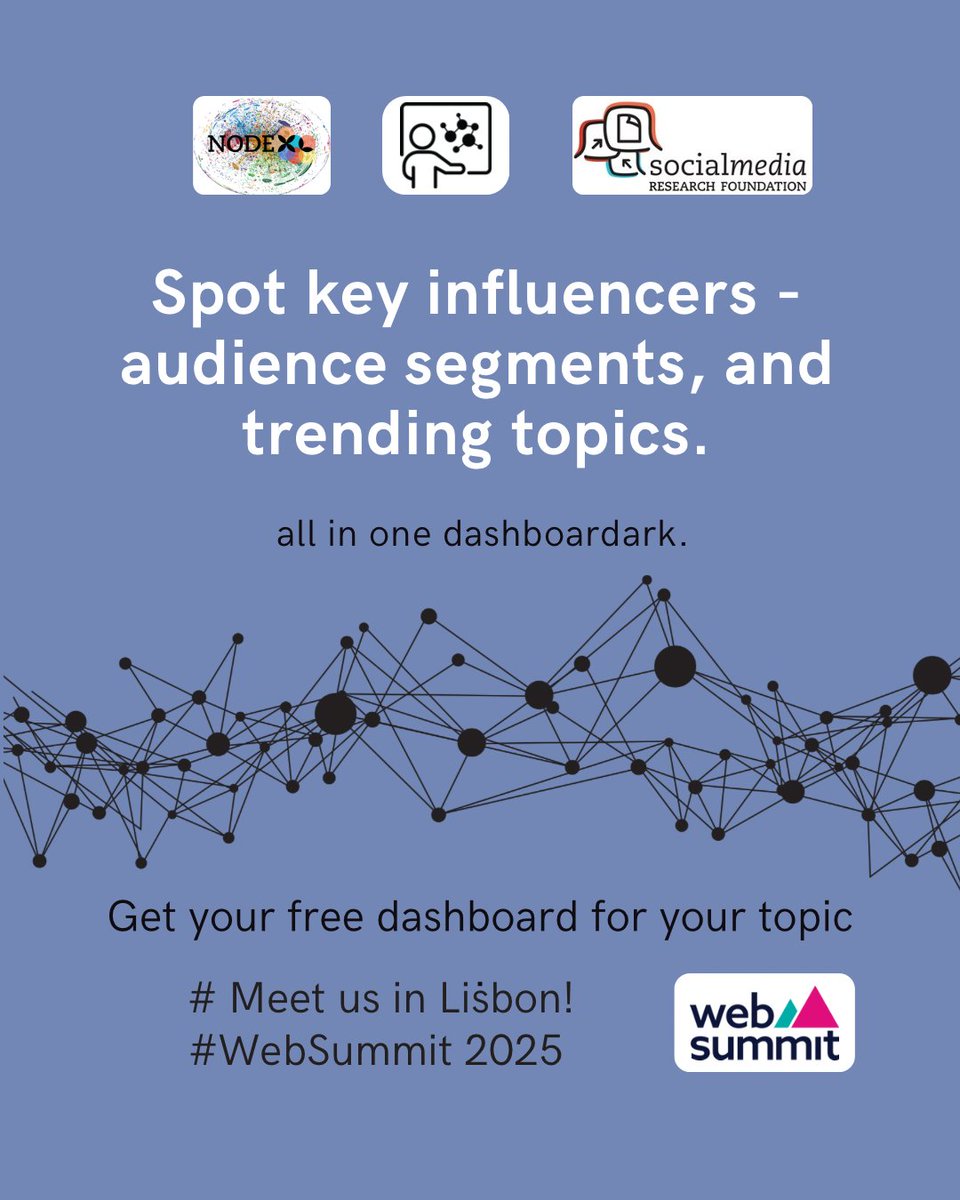
Going to WebSummit Lisbon? 🌍 Let’s talk data, networks, and insights with NodeXL Pro! Book Now : nuel.ink/cMta10 #DataVisualization #SocialMediaAnalysis #NodeXLPro #InfluenceMapping #TrendSpotting #AnalyticsTools
Raw data rarely speaks clearly. Visuals give it a voice 📊 The latest #DataViz Weekly shows great new examples: • Causes of death in reality vs. media • EU healthcare priorities • U.S. school redistricting • Religion & marriage in 🇦🇺 anychart.com/blog/2025/10/1… #DataVisualization

WebSummit isn’t just an event — it’s a network 🌐 See who’s driving the buzz with NodeXL Pro Book Now : nuel.ink/cMta10 #DataVisualization #SocialMediaAnalysis #NodeXLPro #InfluenceMapping #TrendSpotting #AnalyticsTools


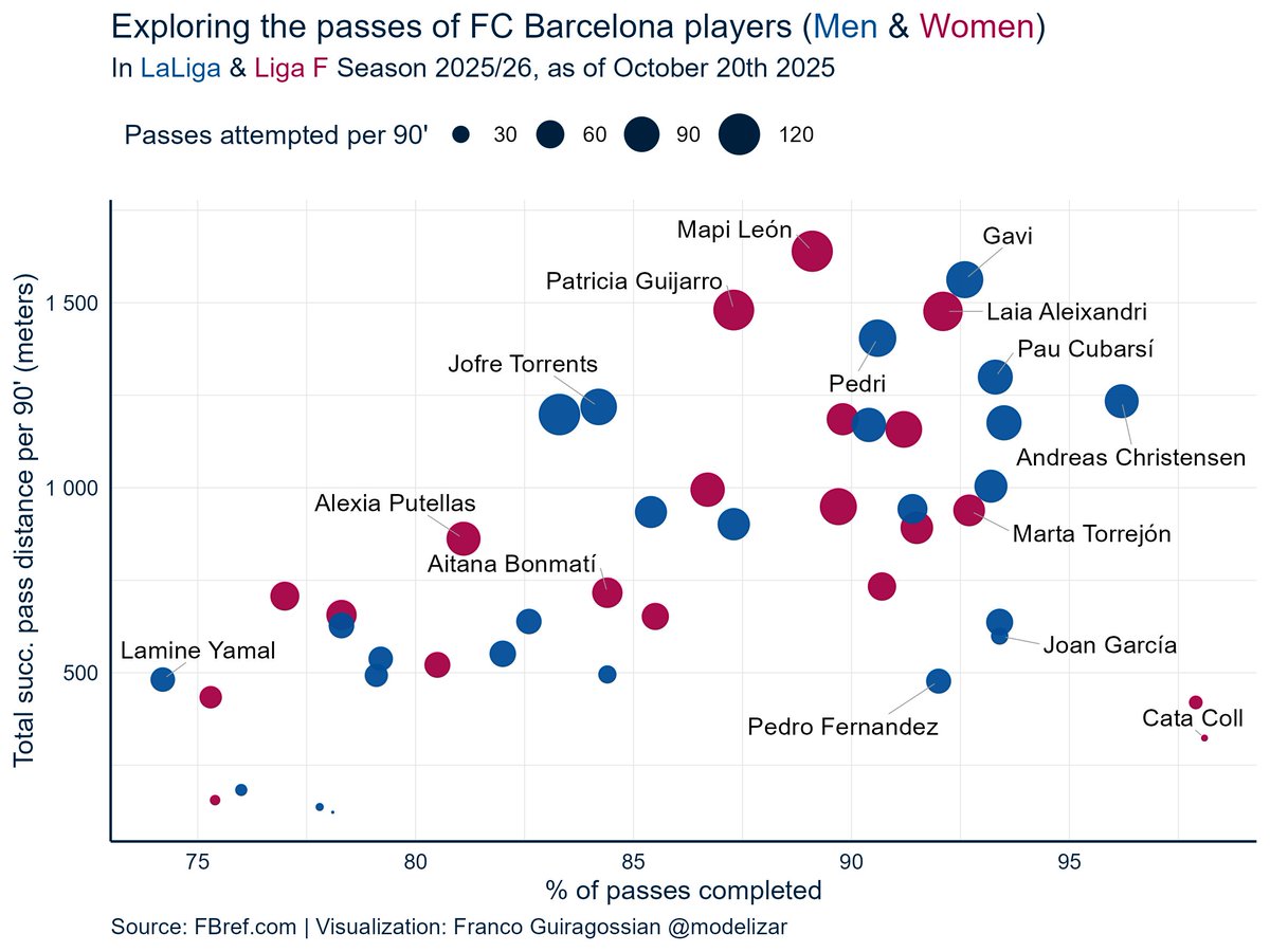
I was curious about the passing stats of @FCBarcelona_es and @FCBfemeni so far. Mapi León has the highest avg. successful pass distance per 90', while Andreas Christensen is the most accurate non-GK passer. #Datavisualization #LaLiga #LigaF #FCBarcelona

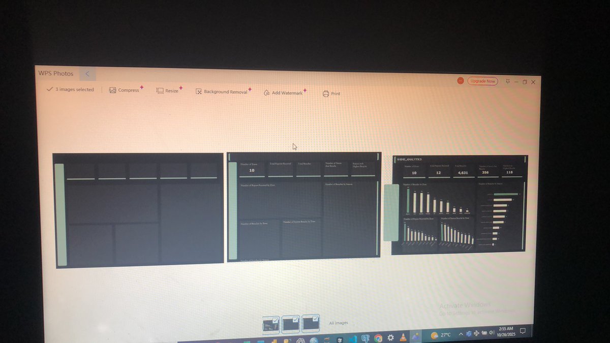
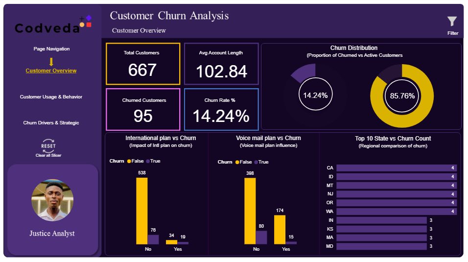
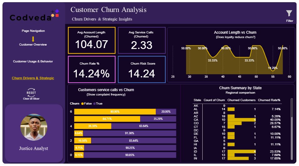
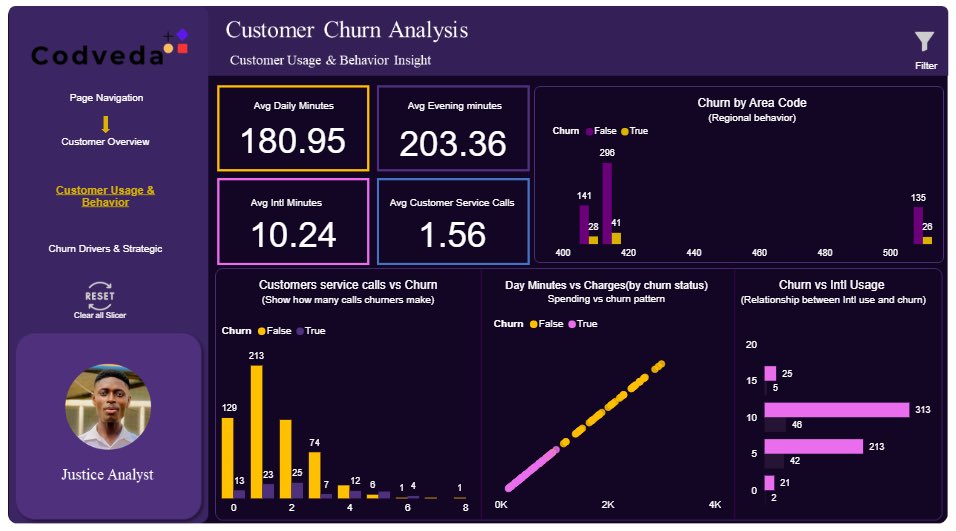
Completed Task 3 of my Codveda internship! Designed an interactive Power BI dashboard to uncover what drives customer churn #DataAnalytics #PowerBI #DataVisualization #CustomerChurn #Internship #Codveda #DAX #DataSci

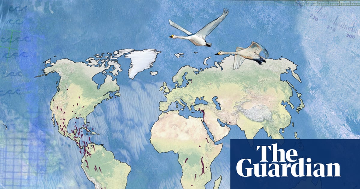
#BirdMigration is changing. What does this reveal about our planet? ow.ly/Y5jn50XelWo #DataVisualization #MigratoryBirds #Ornithology @Guardian @AudubonSociety

WebSummit isn’t just an event — it’s a network 🌐 See who’s driving the buzz with NodeXL Pro Book Now : nuel.ink/cMta10 #DataVisualization #SocialMediaAnalysis #NodeXLPro #InfluenceMapping #TrendSpotting #AnalyticsTools
WebSummit isn’t just an event — it’s a network 🌐 See who’s driving the buzz with NodeXL Pro Book Now : nuel.ink/cMta10 #DataVisualization #SocialMediaAnalysis #NodeXLPro #InfluenceMapping #TrendSpotting #AnalyticsTools

WebSummit isn’t just an event — it’s a network 🌐 See who’s driving the buzz with NodeXL Pro Book Now : nuel.ink/cMta10 #DataVisualization #SocialMediaAnalysis #NodeXLPro #InfluenceMapping #TrendSpotting #AnalyticsTools


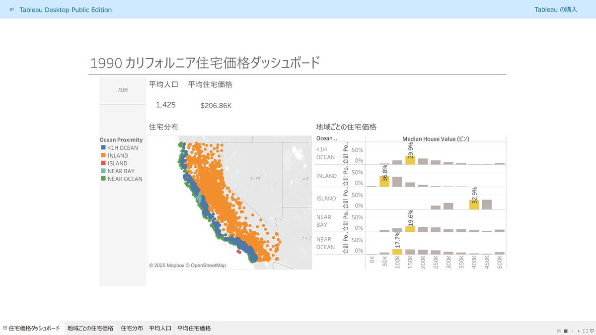
1990年カリフォルニア住宅価格データ(20,640地区)をTableauで可視化しました🏘️ 機械学習の定番データセットを地図上で見ると、また違った発見がありますね。 public.tableau.com/views/1990_176… #DataVisualization #Tableau #CaliforniaHousing
Your data deserves better visuals! This quick guide shows which chart to use and why — from pie charts to scatter graphs. Turn numbers into insights Follow for more quick lessons. #DataVisualization #ResearchTips #DataScience #LearnWithMe #QuantitativeResearch #StatsSimplified
⚾️ How did America really watch the 2025 MLB Fall Classic? From Dodgers Nation in the West to Blue Jays pride in the East — the data tells the story. 👉 mapthos.org/blog/mlb-fall-… #Mapthos #DataVisualization #MLB #SportsAnalytics

Line charts show trends over time. Bar charts highlight comparisons. Do you choose your charts strategically or just go with what feels right? #DataVisualization #ChartTips #BusinessIntelligence #DataDriven #MarketingMetrics #DecisionMaking

Data shouldn’t sit still. @Nitrograph turns analytics into motion — real-time, intelligent, and visual. #Nitrograph #AI #DataVisualization


Herramientas IA para Visualización de datos 🌟 En los últimos meses he estado experimentando bastante con plataformas de IA para distintas funciones dentro de la Visualización de datos Las que mejor resultado me dan 👇 : #AI #dataviz #datavisualization
The global debt landscape reveals a delicate balance between leveraging debt for growth and mitigating associated risks. Data made simple, visuals made powerful: my not-so-latest dashboard. bit.ly/3K6It91 #DataAnalytics #Datavisualization #microsoftpowerbi
I recently built an interactive Power BI dashboard to analyze business performance and uncover key insights from raw data. #PowerBI #DataAnalysis #DataVisualization #BusinessIntelligence #Analytics #DataDriven #DashboardDesign

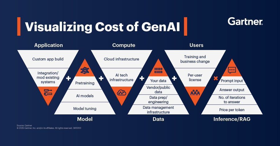
Here is a guide on the visualization cost of GenAI. Source @Gartner_inc #GenAI #ArtificialIntelligence #DataVisualization #GenAIInsights #TechInnovation #DigitalTransformation
Just wrapped up my Power BI Sales Dashboard 📊 Bringing data to life with KPIs, trends, and geographical insights 🌍 #PowerBI #DataAnalyst #DataVisualization
Explore this #Infographic to learn about the pros and cons of #PowerBI! Via @Learnbay #DataVisualization #BusinessIntelligence #DataAnalytics #Analytics #TechTools #DataInsights #BusinessAnalytics cc: @PawlowskiMario @mvollmer1 @gvalan


👉 In this article, you’ll learn strategies and tools to optimize F&B performance and profitability. #datavisualization #analytics #BI #hotel #hotelindustry #hospitality revfine.com/food-and-bever…


How Kontron AIS & TeeChart for .NET Power Smart Industry Blog post: steema.com/wp/blog/2025/1… #chartinglibraries #datavisualization #industrialautomation #performancemonitoring #dotnet #dataanalytics #smartfactories

How to NOT make a GDP growth bar chart. Scaling distorts & skews data comparisons with wonky scales in this one. This GDP growth bar chart makes 6.7% or 6.9% look way bigger vs 6.5%.Starting scales near data's min vs max values is a must for fair visuals/charts #DataVisualization

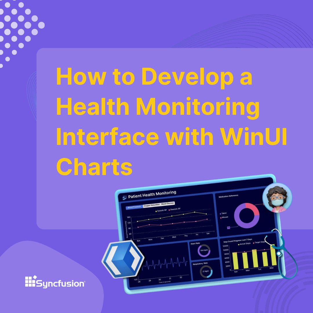
Build a responsive health dashboard using Syncfusion® WinUI controls to track vitals, activity, and medication in real time. Each chart delivers clear insights and a dynamic user experience. ➡️ First up: Display Patient Vitals with Gauges 👇 #WinUI #HealthTech #DataVisualization…
In today’s information-saturated environment, words alone are not enough. Data visualization transforms raw numbers into clear visuals. PR pros can craft stories that simplify complexity, and boost media impact. (Deza Drone) hubs.ly/Q03J4dkB0 #PR #DataVisualization #PRtips

Turning complex data into PR wins: How visualization shapes modern storytelling (Deza Drone) hubs.ly/Q03J4c570 #PR #DataVisualization #PRtips
Something went wrong.
Something went wrong.
United States Trends
- 1. Brian Kelly 11.8K posts
- 2. #VERZUZ 49.7K posts
- 3. Yamamoto 52.6K posts
- 4. Birdman 13.2K posts
- 5. No Limit 32.9K posts
- 6. Mia X 593K posts
- 7. Cash Money 28.3K posts
- 8. Wayne 37.7K posts
- 9. Michigan 38.2K posts
- 10. Death Valley 4,165 posts
- 11. #GoBlue 3,486 posts
- 12. Texas A&M 11.2K posts
- 13. Turk 589K posts
- 14. #HalloweenHavoc 48.1K posts
- 15. Aggies 4,438 posts
- 16. Salter 1,295 posts
- 17. Jonas Brothers 6,579 posts
- 18. Tamar 8,119 posts
- 19. Snoop 10.8K posts
- 20. Jonathan Smith N/A