#datavisualization 検索結果


Using the data to tell the thrilling story of humanity’s journey to the stars 🌌 I built a dashboard tracking all space missions launches (1957–2022) Full documentation: mavenshowcase.com/project/53981 Data truly tells our journey to the stars. #DataVisualization #Excel #Datafam


My biggest fear? Writing code and getting hit with a long trail of errors. Heart skips a beat instantly. But we move; errors won’t stop the grind. I'm enjoying the Python libraries. #DataAnalytics #Python #datavisualization


#30DayMapChallenge Day 6 – Dimensions Taking our maps to the next dimension! #GIS #DataVisualization #Dimensions #3DMapping #Geospatial #UrbanPlanning #Cartography

A dashboard should be both insightful and informative , but great design matters too. Sharing the before-and-after transformation of my dashboard. Let’s call it progress. See you next time! #DataAnalytics #DataVisualization


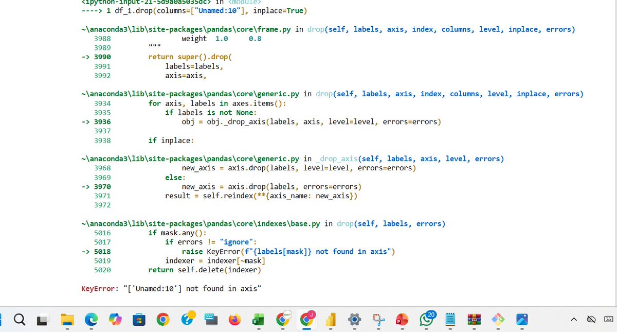
Confused about which chart to use? 📊 Here’s your cheat sheet to choose the right graph for any data visualization! #DataVisualization #DataAnalysis #DataScience #Infographics

Interactive Chart visualization improves clarity and helps users interpret data more effectively. React Charts help you visualize complex data with smooth performance and built-in interactivity. Here’s what makes it powerful 👇 #ReactJS #DataVisualization #WebDevelopment…

I'm in my 𝗹𝗮𝘀𝘁 𝗱𝗮𝘆𝘀 of building dashboards for "him" 👀 So I'll be trying a 𝗹𝗼𝘁 𝗼𝗳 𝘀𝘁𝘂𝗳𝗳 in the coming months 🚀 Check out this 𝘄𝗶𝗿𝗲𝗳𝗿𝗮𝗺𝗲 and tell me what you think 👇 #Datafam #PowerBI #DataVisualization


Explore every map from our #30DayMapChallenge collection — all in one place. From 3D cityscapes to air quality visualizations, see what’s possible when developers build with Mapbox. 🌍 👉 mapbox.com/30daymapchalle… #BuiltWithMapbox #DataVisualization


Pernah ngerasa hidup kuliah tuh nggak jauh-jauh dari buka HP? 🤭 Ternyata, kebiasaan itu bukan kamu doang, lho. Kalau kamu sendiri, aplikasi mana yang paling susah kamu tinggalin? Drop di komen ya! 👇🔥 #PopSurvey #DibantuPopSurvey #Datavisualization #mahasiswa #GenZ


Week 3 of the Metro Bank Analytics Challenge at #LetsTalkExcelWithFreedom This week’s focus: Transactions. Built KPIs, tested insights with Pivot Tables, and designed a dashboard that highlights where money flows & which channels drive activity. #Excel #Datavisualization


💡 ioChem-BD helps computational chemists store, manage, analyze, and share their data. 🔬 Visualize 3D geometries, images, and plots all in one platform for deeper insights. #DataVisualization #MolecularModeling #ComputationalChemistry #ResearchTools #OpenScience


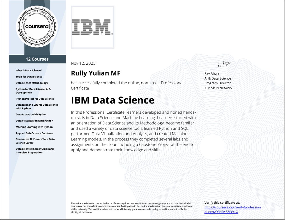
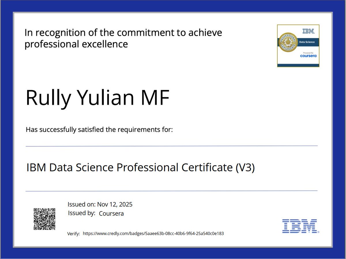
Alhamdulillah. It's a wrap! After passing 12 stages certification, finally received professional certification. @IBM Data Science Professional issued by @coursera Now it's time to rest first 😊 #DataScience #DataAnalysis #DataVisualization #MachineLearning #AI #GenAI #Python


👉 In this article, you’ll learn how accessible hotel analytics boost decision speed, align teams, build confidence, and drive better performance. #datavisualization #analytics #BI #hotel #hotelindustry #hospitality revfine.com/why-hotel-anal…


🔍 ถอดรหัสวิธีคิดมิจฉาชีพ เลือกเหยื่อจากอะไร ? 🔴 #TheVisual #ThaiPBS ชวนทุกคนเจาะลึกกลเม็ดหลอกล่อ "เหยื่อ" และแก๊งสแกมเมอร์ในรูปแบบ #DataVisualization ป้องกันตัวเองไม่ตกเป็นเหยื่อ กับ #TheScammer Click • Pay • Cry กฎข้อเดียวของเกมนี้ = อย่าเชื่อใจใคร 👉…


Something went wrong.
Something went wrong.
United States Trends
- 1. Tulane 13.4K posts
- 2. Gunther 23.2K posts
- 3. #SmackDown 34.8K posts
- 4. Cocona 75.1K posts
- 5. North Texas 7,443 posts
- 6. #ROHFinalBattle 18K posts
- 7. LA Knight 10.9K posts
- 8. Anthony Davis 2,194 posts
- 9. Boise State 3,591 posts
- 10. fnaf 2 61.9K posts
- 11. #GCWSay N/A
- 12. UNLV 4,321 posts
- 13. #OPLive 2,672 posts
- 14. #TNAFinalResolution 7,544 posts
- 15. Trouba 1,152 posts
- 16. Flag Day 3,014 posts
- 17. Meek 8,338 posts
- 18. 5 YEARS WITH MC WONYOUNG 5,532 posts
- 19. Athena 10.4K posts
- 20. Dizzy 6,380 posts