#dataviztips search results

#dataviztips: To show a relationship between two metrics, use a scatterplot. Not a bar chart, like in this #dataviz of the relationship between # of sex workers and cost per hour in Moscow.

#dataviztips: In most instances of line charts it's unnecessary to mark each data point. This chart of cumulative views of popular music videos on YouTube by reddit /u/grafitofarhan would look less cluttered sans dots. #dataviz #DataVisualization

#dataviztips: Just because it's now easy to make a Sankey diagram doesn't mean you should make a Sankey diagram. This Sankey of the geographical area of US states by reddit /u/derpt145 would work better as a bar chart or tree map. #dataviz #DataVisualization #wtfviz


Make your charts looks 🔥 with these tips: 1- Use the right & unique chart type. 2- Avoid clutter. 3- Use color to highlight insights. 4- Add labels and annotations. 5- Tell a story. #dataviz #datavisualization #dataviztips #datastorytelling

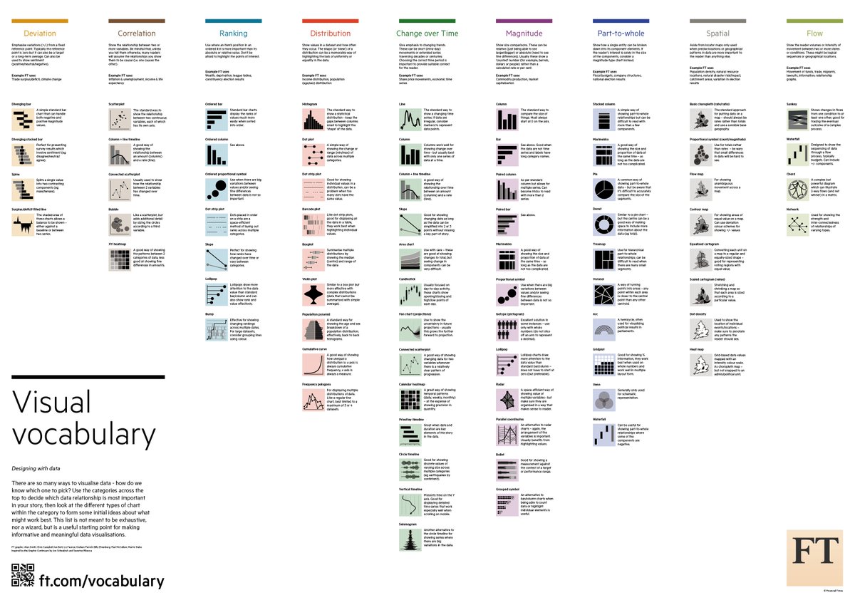
All the #dataviztips: an impressive compendium of #datavisulization best practices from @martinstabe and @ftdata. 💯👏 #dataviz buff.ly/2G43LxR

Design in black and white first. If you can get it right, it should work in colour. #HowWeDoThings #DataVizTips #DataViz


Don't be afraid to show the reader where to look. If there's a shocking data point on the chart, point to it! #HowWeDoThings #DataVizTips #DataViz

A good headline could be the most important 'line' in your chart. #HowWeDoThings #DataVizTips #Dataviz


Say goodbye to flat colors and hello to smooth data transitions. Gradients reveal trends, emphasize outliers, and make your visualizations more effective. ⚡ #dataviztips #datadesign

Show a sketch or early schematic to someone who doesn't know much about the topic or data in general. Showing a parent or friend usually works. #HowWeDoThings #DataVizTips #DataViz

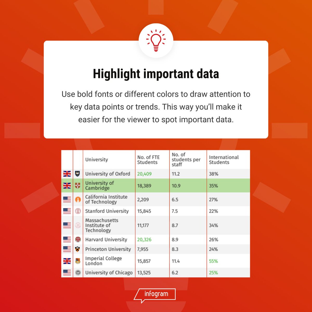
Data with flair! ✨ Bold fonts and contrasting colors make your key findings stand out from the crowd. This visual trick helps viewers grasp the essence of your data and remember your message. Up your data viz game with strategic highlighting! #dataviztips #datavisualization
When animating a chart focus on guiding the user to help them understand. (1/2) #HowWeDoThings #DataVizTips #DataViz

Drowning in numbers? 🌊 Let's make finance fun! 📊📈 Learn how to visualize your data with Excel tricks. 💡 #FinancialMagic #DataVizTips #UnlockTheData
Background removal magic! ✨ Infogram's feature makes your images stand out, perfect for data viz, social media, and more! No design skills needed. 😉 #dataviz #dataviztips #designhacks
Put yourself in the audience's shoes. Send yourself the viz on mobile and see if you can read it properly. #HowWeDoThings #DataVizTips #DataViz


Data viz = storytelling. Don’t confuse your audience. #PowerBI #DataVizTips #DashboardDesign #fyp #dataanalytics

#DataVizTips - Make sure everything is clearly labelled. africacheck.org/factsheets/gui… #DataSci #PhDchat


What age were you when you first discovered that you could print nicely formatted data with `console.table()` instead of the old `console.log()` ? #dataviztips


🌟 #SankeyMaster 📊 Unveil the Intricacies of Data Flow! 🌍 🌐 #DataVizTips: Transform your dataset into a visual masterpiece with a Sankey Chart! #sankeymaster #sankey 👉apps.apple.com/app/apple-stor…

Data viz = storytelling. Don’t confuse your audience. #PowerBI #DataVizTips #DashboardDesign #fyp #dataanalytics

The golden rule of Data Viz: Clarity > Complexity Your chart should be understood in 5 seconds or less. If people need a manual to read it, you’ve already lost them. #dataviztips

#DataVizTips tips #VisualisasiData ke-4 utk konten #tabel baik teks maupun angka. Kerja sama dgn kami, klik bio atau WA Bu Kuma 0857 3333 0407.
🎨✨ #SankeyMaster #DataVizTips🔍 Are you looking to visualize complex energy flows or resource distributions with a professional twist? Sankey charts might just be your new favorite tool! 🌍✨ #sankeymaster #sankey 👉apps.apple.com/app/sankeymast…

Why It Matters - Well-designed visuals turn raw data into actionable insights. Whether for client presentations or team reports, clear and impactful visuals can distinguish you. What's your favorite visualization tip? Share below and let's discuss! #DataVizTips #DataAnalytics

Small details make a big difference in #PowerBI! ✨ Adding borders around your bar charts can elevate your visuals, making them cleaner and easier to read. Simple tweaks = polished reports. 🖌️ #DataVizTips #PowerBICommunity

Data Visualization Rule: "Simplify to amplify!" Avoid clutter in your dashboards. A clear chart tells a better story. #DataVizTips #PowerBI

4/ Engagement: If the numbers are boring, you’ve got the wrong numbers. Credibility vanishes in clouds of chartjunk; no one trusts a chart that looks like a video game. #DataVizTips

Make your data sing! Get some tips for creating clear and impactful data visualizations in this tutorial. ow.ly/VfZh50SmChc #DataVizTips #DataDrivenDesign #ChartDesign #infoviz #datavis #datascience #powerbi #tableau #sisense #nft #growth

Data with flair! ✨ Bold fonts and contrasting colors make your key findings stand out from the crowd. This visual trick helps viewers grasp the essence of your data and remember your message. Up your data viz game with strategic highlighting! #dataviztips #datavisualization
Background removal magic! ✨ Infogram's feature makes your images stand out, perfect for data viz, social media, and more! No design skills needed. 😉 #dataviz #dataviztips #designhacks
Say goodbye to flat colors and hello to smooth data transitions. Gradients reveal trends, emphasize outliers, and make your visualizations more effective. ⚡ #dataviztips #datadesign

Remember to utilize your life experience. Life experiences can provide unique perspectives that inform the choice of the visuals. For instance, Data analysts frustrated by the complexity of medical records might focus on creating user-friendly interfaces.#DataVizTips.
Data visualizations bring clarity to complexity, but without diverse voices, the picture can be incomplete. Data analysts must acknowledge their own limitations and embrace different approaches to create truly insightful and inclusive visualizations. #DataVizTips.
#dataviztips: To show a relationship between two metrics, use a scatterplot. Not a bar chart, like in this #dataviz of the relationship between # of sex workers and cost per hour in Moscow.
#dataviztips: Just because it's now easy to make a Sankey diagram doesn't mean you should make a Sankey diagram. This Sankey of the geographical area of US states by reddit /u/derpt145 would work better as a bar chart or tree map. #dataviz #DataVisualization #wtfviz
#dataviztips: In most instances of line charts it's unnecessary to mark each data point. This chart of cumulative views of popular music videos on YouTube by reddit /u/grafitofarhan would look less cluttered sans dots. #dataviz #DataVisualization
Make your charts looks 🔥 with these tips: 1- Use the right & unique chart type. 2- Avoid clutter. 3- Use color to highlight insights. 4- Add labels and annotations. 5- Tell a story. #dataviz #datavisualization #dataviztips #datastorytelling
All the #dataviztips: an impressive compendium of #datavisulization best practices from @martinstabe and @ftdata. 💯👏 #dataviz buff.ly/2G43LxR
Say goodbye to flat colors and hello to smooth data transitions. Gradients reveal trends, emphasize outliers, and make your visualizations more effective. ⚡ #dataviztips #datadesign
Design in black and white first. If you can get it right, it should work in colour. #HowWeDoThings #DataVizTips #DataViz
Data with flair! ✨ Bold fonts and contrasting colors make your key findings stand out from the crowd. This visual trick helps viewers grasp the essence of your data and remember your message. Up your data viz game with strategic highlighting! #dataviztips #datavisualization
Don't be afraid to show the reader where to look. If there's a shocking data point on the chart, point to it! #HowWeDoThings #DataVizTips #DataViz
A good headline could be the most important 'line' in your chart. #HowWeDoThings #DataVizTips #Dataviz
Show a sketch or early schematic to someone who doesn't know much about the topic or data in general. Showing a parent or friend usually works. #HowWeDoThings #DataVizTips #DataViz
📊 #DataVizTips from the #Infogram creator community ⤵ 💡 Tip 1: Invest your time. The more projects you create, the more growth you'll see. Discover more pro tips here: bit.ly/3laOhO1

Put yourself in the audience's shoes. Send yourself the viz on mobile and see if you can read it properly. #HowWeDoThings #DataVizTips #DataViz
#DataVizTips - Make sure everything is clearly labelled. africacheck.org/factsheets/gui… #DataSci #PhDchat
#DataVizTips - Avoid 3-D and ‘blow-apart’ effects. africacheck.org/factsheets/gui… … #DataSci #PhDchat


Top Tips for Mastering Data Visualization: Decode the Art of Effective Analysis with Our Informative Infographic! 📊🔍 Elevate Your Insights Game Today. 🚀 #DataVizTips #InsightsUnleashed #datastudiosnet #GoogleDataStudio


Make your data sing! Get some tips for creating clear and impactful data visualizations in this tutorial. ow.ly/VfZh50SmChc #DataVizTips #DataDrivenDesign #ChartDesign #infoviz #datavis #datascience #powerbi #tableau #sisense #nft #growth

Creating #DataViz can bring your story to life & help you make complex data meaningful! Here are some tips for creating powerful data visualizations that highlight the big picture & present trends quickly. #DataVizTips #DataScience #DataAnalytics #DataAnalyst #PowerBI


Something went wrong.
Something went wrong.
United States Trends
- 1. Marcus Smart 3,632 posts
- 2. Wemby 18.9K posts
- 3. #LakeShow 3,539 posts
- 4. Blazers 5,681 posts
- 5. Richard 43.9K posts
- 6. Horford 1,509 posts
- 7. Westbrook 6,922 posts
- 8. #Lakers 1,372 posts
- 9. #RipCity N/A
- 10. #AEWDynamite 19K posts
- 11. Podz 2,120 posts
- 12. Kuminga 3,012 posts
- 13. Champagnie N/A
- 14. Spencer Knight N/A
- 15. #Survivor49 3,219 posts
- 16. Ayton 6,774 posts
- 17. Deni 5,706 posts
- 18. Luka Doncic 7,122 posts
- 19. Sochan 1,873 posts
- 20. Jrue Holiday N/A